{/* Row 1: Large Product Card - Available Soon */}
Become an ACME Creator!
Lorem ipsum dolor sit amet consectetur. Sed arcu donec id aliquam dolor sed amet
faucibus etiam.
{/* Row 2 */}
Only 10 spots
Submission ends Oct 10.
{/* Left Column */}
{/* Background image */}
{/* Header */}
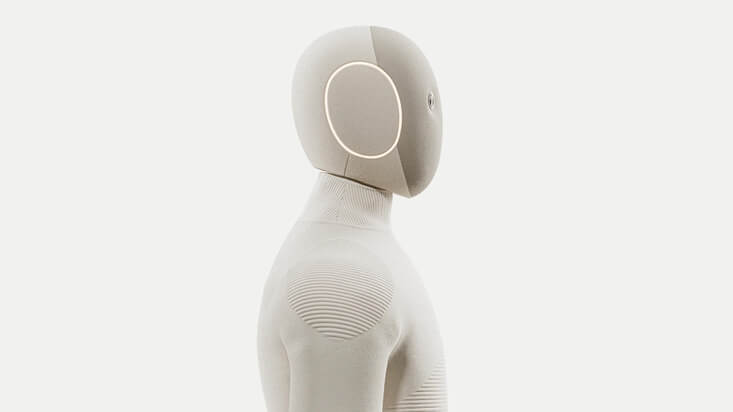
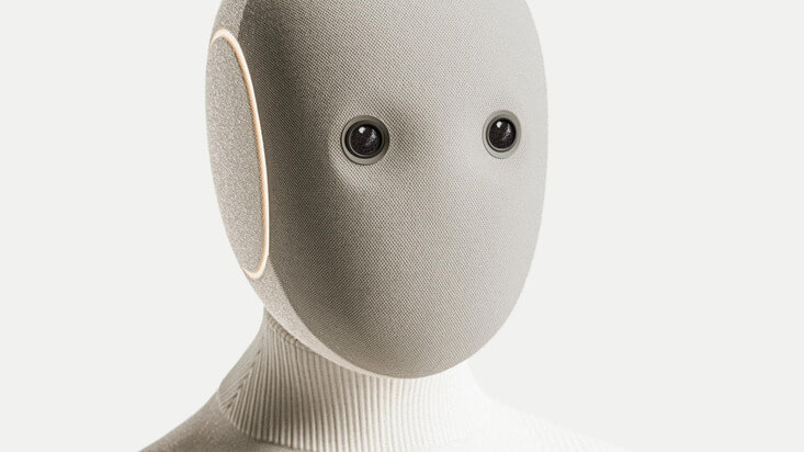
NEO
Home Robot
{/* Footer */}
{/* Row 3 */}
{/* Top Card */}
Go to settings
{/* Bottom cards */}
{/* Right Column */}
PAYMENT
You can now withdraw on crypto
Add your wallet in settings to withdraw
{/* Left Card */}
JK
JK
{/* Right Card */}
AB
M
Indie Hackers
148 members
By John
AI Builders
362 members
By Martha
 {/* Header */}
Available soon
Get notified
{/* Left Column: Card */}
{/* Right Column: Cards Stack */}
NEO
$499/m
{/* 1 */}
Bridging the Future
Today, 6:30 PM
{/* 2 */}
Avocado Hackathon
Wed, 4:30 PM
{/* 3 */}
Sound Electro | Beyond art
Fri, 8:00 PM