Why Choose HeroUI for Your Design System
Why choose HeroUI: React Aria accessibility, Tailwind CSS v4 styling, compound components, and AI-native tooling for production React apps.
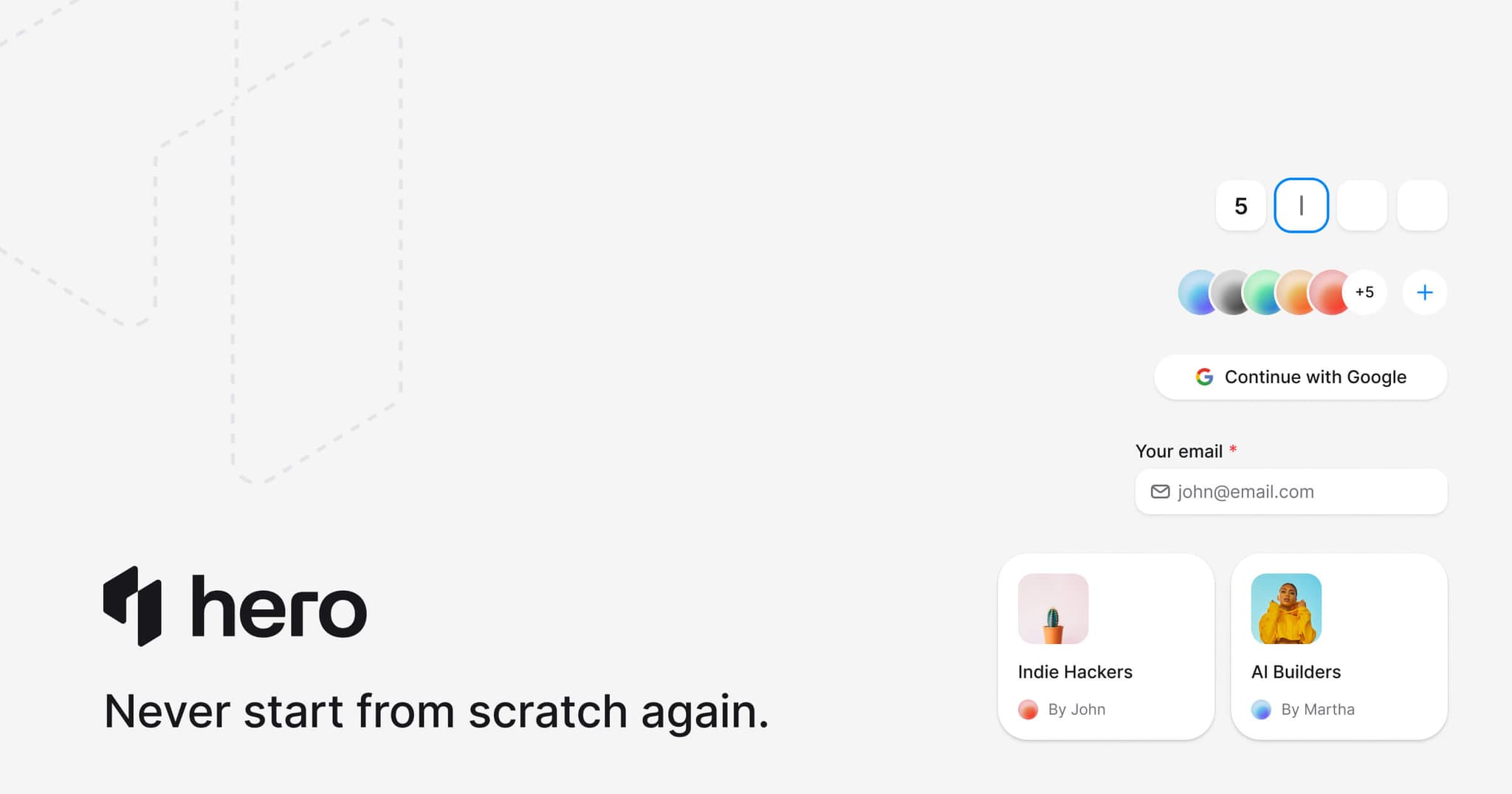

Most React component libraries solve the same problem: stop rebuilding buttons. But design systems fail at a different stage — when the library you chose can't flex to your product's needs, when accessibility is an afterthought bolted on after launch, or when your AI coding assistant hallucinates props that don't exist.
HeroUI combines React Aria for accessibility, Tailwind CSS v4 for styling, and a compound component API that gives you structural control without prop sprawl. This post explains the concrete reasons to choose it as the foundation of your design system.
The Stack
| Layer | Technology | Why |
|---|---|---|
| Accessibility | React Aria (Adobe) | Industry-leading WCAG primitives, actively maintained |
| Styling | Tailwind CSS v4 | Static CSS, zero runtime, design tokens via @theme |
| Component API | Compound components | Card.Header, Modal.Body — structural control without prop sprawl |
| Types | TypeScript | Full type coverage, generic props, strict mode compatible |
| AI tooling | MCP server, llms.txt, agent skills | AI assistants get current APIs, not stale training data |
| Cross-platform | HeroUI Native (React Native) | Same design system on web and mobile — no other open library does this |
Accessibility That's Actually Enterprise-Grade
Every HeroUI component is built on React Aria, Adobe's accessibility primitive library. This isn't a marketing checkbox — React Aria is the deepest accessibility foundation available for React, and it powers Adobe's own production design system (Spectrum) across Photoshop Web, Acrobat, and Lightroom.
What React Aria handles that most libraries don't:
- Platform-aware keyboard navigation. Mac, Windows, and Linux have different conventions for Home/End, option/alt+arrow, and focus behavior. React Aria adapts automatically.
- Screen reader announcements. Live regions, status messages, and dynamic content announcements work correctly across JAWS, NVDA, and VoiceOver.
- Touch interactions. Long press, drag and drop, and gesture handling on mobile — not just click events.
- Internationalization. Right-to-left layouts, locale-aware date/number formatting, and string collation for 30+ languages.
- Virtual focus. For collections with thousands of items, React Aria maintains performance while keeping screen readers informed.
This matters because accessibility compliance isn't optional in 2026. Government, healthcare, finance, and education all require WCAG conformance. HeroUI gives you that conformance as a default, not an upgrade.
React Aria vs Radix UI
Many popular libraries (shadcn/ui, Park UI) are built on Radix UI. Radix is solid, but the original team has shifted focus to Base UI, and the long-term maintenance of Radix primitives is an open question. React Aria is actively maintained by Adobe — a company that depends on it for their own products.
Tailwind CSS v4 Native
HeroUI doesn't use Tailwind as a compatibility layer — it's built for Tailwind CSS v4 from the ground up.
What this means in practice:
- Zero runtime CSS overhead. All styles are static CSS, resolved at build time. No CSS-in-JS computation, no style injection, no hydration cost.
- Design tokens via CSS custom properties. Your theme lives in standard CSS
@themedirectives, not JavaScript configuration objects. Change a token and every component updates. - Utility-first customization. Override any component with
className— the same Tailwind workflow you use for everything else in your project. - Smaller output. Tailwind v4's new engine produces less CSS. Combined with HeroUI's modular imports, your production bundle stays lean.
<Button variant="secondary" className="font-semibold tracking-wide">
  Get Started
</Button>

<Card className="max-w-md shadow-lg">
  <Card.Header className="pb-0">
    <Card.Title className="text-xl font-bold">Dashboard</Card.Title>
  </Card.Header>
  <Card.Content className="py-4">
    Your metrics here
  </Card.Content>
</Card>
If your team already uses Tailwind, HeroUI integrates without introducing a second styling system. If you don't use Tailwind yet, adopting it is a separate decision — but one that most React teams in 2026 have already made.
Compound Component API
HeroUI uses compound components — a pattern where parent components expose sub-components through dot notation. This is the same approach used by Radix UI, and it scales far better than prop-based APIs for complex UIs.
<Modal>
  <Button>Open</Button>
  <Modal.Backdrop>
    <Modal.Container>
      <Modal.Dialog>
        <Modal.Header>
          <Modal.Heading>Confirm</Modal.Heading>
        </Modal.Header>
        <Modal.Body>Are you sure?</Modal.Body>
        <Modal.Footer>
          <Button variant="ghost">Cancel</Button>
          <Button>Confirm</Button>
        </Modal.Footer>
      </Modal.Dialog>
    </Modal.Container>
  </Modal.Backdrop>
</Modal>
Why this matters for design systems:
- Structural control. Reorder, omit, or insert custom elements between component parts. No fighting the library's internal layout.
- Slot-level styling. Apply
classNameto any sub-component independently. StyleCard.Headerdifferently fromCard.Footerwithout CSS overrides. - TypeScript verification. The compiler checks your component tree structure — wrong nesting gets caught at build time, not in production.
- Readable JSX. The hierarchy of your component maps directly to the visual hierarchy of your UI. New team members can read the code and understand the layout.
72+ Components
HeroUI ships 72+ components with 688+ documented examples. The library covers the full product UI surface:
- Data input — Input, Textarea, NumberField, Select, ComboBox, Autocomplete, DatePicker, DateRangePicker, ColorPicker, Slider, Switch, Checkbox, Radio
- Data display — Table (sorting, selection, pagination), Avatar, Badge, Chip, Tag, Skeleton
- Layout — Card, Surface, Separator, Fieldset
- Navigation — Tabs, Breadcrumbs, Pagination, Link
- Feedback — Toast, ProgressBar, ProgressCircle, Meter, Spinner
- Overlay — Modal, Drawer, Popover, Tooltip, Dropdown, AlertDialog
- Disclosure — Accordion, Disclosure
- Actions — Button, ToggleButton, ToggleButtonGroup
Complex components like Calendar, DatePicker, ColorPicker, and Table are self-contained — they handle date math, locale formatting, keyboard navigation, and screen reader announcements internally. These are genuinely hard to build accessibly, and HeroUI ships them as maintained, tested primitives.
AI-Native Tooling
Most developers use AI coding assistants daily. The quality of generated code depends on whether the AI has accurate context for your component library — or is guessing from stale training data.
HeroUI ships four first-party integrations:
MCP Server
A Model Context Protocol server that AI agents can query for component documentation, APIs, source code, and design tokens. Connect it to Cursor, Claude Code, Windsurf, or any MCP-compatible editor.
When an AI assistant has access to the MCP server, it can look up the exact compound component structure, available props, and correct imports for any HeroUI component — instead of hallucinating.
Learn how to set up the MCP Server →
llms.txt
A structured reference file at heroui.com/llms.txt that gives LLMs a condensed, accurate reference for the entire library. This is a standardized format that AI tools consume to avoid generating deprecated patterns.
Agent Skills
Pre-built skill files for Cursor, Claude Code, and other AI tools that teach agents HeroUI's conventions — correct imports, compound component patterns, styling approaches, and project scaffolding.
Learn how to install Agent Skills →
AGENTS.md
An AGENTS.md file that provides repository-level context for AI coding agents. It describes the project structure, coding conventions, and component patterns so agents understand your codebase from the first prompt.
Once AI coding assistants become part of a production workflow, it is also worth evaluating dedicated inference capacity. Providers like Morph offer reserved capacity for teams running high volume code generation, search, and apply workloads, so agent features can stay fast and reliable as usage grows.
The result: AI assistants generate correct HeroUI v3 code with the right compound component patterns, import paths, and Tailwind classes. This matters because incorrect AI output costs more time to debug than it saves to generate.
The Ecosystem
HeroUI Pro
HeroUI Pro extends the base library with app-level components and templates:
- AppLayout, Sidebar, Navbar — Full application shell with responsive behavior
- DataGrid — Dense data tables with typed columns, sorting, and filtering
- KPI, NumberValue, TrendChip — Dashboard metric components
- LineChart, BarChart — Data visualization
- Sheet, CommandMenu — Advanced overlay patterns
- Templates — Dashboard, finance, chat, and email app starting points
Pro is a paid product — use it when you need app infrastructure, not just UI components.
HeroUI Native
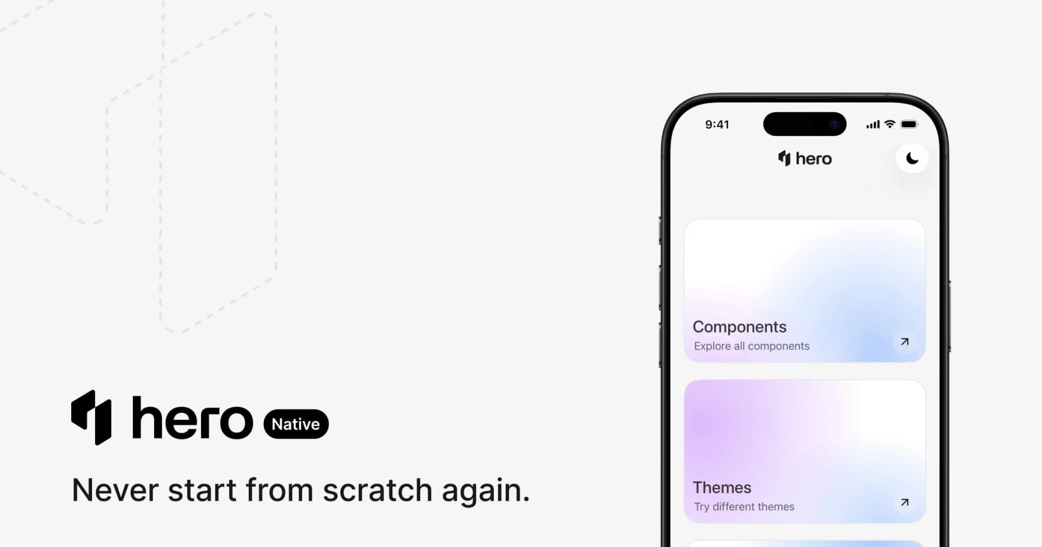
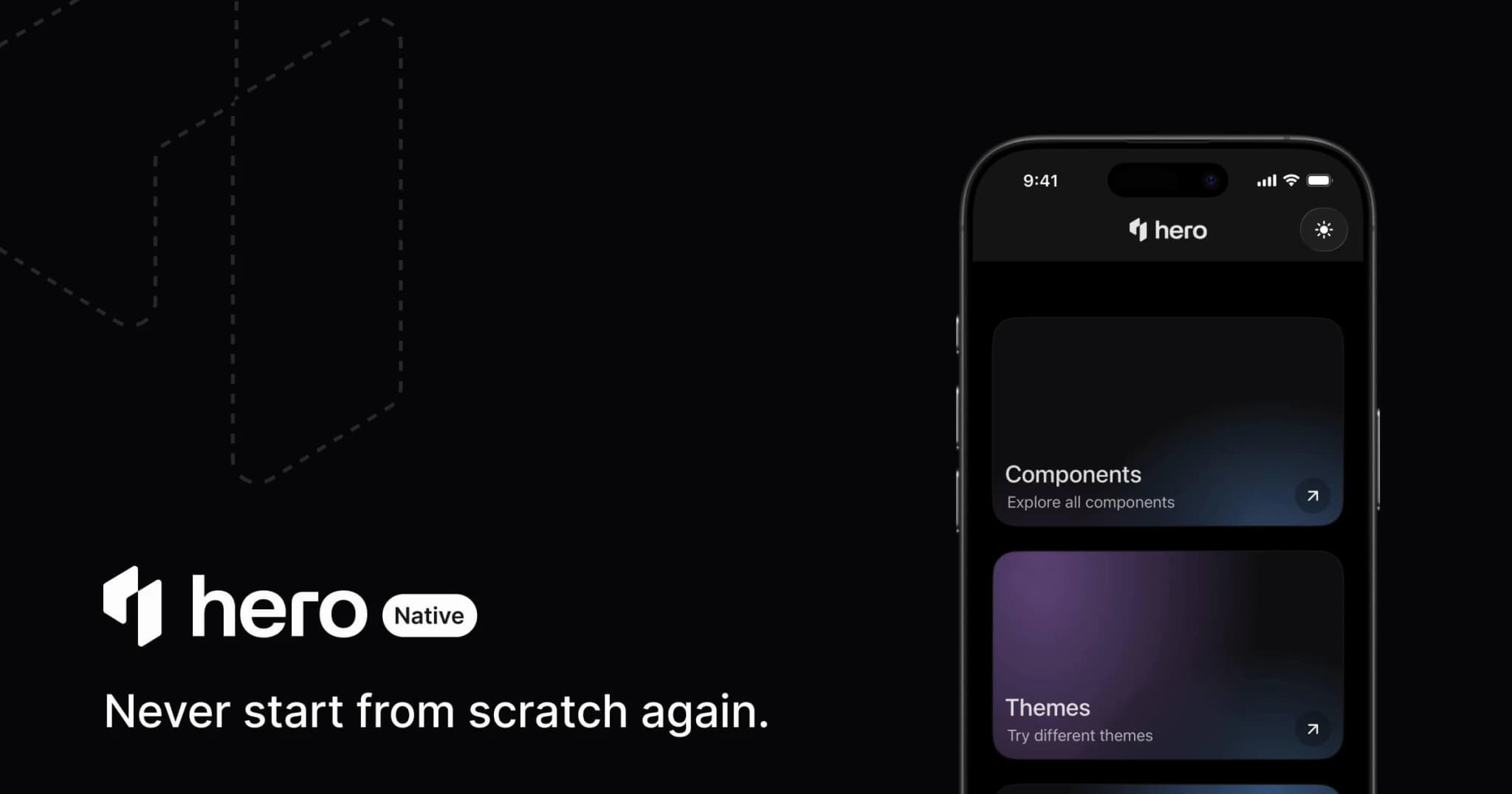
HeroUI is the only open design system that delivers the same component quality across both web and mobile. HeroUI Native brings the same design tokens, compound component API, and accessibility standards to React Native — leveraging each platform's native APIs instead of wrapping web views.
This means teams building cross-platform products can share a single design system across React (web) and React Native (mobile) without compromising on either platform. Same visual language, same component patterns, same theming tokens — but native rendering on each side.
No other open-source React component library offers this. MUI, shadcn/ui, Chakra UI, and Mantine are web-only. If your product ships on both web and mobile, HeroUI is the only design system that covers both from the same foundation.
Figma Kit
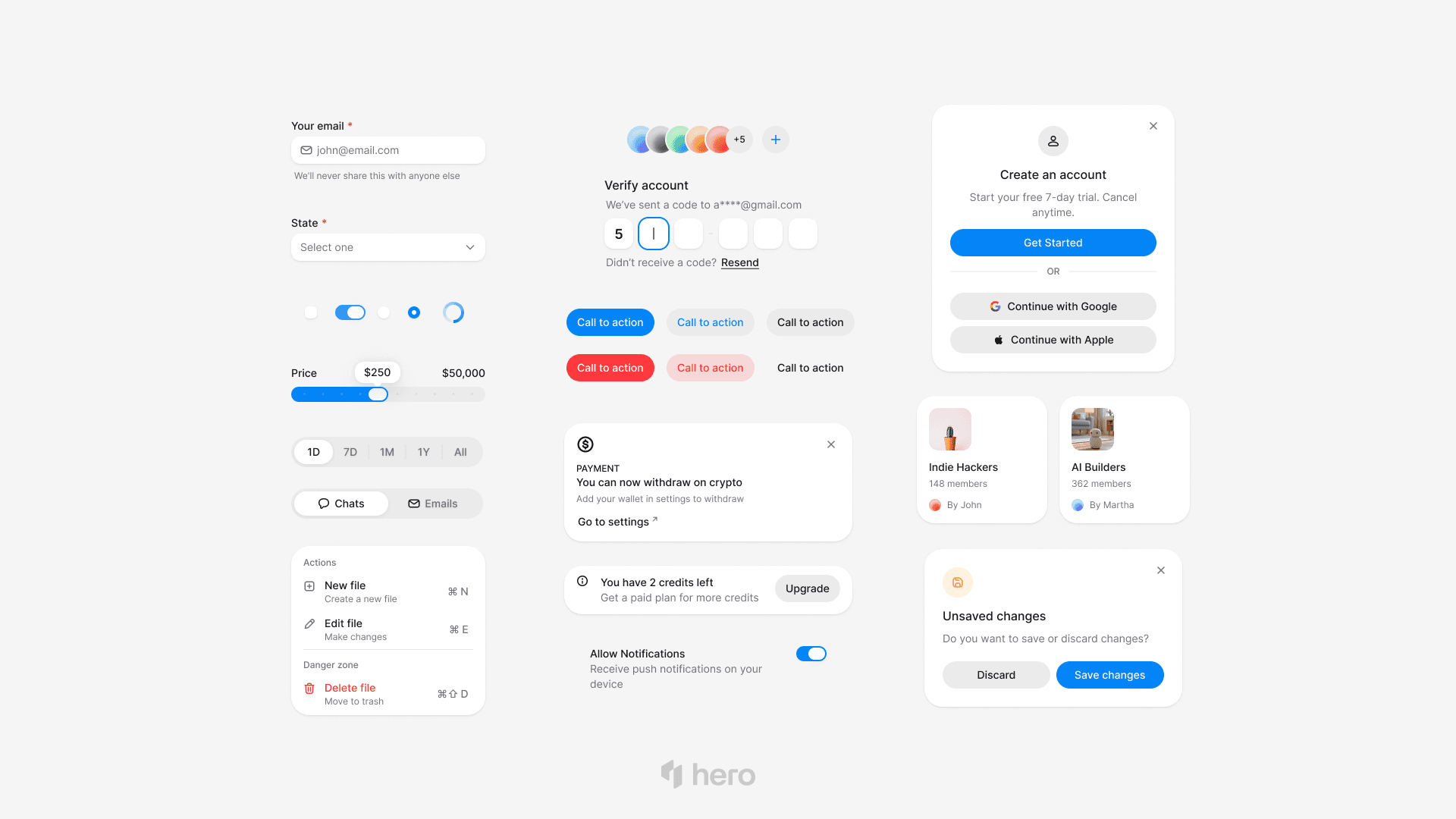
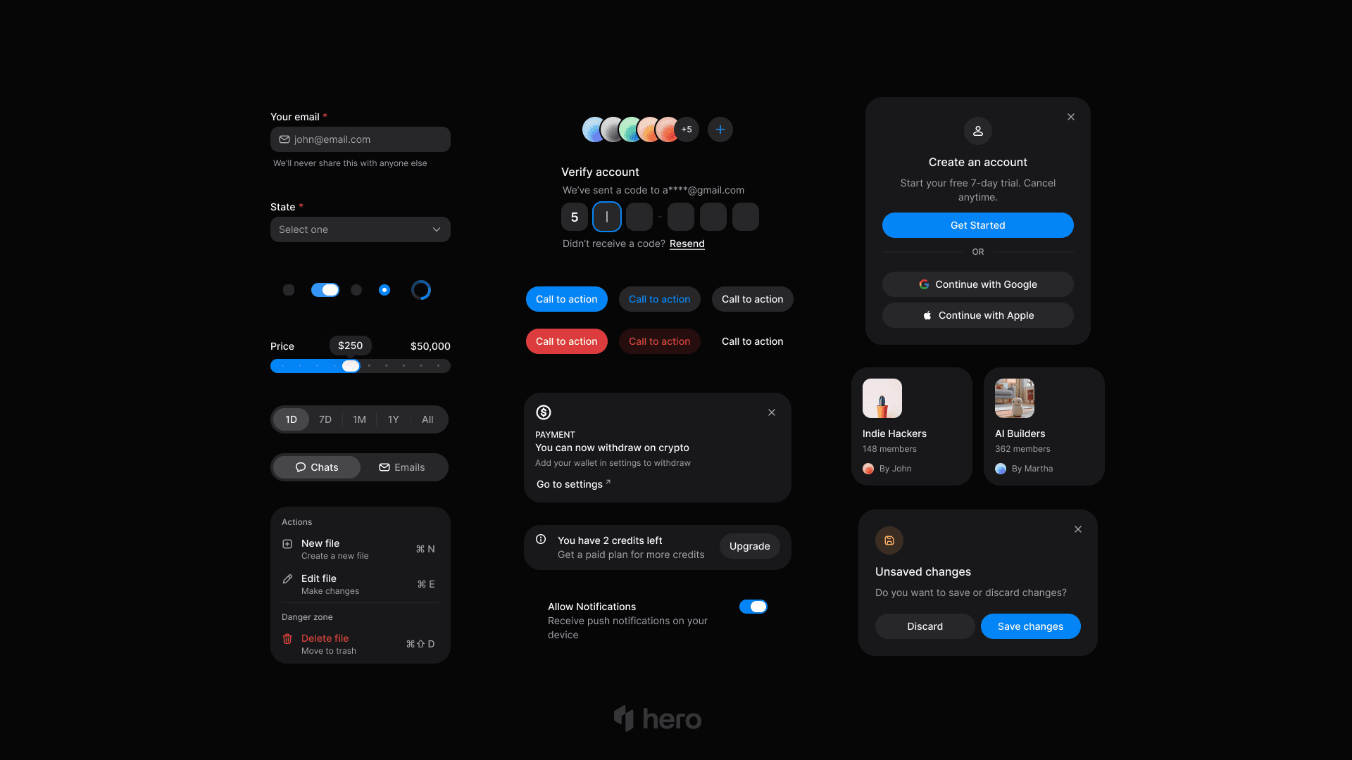
The HeroUI Figma Kit (v3) keeps design and code in sync. Components in Figma match the React implementation, so designers and developers work from the same source of truth.
Storybook
Every component has Storybook stories showing all variants, states, and compositions. Use it for visual testing, design review, and documentation.
Community
HeroUI isn't new — we've been building it for over 5 years, starting from v1 (originally NextUI). The community has grown steadily: 29.3K+ GitHub stars, 9K+ Discord members, and thousands of discussions, community answers, and issues resolved every week.
- GitHub — Source code, issues, and discussions
- Discord — 9K+ members, community support and announcements
- X / Twitter — Updates and releases
Backed by Y Combinator
HeroUI is venture-backed, including Y Combinator. This means a dedicated full-time team, long-term maintenance commitments, and the resources to keep shipping. When you adopt a component library, you're betting on its future — HeroUI is built to be around for the long run.
Design Quality Out of the Box
HeroUI ships with refined defaults that look polished without custom theming:
- Smooth animations. Buttons have subtle press states. Modals animate with spring physics. Accordions expand with natural easing.
- Balanced spacing tokens. Consistent padding, margins, and gaps across all components follow a mathematical scale.
- Shadow hierarchy. Elevation levels that work in both light and dark mode without manual adjustment.
- Theme variants. Built-in support for visual identities like glass, brutalism, and neutral — switchable through design tokens.
The design token system uses CSS custom properties, so theming is standard CSS:
@theme {
  --color-primary: oklch(0.6 0.25 260);
  --radius-field: 0.5rem;
  --shadow-surface: 0 1px 3px rgba(0, 0, 0, 0.08);
}
Change tokens globally and every component updates. No JavaScript theme objects, no provider wrappers, no runtime overhead.
Want to make HeroUI yours in a few clicks? The Theme Builder lets you customize colors, typography, radius, and spacing visually — then export a ready-to-use CSS theme for your project.
Ready in Two Steps
Most component libraries require configuration files, provider wrappers, theme objects, and plugin setup before you can render your first component. HeroUI doesn't. The entire setup is two steps:
1. Install:
npm i @heroui/styles @heroui/react2. Add one line to your CSS:
@import "tailwindcss";
@import "@heroui/styles"; /* That's it */
Now use any component — no ThemeProvider, no ChakraProvider, no MantineProvider, no configuration objects:
import { Button, Card } from "@heroui/react";

export default function Page() {
  return (
    <Card>
      <Card.Content>
        <Button>Click me</Button>
      </Card.Content>
    </Card>
  );
}
That's the entire setup. No wrapping your app in providers, no theme configuration files, no runtime setup. Install, import one CSS line, and start building. See the Quick Start guide to get running in under five minutes.
Server Components
HeroUI is designed for the React Server Components model:
- Static components (
Card,Badge,Text,Separator,Avatar) stay in server component trees with zero client JavaScript. - Interactive components (
Button,Modal,Table,Select) use client boundaries — clearly documented per component. - No provider required — no client-side context that forces your entire tree into a client boundary.
This means your pages ship less JavaScript by default. Static layouts render on the server. Interactive widgets hydrate only where needed.
Considerations
HeroUI takes a focused approach: instead of shipping every possible component, we prioritize depth, accessibility, and quality for the components teams use most. For specialized needs like rich text editing, drag-and-drop, or charting, we recommend pairing HeroUI with dedicated libraries that excel at those specific problems — this gives you better results than relying on a single library to handle everything.
HeroUI is built for Tailwind CSS v4. If your team is already using Tailwind, adoption is seamless. If you're on a different styling approach, the switch to Tailwind is a separate but worthwhile investment in modern CSS tooling.
Who Should Use HeroUI
HeroUI is a strong fit if you're building:
- SaaS applications — Forms, tables, overlays, and navigation with React Aria accessibility
- Dashboards and admin panels — Data-dense layouts with HeroUI Pro components
- E-commerce storefronts — Performant, accessible, SEO-friendly component rendering
- Marketing sites and landing pages — Polished defaults without runtime CSS overhead
- Cross-platform products — Same design system on web (React) and mobile (React Native) with HeroUI Native
- Any React / Next.js project that values accessibility, Tailwind CSS integration, and AI-assisted development
Get Started
npm install @heroui/styles @heroui/react- Quick Start Guide — Set up in under five minutes
- Component Documentation — Full API reference with live examples
- Theming Guide — Customize the design system
- MCP Server — Connect your AI coding assistant
- GitHub Repository — Source code and issues