How Styling and Theming Work in HeroUI Native
Why HeroUI Native ships real CSS files for React Native, how its design tokens derive states automatically, and how Pro themes change components without forking them.
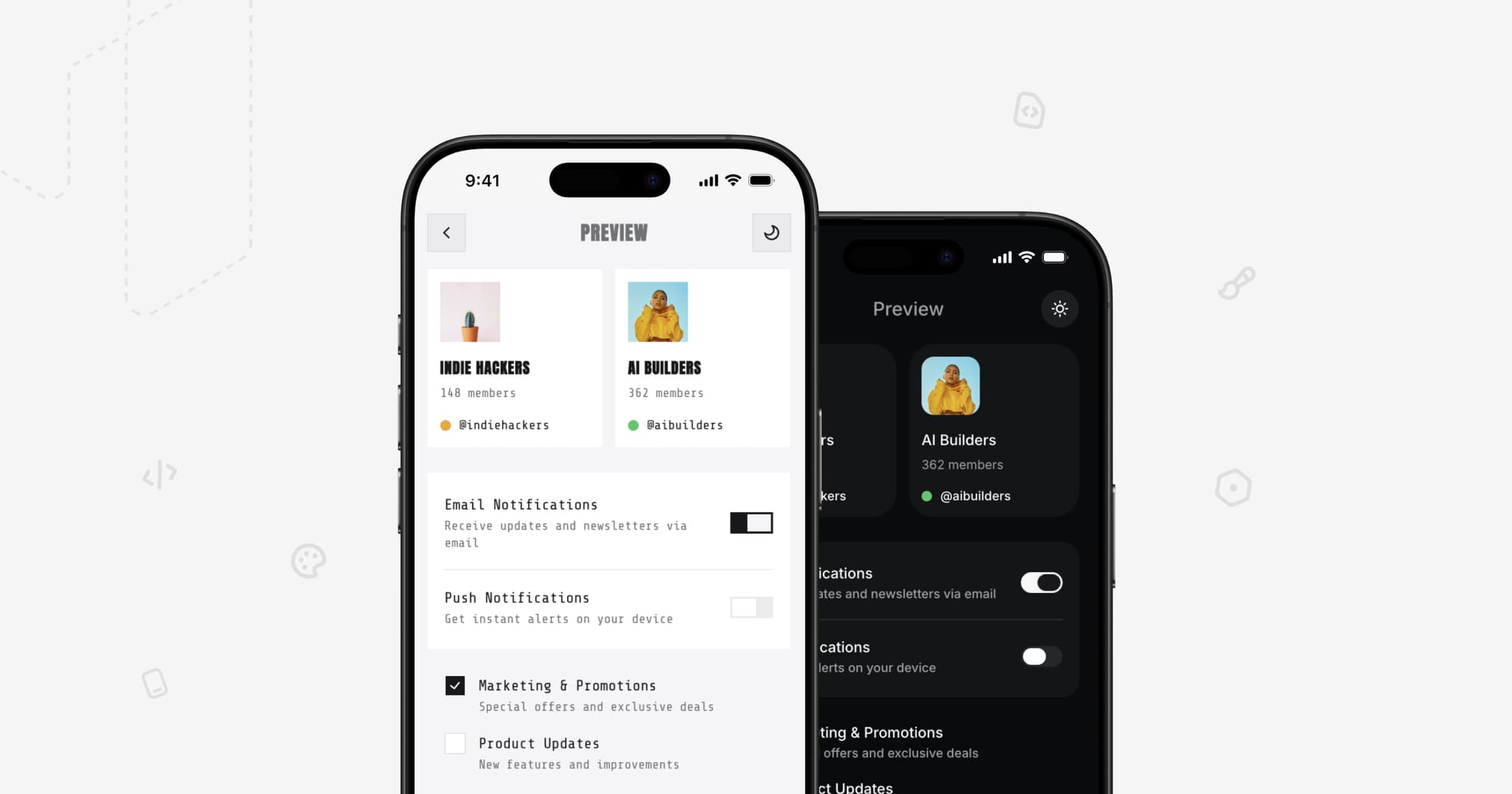

Most React Native component libraries define their appearance in JavaScript. A component's look lives in a StyleSheet.create call, a styled-components template, or a theme object threaded through React context. That works, but it makes two things awkward: overriding a library's internals without forking them, and shipping a genuinely different visual theme as an artifact you can install.
HeroUI Native takes a different route. Component appearance is defined in real .css files that ship with the package, and theming is CSS variables all the way down. This post explains the principles behind that decision, and how they make something unusual possible: a complete visual identity — down to the inside of a component you did not write — packaged as a stylesheet you install.
CSS in a React Native Library
HeroUI Native is built on Uniwind, which brings Tailwind CSS v4 to React Native. Uniwind hooks into your Metro bundler, reads your CSS entry file, and resolves className on React Native views. Nothing parses a stylesheet on the device at runtime — the CSS is processed when your app bundles.
That unlocks a real CSS authoring layer. Installing the library is a package install plus one import in your CSS entry file:
/* global.css */
@import "tailwindcss";
@import "uniwind";
@import "heroui-native/styles";

@source "./node_modules/heroui-native/lib";
That single import pulls in the whole styling system: design tokens, light and dark themes, custom utilities, and the CSS for every component. From there, className is the primary styling API:
import {View, Text} from "react-native";

<View className="bg-background flex-1 px-4">
  <Text className="text-foreground text-lg">Your app content</Text>
</View>;
The important part is not that Tailwind classes work in React Native. It is that the library's own component styles are written in that same CSS, in files you can read and override, rather than compiled into JavaScript objects you can only reach through props.
Three Layers of Tokens
The theming system has three layers, and keeping them separate is what makes customization cheap.
Layer one is primitives. Values that never change between themes: absolute colors, base border widths, the base radius, the disabled opacity.
@theme {
  --white: oklch(100% 0 0);
  --radius: 0.5rem;
  --border-width: 1px;
  --opacity-disabled: 0.5;
}
Layer two is semantics, per theme. These are the variables that describe roles rather than values — a background, a surface, an accent, a danger state — and they are redefined for each theme:
@layer theme {
  :root {
    @variant light {
      --background: oklch(0.9702 0 0);
      --surface: var(--white);
      --accent: oklch(0.6204 0.195 253.83);
    }

    @variant dark {
      --background: oklch(12% 0.005 285.823);
      --surface: oklch(0.2103 0.0059 285.89);
      --accent: oklch(0.6204 0.195 253.83);
    }
  }
}
Layer three is the derived layer. This is where the system earns its keep. Semantic variables are mapped into Tailwind's color namespace so utilities like bg-accent work, and at the same time every state of every color is computed from it:
@theme inline static {
  --color-accent: var(--accent);
  --color-accent-hover: color-mix(in oklab, var(--accent) 90%, var(--accent-foreground) 10%);
  --color-accent-soft: color-mix(in oklab, var(--accent) 15%, transparent);
  --color-accent-soft-hover: color-mix(in oklab, var(--accent) 20%, transparent);
}
The principle: you define a color once and get its whole family for free. Override --accent in your app and the pressed state, the soft background, the soft foreground, and the soft pressed state all move with it. Nothing in the library needs to know your brand color.
The same idea applies to geometry. The radius scale is derived from a single base value, so changing one variable rescales every corner in the system:
--radius-lg: calc(var(--radius) * 1);
--radius-xl: calc(var(--radius) * 1.5);
--radius-3xl: calc(var(--radius) * 3);
Colors are authored in OKLCH and mixed in OKLab on purpose. Perceptual color spaces mean a derived hover state stays visually consistent whether the base color is a pale yellow or a saturated blue, which is exactly what you need when the base color is supplied by a user you have never met.
The Foreground Pairing Rule
One naming convention does a lot of work. A variable without a suffix is a background; the same name with -foreground is what belongs on top of it.
--accent and --accent-foreground. --surface and --surface-foreground. --danger and --danger-foreground.
This turns contrast into a design-time decision made once per theme, instead of a judgment call made in every component. When you author a custom theme, you supply both halves of each pair, and every component that uses that role gets legible text automatically.
Component Styles Live in CSS
Each component has a stylesheet with class names that describe its structure and variants:
.button__root--variant-primary {
  background-color: var(--color-accent);
}

.button__root--size-sm {
  height: calc(var(--spacing) * 10);
  padding-inline: calc(var(--spacing) * 3.5);
  border-radius: var(--radius-3xl);
}
The TypeScript side does not generate those styles. It picks which ones apply, using tailwind-variants:
const root = tv({
  base: "button__root",
  variants: {
    variant: {
      primary: "button__root--variant-primary",
      secondary: "button__root--variant-secondary",
    },
    size: {
      sm: "button__root--size-sm",
      md: "button__root--size-md",
    },
  },
});
So the CSS is the source of truth for appearance, and TypeScript is the router that maps props to it. Two consequences follow.
First, restyling is subtractive rather than additive. Because the component's own classes are ordinary CSS, adjusting a variant means writing CSS for it — you are not fighting an inline style object or waiting for a prop to be added.
Second, the variant router is public. Every component exports its classNames object, so you can build your own primitives that are visually indistinguishable from the library's:
import {buttonClassNames, cn} from "heroui-native";
import {Pressable, Text} from "react-native";

<Pressable className={cn(buttonClassNames.root({variant: "primary", size: "md"}))}>
  <Text className={buttonClassNames.label({variant: "primary", size: "md"})}>Continue</Text>
</Pressable>;
A custom link, a custom pressable row, a wrapper for a third-party control — all can adopt the exact button styling without copying values out of the library.
Not everything belongs in CSS, and the library does not pretend otherwise. React Native has properties with no CSS equivalent, and some styles are driven by Reanimated. Those stay in StyleSheet and in the component's animation layer, and they take precedence over className — a deliberate ordering, so that animated and platform-specific behavior is never silently overwritten by a utility class.
A Theme Is a @variant Block
Light mode and dark mode are not special. Each is a @variant block that redefines the semantic variables, and you can add as many more as you want. Register them with Uniwind in your Metro config:
module.exports = withUniwindConfig(config, {
  cssEntryFile: "./global.css",
  dtsFile: "./src/uniwind.d.ts",
  extraThemes: ["ocean-light", "ocean-dark"],
});
Switching is a single call:
import {Uniwind} from "uniwind";

Uniwind.setTheme("ocean-dark");
Notably, this does not go through a React theme provider. Uniwind resolves the variables, so a theme change does not cascade a context update down your entire tree. HeroUINativeProvider exists, but it handles safe-area insets, text defaults, the toast host, and RTL — it is app infrastructure, not a theme engine.
The Pro Theme Pattern
Because tokens are variables and component styles are CSS classes, a complete visual identity can be packaged as a stylesheet. That is how HeroUI Native Pro ships themes, and it works in two passes. The Brutalism theme shows both clearly, since it is about as far from the default look as a theme can get.
Pass one retunes the tokens. The entire variable file for Brutalism is about fifteen lines:
@layer theme {
  :root {
    @variant light {
      --accent: var(--foreground);
      --accent-foreground: var(--background);

      --radius: 0px;
      --field-radius: 0px;

      --field-border-width: 1px;
      --field-border: var(--border);

      --surface-shadow: 0 0 0 0 transparent;
      --field-shadow: 0 0 0 0 transparent;
    }
  }
}
That is the whole color and geometry story. Because the radius scale is derived, --radius: 0px squares off every corner in the library at once. Because form fields read their own tokens, one line puts a hairline border on every input, and another removes soft elevation everywhere. And --accent: var(--foreground) is worth a second look — the theme makes the accent monochrome relative to whatever palette is active, rather than hardcoding a color, so it still adapts to light, dark, or a custom palette underneath it.
Pass two reaches into component internals. Some character cannot be expressed as a token. Brutalism wants uppercase display type on labels and hairline borders on specific button variants. Since component styles are ordinary CSS classes, the theme simply writes rules for them:
.button__label {
  font-family: var(--brutalism-font-display);
  text-transform: uppercase;
  letter-spacing: 0.05em;
}

.button__root--variant-secondary,
.button__root--variant-tertiary,
.button__root--variant-outline {
  border-width: 1px;
  border-color: var(--color-border);
}
That is the complete button override for the theme. Switch does two lines. Widget does three. The theme is around thirty small files like this, covering both base and Pro components, and it is installed with one import placed after the base styles:
@import "heroui-native/styles";
@import "heroui-native-pro/styles";
@import "heroui-native-pro/themes/brutalism";
Here is why that pattern is worth pointing out. The theme is restyling parts of components it does not own — the label inside a button, the thumb inside a switch, the dot in a widget's legend — with no prop, no theme-object key, and no fork. In a library whose styles live in JavaScript, reaching a component's inner text like that only works if the library anticipated it and shipped an escape hatch for that specific element. Here the whole component tree is addressable by default, because the styles are CSS and the class names are stable and structural.
Themes can also introduce their own variables. --brutalism-font-display above is invented by the theme and filled in by your app, which is how a theme asks for something it cannot supply itself:
@layer theme {
  :root {
    @variant light {
      --brutalism-font-display: "Anton-Regular";
    }
  }
}
None of this is privileged. A Pro theme is doing exactly what your own global.css can do — retune some variables, then override the classes that need it. The difference is packaging, not capability.
What This Buys You
Pulling the principles together:
- Customization is upgrade-safe. You override tokens and write CSS, rather than forking component internals, so library updates keep landing.
- One change propagates. A single accent color or base radius flows into every derived state and size in the system.
- Theming is not a React concern. Themes live in CSS and switch through Uniwind, without a context update cascading through your tree.
- Themes are shippable artifacts. A complete visual identity is a stylesheet, so it can be published, versioned, and installed like any other dependency.
- The vocabulary matches the rest of HeroUI. Semantic roles, foreground pairing, and compound components are the same ideas you already use on the web.
- Agents can read it. Design tokens as CSS variables and component styles as CSS classes are formats AI assistants handle well, which is why the MCP server and llms.txt endpoints can describe the styling system accurately.
Where to Go Next
Start with the Quick Start to get Uniwind and the stylesheet wired up, then read Styling for the className and precedence rules and Theming for the full variable reference and custom theme walkthrough. Colors has the complete semantic palette if you are authoring a theme of your own.