


设计原则
指导 HeroUI Native 设计与开发的核心理念
HeroUI Native 遵循 9 条核心原则,强调清晰、无障碍、可定制与开发者体验。
核心原则
1. 语义意图优先于视觉样式
使用语义化命名(primary、secondary、tertiary)而非纯视觉描述(solid、flat、bordered)。受 Uber Base 设计系统 启发,变体形成清晰层级:
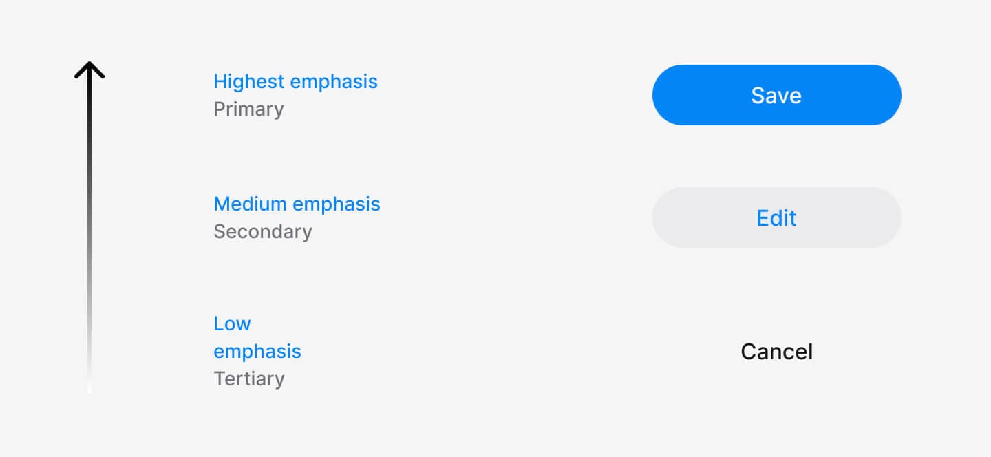
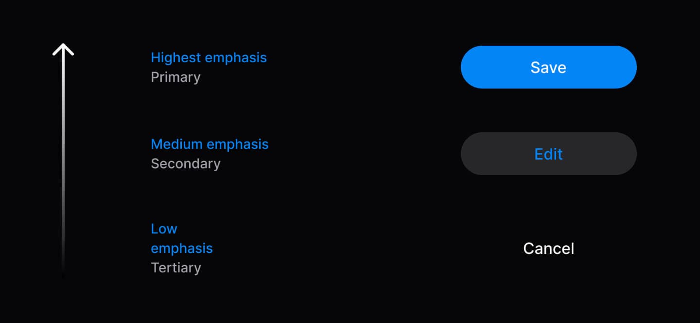
// ✅ 语义变体传达层级
<Button variant="primary">Save</Button>
<Button variant="secondary">Edit</Button>
<Button variant="tertiary">Cancel</Button>| 变体 | 用途 | 使用建议 |
|---|---|---|
| Primary | 推进流程的主操作 | 同一上下文通常 1 个 |
| Secondary | 备选操作 | 可多个 |
| Tertiary | 取消、跳过等弱操作 | 谨慎使用 |
| Danger | 破坏性操作 | 按需使用 |
2. 无障碍作为基础
遵循移动端无障碍最佳实践,内置合理的触控可达性、焦点管理与读屏支持。所有组件提供适当的无障碍标签与语义结构,以支持 VoiceOver(iOS)与 TalkBack(Android)。
import { Tabs } from 'heroui-native';

<Tabs value="profile" onValueChange={setActiveTab}>
  <Tabs.List>
    <Tabs.Indicator />
    <Tabs.Trigger value="profile">
      <Tabs.Label>Profile</Tabs.Label>
    </Tabs.Trigger>
    <Tabs.Trigger value="security">
      <Tabs.Label>Security</Tabs.Label>
    </Tabs.Trigger>
  </Tabs.List>
  <Tabs.Content value="profile">Content</Tabs.Content>
  <Tabs.Content value="security">Content</Tabs.Content>
</Tabs>
3. 组合优于配置
复合组件可按需重排、定制或省略子部件,通过点记法精确拼装。
// 组合子部件得到所需结构
import { Accordion } from 'heroui-native';

<Accordion>
  <Accordion.Item value="1">
    <Accordion.Trigger>
      Question Text
      <Accordion.Indicator />
    </Accordion.Trigger>
    <Accordion.Content>Answer content</Accordion.Content>
  </Accordion.Item>
</Accordion>
4. 渐进式披露
从简单开始,仅在需要时增加复杂度。组件在最少配置下即可工作,并随需求增长而扩展。
import { Button, Spinner } from 'heroui-native';
import { Feather } from '@expo/vector-icons';

// Level 1: Minimal
<Button>Click me</Button>

// Level 2: Enhanced
<Button variant="primary" size="lg">
  <Feather name="check" size={20} />
  <Button.Label>Submit</Button.Label>
</Button>

// Level 3: Advanced
<Button variant="primary" isDisabled={isLoading}>
  {isLoading ? (
    <>
      <Spinner size="sm" />
      <Button.Label>Loading...</Button.Label>
    </>
  ) : (
    <Button.Label>Submit</Button.Label>
  )}
</Button>
5. 可预测的行为
跨组件保持一致:sm / md / lg 尺寸、变体体系与 className 支持。API 一致,行为一致。
import { Button, Chip, Avatar } from 'heroui-native';

// All components follow the same patterns
<Button size="lg" variant="primary" className="custom">
  <Button.Label>Click me</Button.Label>
</Button>
<Chip size="lg" color="success" className="custom">
  <Chip.Label>Success</Chip.Label>
</Chip>
<Avatar size="lg" className="custom">
  <Avatar.Fallback>JD</Avatar.Fallback>
</Avatar>
6. 类型安全优先
完整的 TypeScript 支持:智能提示、自动补全与编译期检查。可为自定义组件扩展类型。
import type { ButtonRootProps } from 'heroui-native';

// Type-safe props and event handlers
<Button
  variant="primary"  // Autocomplete: primary | secondary | tertiary | ghost | danger | danger-soft
  size="md"          // Type checked: sm | md | lg
  onPress={() => {   // Properly typed press handler
    console.log('Button pressed');
  }}
>
  <Button.Label>Click me</Button.Label>
</Button>

// Extend types for custom components
interface CustomButtonProps extends Omit<ButtonRootProps, 'variant'> {
  intent: 'save' | 'cancel' | 'delete';
}
7. 卓越的开发者体验
清晰的 API、可读的错误信息、智能提示,以及对 AI 友好的 Markdown 文档。
8. 完整可定制
默认即美观;也可通过 CSS 变量与 Uniwind 主题系统 整体换肤。每个插槽都可定制。
/* Custom colors using Uniwind's theme layer */
@layer theme {
  @variant light {
    --accent: oklch(0.65 0.25 270); /* Custom indigo accent */
    --background: oklch(0.98 0 0);  /* Custom background */
  }

  @variant dark {
    --accent: oklch(0.65 0.25 270);
    --background: oklch(0.15 0 0);
  }
}

/* Radius customization */
@theme {
  --radius: 0.75rem; /* Increase for rounder components */
}
9. 开放与可扩展
可包装、扩展与定制组件以匹配产品需求;也可用 className 应用自定义样式。
import { Button } from 'heroui-native';
import type { ButtonRootProps } from 'heroui-native';

// Custom wrapper component
interface CTAButtonProps extends Omit<ButtonRootProps, 'variant'> {
  intent?: 'primary-cta' | 'secondary-cta' | 'minimal';
}

const CTAButton = ({
  intent = 'primary-cta',
  children,
  ...props
}: CTAButtonProps) => {
  const variantMap = {
    'primary-cta': 'primary',
    'secondary-cta': 'secondary',
    'minimal': 'ghost'
  } as const;

  return (
    <Button variant={variantMap[intent]} {...props}>
      <Button.Label>{children}</Button.Label>
    </Button>
  );
};

// Usage
<CTAButton intent="primary-cta">Get Started</CTAButton>
<CTAButton intent="secondary-cta">Learn More</CTAButton>
结合 tailwind-variants 扩展:
import { Button } from 'heroui-native';
import { tv } from 'tailwind-variants';

// Extend button styles with custom variants
const myButtonVariants = tv({
  base: 'px-4 py-2 rounded-lg',
  variants: {
    variant: {
      'primary-cta': 'bg-accent px-8 py-4 shadow-lg',
      'secondary-cta': 'border-2 border-accent px-6 py-3',
    }
  },
  defaultVariants: {
    variant: 'primary-cta',
  }
});

// Label variants for text colors (must be applied to Button.Label)
const myLabelVariants = tv({
  base: '',
  variants: {
    variant: {
      'primary-cta': 'text-accent-foreground',
      'secondary-cta': 'text-accent',
    }
  },
  defaultVariants: {
    variant: 'primary-cta',
  }
});

// Use the custom variants
function CustomButton({ variant, className, labelClassName, children, ...props }) {
  return (
    <Button className={myButtonVariants({ variant, className })} {...props}>
      <Button.Label className={myLabelVariants({ variant, className: labelClassName })}>
        {children}
      </Button.Label>
    </Button>
  );
}

// Usage
<CustomButton variant="primary-cta">Get Started</CustomButton>
<CustomButton variant="secondary-cta">Learn More</CustomButton>