


设计原则
指导 HeroUI v3 设计和开发的核心原则
HeroUI v3 遵循 10 项核心原则,注重清晰度、无障碍、可定制性以及开发者体验。
核心原则
1. 语义意图优于视觉风格
使用语义命名(primary、secondary、tertiary),而非视觉描述(solid、flat、bordered)。灵感来自 Uber 的 Base 设计系统,变体遵循清晰的层次结构:
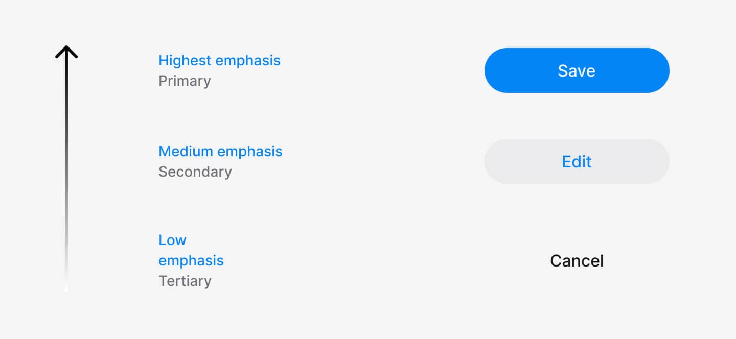
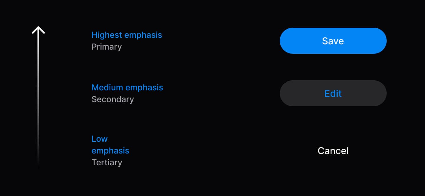
// ✅ Semantic variants communicate hierarchy
<Button variant="primary">Save</Button>
<Button variant="secondary">Edit</Button>
<Button variant="tertiary">Cancel</Button>| 变体 | 用途 | 使用方式 |
|---|---|---|
| Primary | 推进流程的主要操作 | 每种场景 1 个 |
| Secondary | 备选操作 | 可使用多个 |
| Tertiary | 次要操作(取消、跳过) | 谨慎使用 |
| Danger | 破坏性操作 | 需要时使用 |
2. 无障碍是基础
基于 React Aria Components 构建,符合 WCAG 2.1 AA 标准。内置自动 ARIA 属性、键盘导航与屏幕阅读器支持。
import { Tabs, TabList, Tab, TabPanel } from '@heroui/react';

<Tabs defaultSelectedKey="profile">
  <TabList aria-label="Settings">
    <Tab id="profile">Profile</Tab>
    <Tab id="security">Security</Tab>
  </TabList>
  <TabPanel id="profile">Content</TabPanel>
  <TabPanel id="security">Content</TabPanel>
</Tabs>
3. 组合优于配置
复合组件允许你按需重新组合、自定义或省略其中的各个部分。可以使用点号语法、命名导出,或两者混合使用。
// Compose parts to build exactly what you need
import {
  Accordion,
  AccordionItem,
  AccordionHeading,
  AccordionTrigger,
  AccordionIndicator,
  AccordionPanel,
  AccordionBody
} from '@heroui/react';

<Accordion>
  <AccordionItem id="1">
    <AccordionHeading>
      <AccordionTrigger>
        Question Text
        <AccordionIndicator />
      </AccordionTrigger>
    </AccordionHeading>
    <AccordionPanel>
      <AccordionBody>Answer content</AccordionBody>
    </AccordionPanel>
  </AccordionItem>
</Accordion>
4. 渐进式呈现
从简单开始,仅在需要时才增加复杂度。组件只需最少的 props 即可工作,并能随需求增长而扩展。
// Level 1: Minimal
<Button>Click me</Button>

// Level 2: Enhanced
<Button variant="primary" size="lg">
  <Icon icon="gravity-ui:check" className="mr-2" />
  Submit
</Button>

// Level 3: Advanced
<Button variant="primary" isDisabled={isLoading}>
  {isLoading ? <><Spinner size="sm" className="mr-2" /> Loading...</> : 'Submit'}
</Button>
5. 可预测的行为
所有组件遵循一致的模式:尺寸(sm、md、lg)、变体、className 支持以及 data 属性。相同的 API,相同的行为。
// All components follow the same patterns
<Button size="lg" variant="primary" className="custom" data-pressed="true" />
<Chip size="lg" variant="success" className="custom" />
<Avatar size="lg" className="custom" />

// Compound components support both named exports and dot notation
import { Alert, AlertIcon, CardHeader, AccordionTrigger } from '@heroui/react';

// Named exports
<Alert>
  <AlertIcon />
</Alert>

// Dot notation
<Alert>
  <Alert.Icon />
</Alert>
6. 类型安全优先
完整的 TypeScript 支持,包括 IntelliSense、自动补全与编译时错误检测。可为自定义组件扩展类型。
import type { ButtonProps } from '@heroui/react';

// Type-safe props and event handlers
<Button
  variant="primary"  // Autocomplete: primary | secondary | tertiary | danger | ghost
  size="md"          // Type checked: sm | md | lg
  onPress={(e) => {  // e is properly typed as PressEvent
    console.log(e.target);
  }}
/>

// Extend types for custom components
interface CustomButtonProps extends Omit<ButtonProps, 'variant'> {
  intent: 'save' | 'cancel' | 'delete';
}
7. 样式与逻辑分离
样式(@heroui/styles)与逻辑(@heroui/react)相互分离,可与任何框架或纯 HTML 一同使用。参见 Tailwind Play 示例。
<!-- Use with plain HTML -->
<button class="button button--primary">Click me</button>
或与 React 一同使用:
// Apply styles to any component
import { buttonVariants } from '@heroui/styles';

<Link className={buttonVariants({ variant: "primary" })} href="/home">
  Home
</Link>
8. 卓越的开发者体验
清晰的 API、富含信息的错误提示、IntelliSense、对 AI 友好的 Markdown 文档,以及用于可视化测试的 Storybook。
9. 完全可定制
开箱即用的精美默认样式。使用 CSS 变量或 BEM 类即可彻底改变整体外观。每一个插槽都可定制。
/* Theme-wide changes with variables */
:root {
  --accent: oklch(0.7 0.25 260);
  --radius: 0.375rem;
  --spacing: 0.5rem;
}

/* Component-specific customization */
@layer components {
  .button {
    @apply uppercase tracking-wider;
  }
  .button--primary {
    @apply bg-gradient-to-r from-purple-500 to-pink-500;
  }
}
10. 开放且可扩展
可以包装、扩展或自定义组件以满足你的需求。可以使用变体函数、直接应用 BEM 类,或创建自定义的包装组件。
使用变体函数应用样式:
import { Link } from '@heroui/react';
import { linkVariants } from '@heroui/styles';
import NextLink from 'next/link';

// Use variant functions to style framework-specific components
const slots = linkVariants({ underline: "hover" });

<NextLink className={slots.base()} href="/about">
  About Page
  <Link.Icon className={slots.icon()} />
</NextLink>
直接应用 BEM 类:
import Link from 'next/link';

// Apply HeroUI's BEM classes directly to any element
<Link className="button button--primary" href="/dashboard">
  Dashboard
</Link>
创建自定义包装组件:
// Custom wrapper component
const CTAButton = ({
  intent = 'primary-cta',
  children,
  ref,
  ...props
}: CTAButtonProps) => {
  const variantMap = {
    'primary-cta': 'primary',
    'secondary-cta': 'secondary',
    'minimal': 'ghost'
  };

  return (
    <Button ref={ref} variant={variantMap[intent]} {...props}>
      {children}
    </Button>
  );
};
使用 Tailwind Variants 扩展:
import { Button } from '@heroui/react';
import { buttonVariants, tv } from '@heroui/styles';

// Extend button styles with custom variants
const myButtonVariants = tv({
  extend: buttonVariants,
  variants: {
    variant: {
      'primary-cta': 'bg-gradient-to-r from-blue-500 to-purple-600 text-white shadow-lg',
      'secondary-cta': 'border-2 border-blue-500 text-blue-500 hover:bg-blue-50',
    }
  }
});

// Use the custom variants
function CustomButton({ variant, className, ...props }) {
  return <Button className={myButtonVariants({ variant, className })} {...props} />;
}

// Usage
<CustomButton variant="primary-cta">Get Started</CustomButton>
<CustomButton variant="secondary-cta">Learn More</CustomButton>
与 HeroUI v2 的对比
| 维度 | HeroUI v2 | HeroUI v3 |
|---|---|---|
| 动画 | Framer Motion | CSS + GPU 加速 |
| 组件模式 | 带有大量 props 的单一组件 | 复合组件 |
| 变体 | 基于视觉(solid、bordered、flat) | 基于语义(primary、secondary、tertiary) |
| 样式 | 部分支持 Tailwind v4 | 完整支持 Tailwind v4 |
| 无障碍 | 优秀(基于 React Aria) | 优秀(基于 React Aria) |
| 打包体积 | 较大(整体打包) | 较小(支持 tree-shaking) |
| 自定义难度 | 中等(基于 props) | 简单(复合组件 + 原生 CSS) |