


v3.0.0-beta.7
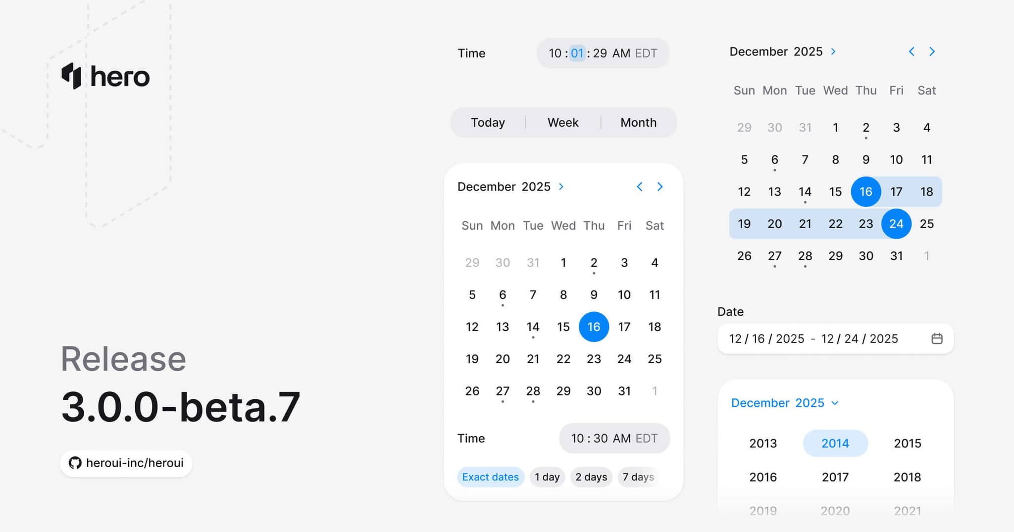
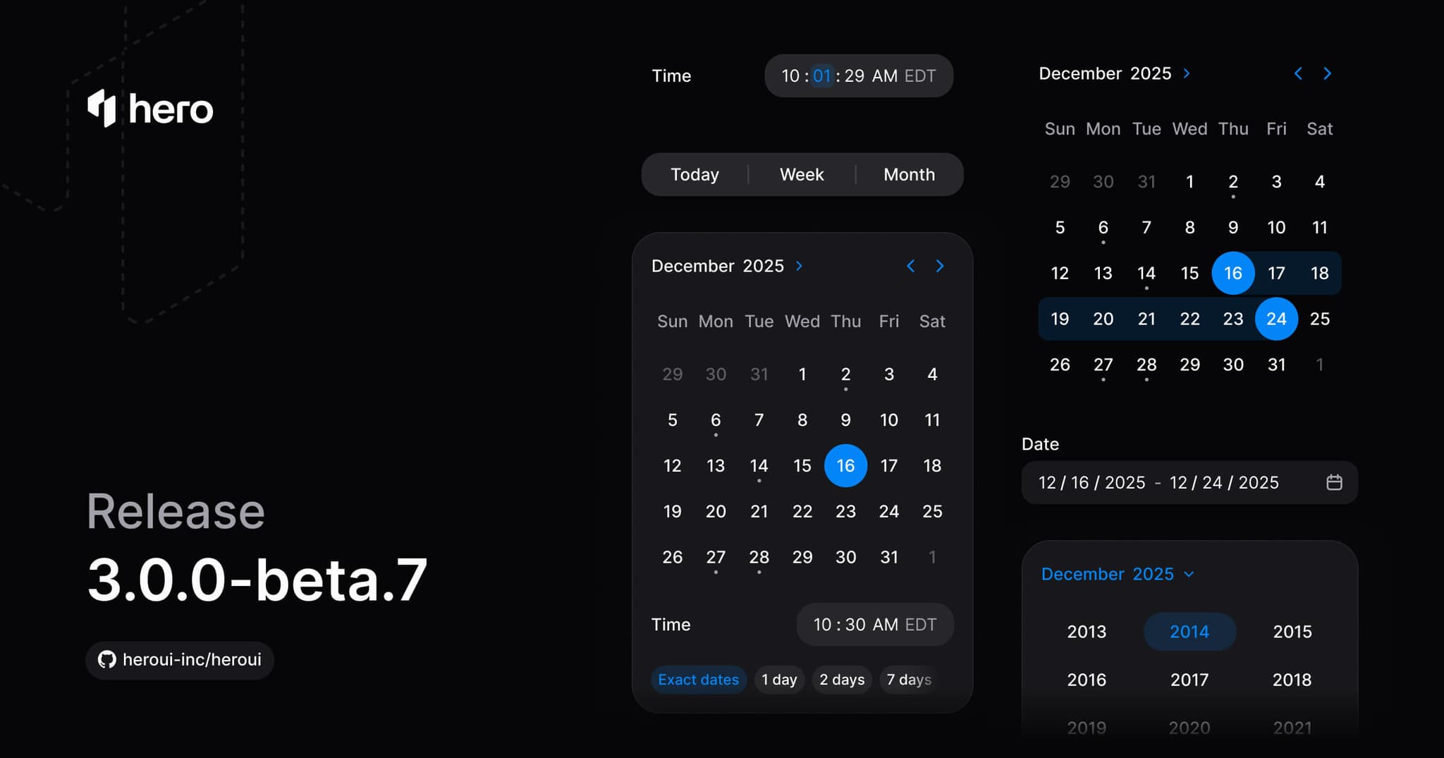
新增 4 个组件(Calendar、RangeCalendar、DatePicker、DateRangePicker)以及多项 API 改进。
本次发布新增 4 个组件:Calendar、RangeCalendar、DatePicker 与 DateRangePicker。同时还引入了 Switch.Content,用于将 label 与 description 组合到 Switch 控件旁边;以及 Tabs.Separator,用于在 Tab 之间按需添加分隔线。
⚠️ 破坏性变更:从 Tabs 中移除了 hideSeparator;DateInputGroup 与 ColorInputGroup 已分别合并到 DateField.Group、TimeField.Group 与 ColorField.Group 之下。
安装
升级到最新版本:
npm i @heroui/styles@beta @heroui/react@betapnpm add @heroui/styles@beta @heroui/react@betayarn add @heroui/styles@beta @heroui/react@betabun add @heroui/styles@beta @heroui/react@beta正在使用 AI 助手? 只需对它说一句「Hey Cursor,把 HeroUI 升级到最新版本」,AI 助手就会自动对比版本并应用必要的变更。了解更多请参阅 HeroUI MCP 服务器。
新增功能
日期与时间体系
日期与时间 —— Calendar、DatePicker、RangeCalendar 与 DateRangePicker 均基于 React Aria 的日期基元构建。支持国际化、时区,以及完整的键盘导航与 ARIA 无障碍能力。
主要特性:
- 历法系统:公历、佛历、波斯历等
- 年份选择器:用于快速跳转年份的浮层
- 单元格指示器:在单元格上展示事件、可用状态或状态点
- 范围选择:日期范围带有视觉高亮
- 无障碍:键盘导航、屏幕阅读器、ARIA 全部支持
所有日期值都使用 @internationalized/date 提供的类型(CalendarDate、CalendarDateTime、ZonedDateTime)。可以用 I18nProvider 覆盖区域设置,并通过 useLocale 读取它。
新组件
- Calendar:单日期选择,支持年份选择器、指示器与多月份显示。(文档)
- RangeCalendar:日期范围选择,支持范围高亮与多月份显示。(文档)
- DatePicker:日期输入框 + popover 日历。(文档)
- DateRangePicker:两个日期输入框 + popover 范围日历。(文档)
Calendar
支持单日期选择的日历,包含年份选择器、单元格指示器、多月份视图以及国际化历法。
年份选择器:
国际化历法:
RangeCalendar
日期范围选择,支持范围高亮与多月份视图。
多月份显示:
DatePicker
日期输入框 + popover 日历。支持格式选项、国际化、自定义指示器与表单校验。
日期与时间(搭配 TimeField):
DateRangePicker
两个日期输入框 + popover 范围日历。
API 改进
Switch.Content
Switch.Content 用于将 label 与 description 组合到 Switch 控件旁边(#6240)。
之前:
import { Switch, Label, Description } from '@heroui/react';

<Switch>
  <Switch.Control>
    <Switch.Thumb />
  </Switch.Control>
  <Switch.Content>
    <Label>Email notifications</Label>
    <Description>Get notified when someone mentions you</Description>
  </Switch.Content>
</Switch>
Tabs.Separator
Tabs 组件现在新增了一个显式的 Tabs.Separator 子组件,用于在 Tab 之间添加视觉分隔线。它取代了之前自动生成的 CSS 伪元素分隔线以及 hideSeparator prop(#6243)。
分隔线现在改为 按需启用 —— 在希望出现分隔线的 <Tabs.Tab> 内部添加 <Tabs.Separator /> 即可。
Field 子组件的合并
DateField、TimeField 与 ColorField 现在直接暴露各自的输入组子组件,不再需要单独引入 DateInputGroup 或 ColorInputGroup。具体的迁移方式请参阅 破坏性变更。
Breadcrumbs 修复
传给 Breadcrumbs.Item 的 props 现在会正确转发到底层的 Link(#6233)。
样式修复
- ListBox Item:将悬停背景色从
bg-default-hover调整为bg-default,以保持一致性 - Date Input Group:将段(segment)文本从
tabular-nums调整为text-nowrap,优化布局 - Date Input Group:改进 focus-within 样式,使其将日期选择器触发器排除在字段聚焦高亮之外
依赖更新
- React Aria Components:从
1.14.0升级到1.15.0—— 新增了renderprop,可用于自定义任何 React Aria 组件渲染的 DOM 元素(适用于路由链接、Motion 等动画库) - @react-aria/utils:从
3.32.0升级到3.33.0 - @react-types/shared:从
3.32.1升级到3.33.0 - @internationalized/date:从
3.10.1升级到3.11.0—— 日期字段现在改为在失焦时进行约束,而不是在输入过程中实时约束 - 新增
@react-aria/i18n与@react-stately/utils,用于日历的国际化
⚠️ 破坏性变更
Tabs —— 移除 hideSeparator prop
hideSeparator prop 已从 Tabs 组件中移除。分隔线现在改为 按需启用,通过新增的 <Tabs.Separator /> 子组件来添加,而不再通过 CSS 伪元素自动生成(#6243)。
之前:
{/* Separators shown by default, hidden via prop */}
<Tabs hideSeparator>
  <Tabs.List>
    <Tabs.Tab id="tab1">Tab 1<Tabs.Indicator /></Tabs.Tab>
    <Tabs.Tab id="tab2">Tab 2<Tabs.Indicator /></Tabs.Tab>
  </Tabs.List>
</Tabs>
之后:
{/* No separators by default — explicitly add them where needed */}
<Tabs>
  <Tabs.List>
    <Tabs.Tab id="tab1"><Tabs.Indicator />Tab 1</Tabs.Tab>
    <Tabs.Tab id="tab2"><Tabs.Separator /><Tabs.Indicator />Tab 2</Tabs.Tab>
  </Tabs.List>
</Tabs>
CSS 变更:
- Tab 的分隔线样式已从伪元素(
.tabs__tab:not(:first-child):before)迁移到独立的.tabs__separator类 - 已移除
[data-hide-separator]这一 data 属性
Field 子组件 API 变更
DateInputGroup 与 ColorInputGroup 不再从 @heroui/react 直接导出。它们的子组件已分别合并到对应的 Field 组件之下(DateField、TimeField、ColorField)。
DateField 变更
之前:
import {DateField, Label, DateInputGroup, Description} from '@heroui/react';

<DateField>
  <Label>Date</Label>
  <DateInputGroup>
    <DateInputGroup.Prefix>...</DateInputGroup.Prefix>
    <DateInputGroup.Input>
      {(segment) => <DateInputGroup.Segment segment={segment} />}
    </DateInputGroup.Input>
    <DateInputGroup.Suffix>...</DateInputGroup.Suffix>
  </DateInputGroup>
  <Description>Pick a date</Description>
</DateField>
之后:
import {DateField, Label, Description} from '@heroui/react';

<DateField>
  <Label>Date</Label>
  <DateField.Group>
    <DateField.Prefix>...</DateField.Prefix>
    <DateField.Input>
      {(segment) => <DateField.Segment segment={segment} />}
    </DateField.Input>
    <DateField.Suffix>...</DateField.Suffix>
  </DateField.Group>
  <Description>Pick a date</Description>
</DateField>
TimeField 变更
模式与 DateField 相同:
| 之前 | 之后 |
|---|---|
DateInputGroup | TimeField.Group |
DateInputGroup.Input | TimeField.Input |
DateInputGroup.Segment | TimeField.Segment |
DateInputGroup.Prefix | TimeField.Prefix |
DateInputGroup.Suffix | TimeField.Suffix |
ColorField 变更
| 之前 | 之后 |
|---|---|
ColorInputGroup | ColorField.Group |
ColorInputGroup.Input | ColorField.Input |
ColorInputGroup.Prefix | ColorField.Prefix |
ColorInputGroup.Suffix | ColorField.Suffix |
用法:
import {ColorField, Label, ColorInputGroup, ColorSwatch} from '@heroui/react';

<ColorField>
  <Label>Color</Label>
  <ColorInputGroup>
    <ColorInputGroup.Prefix>
      <ColorSwatch color="#000" />
    </ColorInputGroup.Prefix>
    <ColorInputGroup.Input />
  </ColorInputGroup>
</ColorField>
之后:
import {ColorField, Label, ColorSwatch} from '@heroui/react';

<ColorField>
  <Label>Color</Label>
  <ColorField.Group>
    <ColorField.Prefix>
      <ColorSwatch color="#000" />
    </ColorField.Prefix>
    <ColorField.Input />
  </ColorField.Group>
</ColorField>
说明: 底层的 CSS 类名(
.date-input-group、.color-input-group等)保持不变,仅 JavaScript 引入路径与组件名称发生了变化。
链接
贡献者
感谢每一位为本次发布做出贡献的开发者!