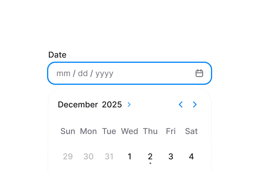
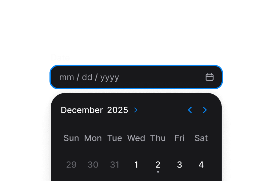
Calendar 日历更新
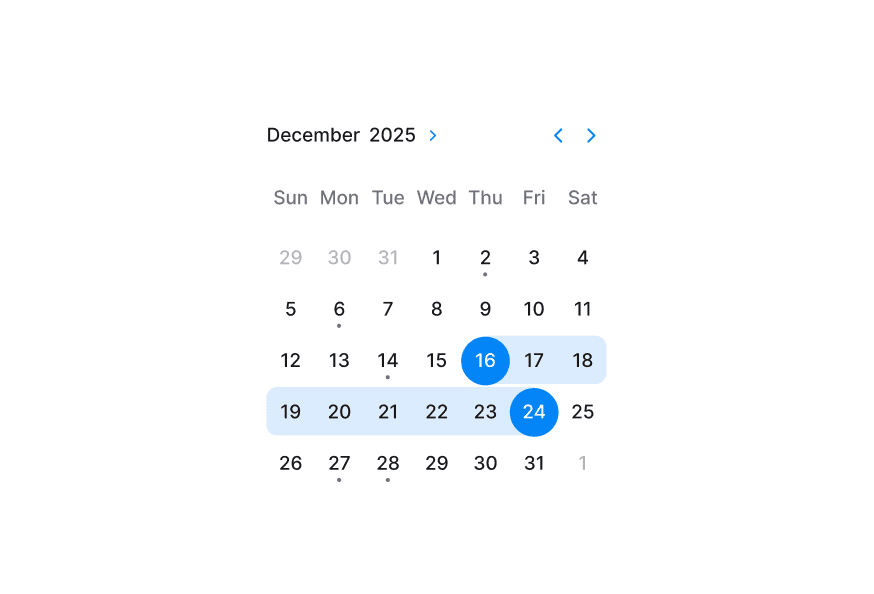
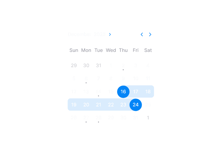
基于 React Aria Calendar 的可组合日期选择器,支持月网格、导航与年份选择
用法
import { Calendar } from '@heroui/react';组件结构
import {Calendar} from '@heroui/react';

export default () => (
  <Calendar aria-label="Event date">
    <Calendar.Header>
      <Calendar.Heading />
      <Calendar.NavButton slot="previous" />
      <Calendar.NavButton slot="next" />
    </Calendar.Header>
    <Calendar.Grid>
      <Calendar.GridHeader>
        {(day) => <Calendar.HeaderCell>{day}</Calendar.HeaderCell>}
      </Calendar.GridHeader>
      <Calendar.GridBody>
        {(date) => <Calendar.Cell date={date} />}
      </Calendar.GridBody>
    </Calendar.Grid>
  </Calendar>
)
示例
禁用
只读
默认值
年份选择
Calendar.YearPickerTrigger、Calendar.YearPickerGrid 及其 body/cell 子组件提供集成的年份导航模式。
受控组件
使用受控的 value 与 focusedValue 进行外部状态协调与自定义快捷操作。
日期范围限制
不可用日期
使用 isDateUnavailable 阻止周末、节假日或已预订时段等日期。
月份周数
将 weeksInMonth 设为固定值(如 6)可在月份切换时保持网格高度稳定。在非公历 locale 中请谨慎使用,类似 firstDayOfWeek。
周视图
设置 visibleDuration={{ weeks: n }} 可一次显示一周或多周。导航按可见周范围前进。显示多周时使用 pageBehavior="single" 可每次移动一周。
日视图
设置 visibleDuration={{ days: n }} 可显示连续日期的滚动窗口。导航按可见日范围前进。显示多天时使用 pageBehavior="single" 可每次移动一天。
多选
设置 selectionMode="multiple" 允许选择多个日期。value、defaultValue 与 onChange 使用日期数组。
聚焦值
使用 focusedValue 与 onFocusChange 以编程方式控制聚焦日期。
单元格标记
可自定义 Calendar.Cell 子节点,并使用 Calendar.CellIndicator 显示事件等元数据。
自定义导航图标
向 Calendar.NavButton 传入子节点以替换默认 chevron 图标。
多月份展示
使用 visibleDuration 与 offset 渲染多个月份网格,适用于预订与规划场景。
典型场景
国际化日历
默认情况下,Calendar 使用用户 locale 的历法系统显示日期。可用 I18nProvider 包裹 Calendar 并设置 Unicode 历法 locale 扩展 来覆盖。
以下示例展示印度历法系统:
Note: onChange 事件始终返回与 value 或 defaultValue 相同历法系统的日期(未提供 value 时为公历),无论显示 locale 如何。这确保应用逻辑在单一历法系统下一致运行,同时仍以用户偏好的格式显示日期。
自定义样式
Tailwind CSS
全局 CSS
@layer components {
  .calendar {
    @apply w-72 rounded-2xl border border-border bg-surface p-3 shadow-sm;
  }

  .calendar__heading {
    @apply text-sm font-semibold text-default-700;
  }

  .calendar__cell[data-selected="true"] {
    @apply bg-accent text-accent-foreground;
  }
}
样式参考
HeroUI 遵循 BEM 方法论,确保组件变体与状态可复用且易于自定义。
CSS 类
Calendar 在 packages/styles/components/calendar.css 与 packages/styles/components/calendar-year-picker.css 中使用以下类:
.calendar- 根容器.calendar__header- 包含导航按钮与标题的头部行.calendar__heading- 当前月份标签.calendar__nav-button- 上/下月导航控件.calendar__grid- 主日期网格.calendar__grid-header- 星期标题行包装器.calendar__grid-body- 日期行包装器.calendar__header-cell- 星期标题单元格.calendar__cell- 可交互的日期单元格.calendar__cell-indicator- 日期单元格内的点指示器.calendar-year-picker__trigger- 年份选择器切换按钮.calendar-year-picker__trigger-heading- 年份选择器触发器内的标题文本.calendar-year-picker__trigger-indicator- 年份选择器触发器内的指示图标.calendar-year-picker__year-grid- 可选年份的覆盖网格.calendar-year-picker__year-cell- 单个年份选项
交互状态
Calendar 同时支持伪类与 React Aria data 属性:
- Selected:
[data-selected="true"] - Today:
[data-today="true"] - Unavailable:
[data-unavailable="true"] - Outside month:
[data-outside-month="true"] - Hovered:
:hover或[data-hovered="true"] - Pressed:
:active或[data-pressed="true"] - Focus visible:
:focus-visible或[data-focus-visible="true"] - Disabled:
:disabled或[data-disabled="true"]
API 参考
Calendar
Calendar 继承 React Aria Calendar 的所有属性。
| Prop | 类型 | 默认值 | 描述 |
|---|---|---|---|
selectionMode | 'single' | 'multiple' | 'single' | 是否可选择单个或多个日期 |
value | DateValue | null 或 DateValue[] | null | - | 受控选中日期。selectionMode 为 multiple 时使用数组 |
defaultValue | DateValue | null 或 DateValue[] | null | - | 初始选中日期(非受控) |
onChange | (value: DateValue | null) 或 (value: DateValue[] | null) => void | - | 选择变化时调用 |
focusedValue | DateValue | - | 受控聚焦日期 |
onFocusChange | (value: DateValue) => void | - | 焦点移至其他日期时调用 |
minValue | DateValue | 历法感知的 1900-01-01 | 最早可选日期 |
maxValue | DateValue | 历法感知的 2099-12-31 | 最晚可选日期 |
weeksInMonth | number | - | 月份中的周数,覆盖 locale 默认值 |
isDateUnavailable | (date: DateValue) => boolean | - | 标记日期为不可用 |
firstDayOfWeek | 'sun' | 'mon' | 'tue' | 'wed' | 'thu' | 'fri' | 'sat' | - | 覆盖 locale 默认的一周起始日 |
pageBehavior | 'visible' | 'single' | 'visible' | 翻页按可见时长还是单个单位前进 |
selectionAlignment | 'start' | 'center' | 'end' | 'center' | 初始渲染时可见范围与选择的对齐方式 |
isDisabled | boolean | false | 禁用交互与选择 |
isReadOnly | boolean | false | 内容可读但不可更改选择 |
isInvalid | boolean | false | 标记日历为无效以显示验证 UI |
visibleDuration | {months?: number; weeks?: number; days?: number} | {months: 1} | 可见时间范围。月视图用 { months: n },周视图用 { weeks: n },日视图用 { days: n } |
defaultYearPickerOpen | boolean | false | 内部年份选择器初始打开状态 |
isYearPickerOpen | boolean | - | 受控年份选择器打开状态 |
onYearPickerOpenChange | (isOpen: boolean) => void | - | 年份选择器打开状态变化时调用 |
Composition Parts
| Component | Description |
|---|---|
Calendar.Header | 导航与标题的头部容器 |
Calendar.Heading | 可见范围的格式化标题。支持 offset(多月布局)与 format(月/年/日选项) |
Calendar.NavButton | 上/下月导航控件(slot="previous" 或 slot="next") |
Calendar.Grid | 单个月份的日期网格(多月布局支持 offset) |
Calendar.GridHeader | 星期标题容器 |
Calendar.GridBody | 日期单元格 body 容器 |
Calendar.HeaderCell | 星期标签单元格 |
Calendar.Cell | 单个日期单元格 |
Calendar.CellIndicator | 自定义元数据的可选指示元素 |
Calendar.YearPickerTrigger | 切换年份选择器模式的触发器 |
Calendar.YearPickerTriggerHeading | 年份选择器触发器内的本地化标题内容 |
Calendar.YearPickerTriggerIndicator | 年份选择器触发器内的切换图标 |
Calendar.YearPickerGrid | 覆盖式年份选择网格容器 |
Calendar.YearPickerGridBody | 年份网格单元格的 body 渲染器 |
Calendar.YearPickerCell | 单个年份选项单元格 |
Year Picker Parts
年份选择器子组件继承 React Aria useCalendarHeading 与 useCalendarYearPicker 的格式化属性。
| Component | Prop | 类型 | 默认值 | 描述 |
|---|---|---|---|---|
Calendar.YearPickerTriggerHeading | format | DateFormatterOptions | - | 自定义月/年标签(如 {month: 'short'}) |
Calendar.YearPickerTriggerHeading | offset | {months?: number} | - | 相对聚焦日期偏移标题(多月布局) |
Calendar.YearPickerGrid | format | DateFormatterOptions | {year: 'numeric'} | 自定义年份单元格标签(纪元、历法等) |
Calendar.YearPickerGrid | visibleYears | number | min–max 跨度或 20 | 滑动窗口中显示的年份数。同时设置 minValue 与 maxValue 时默认为完整范围 |
Calendar.Cell Render
Calendar.Cell 子节点为函数时,可使用 React Aria render props:
| Prop | 类型 | 描述 |
|---|---|---|
formattedDate | string | 单元格的本地化日期标签 |
isSelected | boolean | 日期是否选中 |
isUnavailable | boolean | 日期是否不可用 |
isDisabled | boolean | 单元格是否禁用 |
isOutsideMonth | boolean | 日期是否属于相邻月份 |
有关支持的历法系统及其标识符的完整列表,请参阅:
Related packages
@internationalized/date— 所有日期组件使用的日期类型(CalendarDate、CalendarDateTime、ZonedDateTime)与工具I18nProvider— 覆盖子树的 localeuseLocale— 读取当前 locale 与布局方向