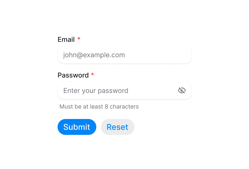
Button 按钮
可点击的按钮组件,支持多种变体与状态
用法
import { Button } from '@heroui/react';示例
变体
尺寸
带图标
仅图标
加载中
加载中(点击触发)
宽度充满
禁用状态
社交媒体按钮
渲染函数
添加自定义变体
可通过包装组件并添加自定义变体来扩展 HeroUI 组件。
添加涟漪效果
Button 组件通过组合支持 ripple 效果,可将 ripple 组件作为子节点嵌套。本示例使用 m3-ripple。
自定义样式
Tailwind CSS
全局 CSS
可使用 @layer components 指令自定义 Button 组件类。
了解更多。
@layer components {
  .button {
    @apply bg-purple-500 text-white hover:bg-purple-600;
  }

  .button--icon-only {
    @apply rounded-lg bg-blue-500;
  }
}
样式参考
HeroUI 遵循 BEM 方法论,确保组件变体与状态可复用且易于自定义。
CSS 类
Button 组件使用以下 CSS 类(查看源码样式):
基础与尺寸类
.button- 基础按钮样式.button--sm- 小尺寸变体.button--md- 中尺寸变体.button--lg- 大尺寸变体
变体类
.button--primary.button--secondary.button--tertiary.button--outline.button--ghost.button--danger
修饰符类
.button--icon-only.button--icon-only.button--sm.button--icon-only.button--lg
交互状态
按钮同时支持 CSS 伪类与 data 属性:
- Hover:
:hover或[data-hovered="true"] - Active/Pressed:
:active或[data-pressed="true"](含缩放变换) - Focus:
:focus-visible或[data-focus-visible="true"](显示焦点环) - Disabled:
:disabled或[aria-disabled="true"](降低透明度,禁用指针事件) - Pending:
[data-pending](加载期间禁用指针事件)
API 参考
Button
| Prop | 类型 | 默认值 | 描述 |
|---|---|---|---|
variant | 'primary' | 'secondary' | 'tertiary' | 'outline' | 'ghost' | 'danger' | 'primary' | 视觉样式变体 |
size | 'sm' | 'md' | 'lg' | 'md' | 按钮尺寸 |
fullWidth | boolean | false | 是否占满容器宽度 |
isDisabled | boolean | false | 是否禁用 |
isPending | boolean | false | 是否处于加载状态 |
isIconOnly | boolean | false | 是否仅包含图标 |
onPress | (e: PressEvent) => void | - | 按下时的回调 |
children | React.ReactNode | (values: ButtonRenderProps) => React.ReactNode | - | 按钮内容或 render prop |
render | DOMRenderFunction<keyof React.JSX.IntrinsicElements, ButtonRenderProps> | - | 使用自定义 render 函数覆盖默认 DOM 元素 |
Render Props
使用 render prop 模式时,提供以下值:
| Prop | 类型 | 描述 |
|---|---|---|
isPending | boolean | 是否处于加载状态 |
isPressed | boolean | 是否正在按下 |
isHovered | boolean | 是否悬停 |
isFocused | boolean | 是否聚焦 |
isFocusVisible | boolean | 是否显示焦点指示器 |
isDisabled | boolean | 是否禁用 |