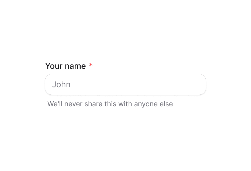
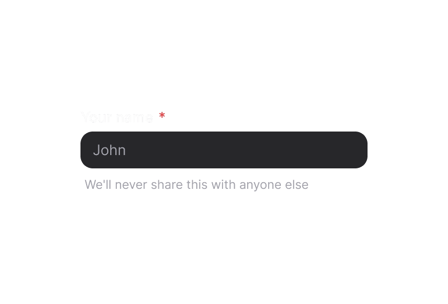
TextArea 多行文本框
原语级多行文本输入组件,可接受标准 HTML 属性。
用法
import { TextArea } from '@heroui/react';校验、标签与错误消息请参阅 TextField。
示例
变体
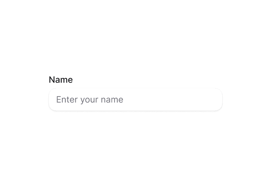
TextArea 组件支持两种视觉变体:
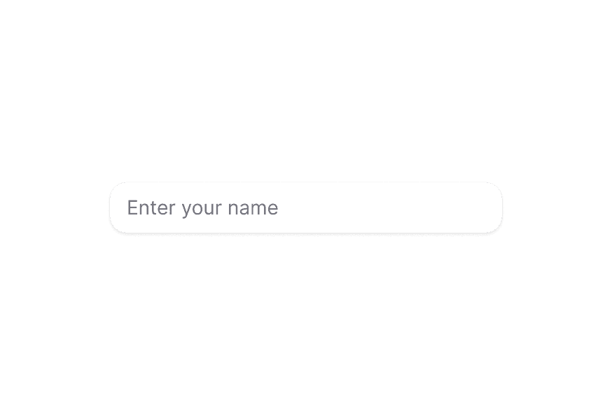
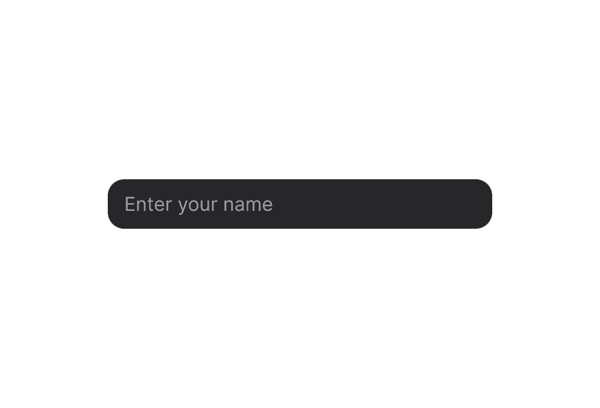
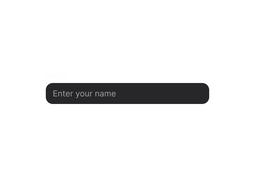
primary(默认)— 带阴影的标准样式,适用于大多数场景secondary— 低强调、无阴影,适合在 Surface 等表面背景上使用
表面样式
在 Surface 内使用时,请使用 variant="secondary",以应用适合表面背景的低强调变体。
宽度充满
受控组件
行数与尺寸调整
自定义样式
Tailwind CSS
全局 CSS
若要自定义组件类,可使用 @layer components 指令。了解更多。
@layer components {
  .textarea {
    @apply rounded-xl border border-border bg-surface px-4 py-3 text-sm leading-6 shadow-sm;

    &:hover,
    &[data-hovered="true"] {
      @apply bg-surface-secondary border-border/80;
    }

    &:focus-visible,
    &[data-focus-visible="true"] {
      @apply border-accent ring-2 ring-accent/20;
    }

    &[data-invalid="true"] {
      @apply border-danger bg-danger-soft text-danger;
    }
  }
}
样式参考
HeroUI 遵循 BEM 方法论,确保组件变体与状态可复用且易于自定义。
CSS 类
基础类
.textarea– 底层<textarea>元素样式
交互状态
- 悬停:
:hover或[data-hovered="true"] - 可见焦点:
:focus-visible或[data-focus-visible="true"] - 无效:
[data-invalid="true"] - 禁用:
:disabled或[aria-disabled="true"]
API 参考
TextArea
TextArea 接受所有标准 HTML <textarea> 属性,以及以下属性:
| Prop | 类型 | 默认值 | 描述 |
|---|---|---|---|
className | string | - | 与基础样式合并的 Tailwind 类。 |
rows | number | 3 | 可见文本行数。 |
cols | number | - | 文本控件的可见宽度。 |
value | string | - | TextArea 的受控值。 |
defaultValue | string | - | 非受控初始值。 |
onChange | (event: React.ChangeEvent<HTMLTextAreaElement>) => void | - | 变更处理函数。 |
placeholder | string | - | 占位符文本。 |
disabled | boolean | false | 禁用 TextArea。 |
readOnly | boolean | false | 将 TextArea 设为只读。 |
required | boolean | false | 将 TextArea 标记为必填。 |
name | string | - | 表单提交时使用的 name。 |
autoComplete | string | - | 浏览器自动完成提示。 |
maxLength | number | - | 最大字符数。 |
minLength | number | - | 最小字符数。 |
wrap | 'soft' | 'hard' | - | 提交时文本如何换行。 |
fullWidth | boolean | false | TextArea 是否占满容器宽度 |
variant | "primary" | "secondary" | "primary" | 组件的视觉变体。primary 为默认带阴影样式。secondary 为弱强调、无阴影变体,适合用于 surface 上。 |
对于
isInvalid、isRequired等校验 prop 以及错误处理,请将 TextArea 作为子组件与 TextField 一起使用。