Select 选择器
Select 展示可折叠的选项列表,并允许用户从中选择一项。
用法
import { Select } from "@heroui/react";组件结构
import {Select, Label, Description, Header, ListBox, Separator} from "@heroui/react";

export default () => (
  <Select>
    <Label />
    <Select.Trigger>
      <Select.Value />
      <Select.ClearButton />
      <Select.Indicator />
    </Select.Trigger>
    <Description />
    <Select.Popover>
      <ListBox>
        <ListBox.Item>
          <Label />
          <Description />
          <ListBox.ItemIndicator />
        </ListBox.Item>
        <ListBox.Section>
          <Header />
          <ListBox.Item>
            <Label />
          </ListBox.Item>
        </ListBox.Section>
      </ListBox>
    </Select.Popover>
  </Select>
);
示例
变体
Select 组件支持两种视觉变体:
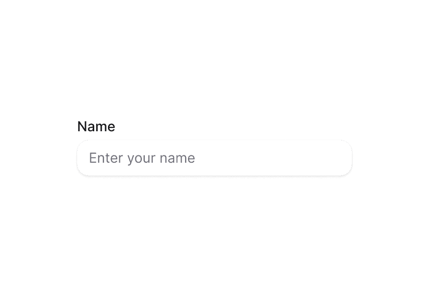
primary(默认)— 带阴影的标准样式,适用于大多数场景secondary— 低强调、无阴影,适合在 Surface 等表面背景上使用
宽度充满
带描述
必填
禁用
含禁用选项
多选
分组选项
受控组件
受控多选
受控展开状态
异步加载
自定义指示器
带清除按钮
Select.Trigger 本身是 button,因此不能再嵌套 <button> 来实现清除。请在触发器内组合 Select.ClearButton — 它渲染为非 button 控件,且不会打开菜单。
由于 ARIA 将 button 的子节点视为纯展示内容,清除控件无法获得焦点,因此它带有 aria-hidden,仅作为指针操作的可视入口。当组合了 Select.ClearButton 时,触发器同时支持按 Backspace 或 Delete 清除,这是键盘与屏幕阅读器用户的清除方式。两种方式都会调用 onClear。
自定义展示值
渲染函数
表面样式
在 Surface 内使用时,请使用 variant="secondary",以应用适合表面背景的低强调变体。
自定义样式
Tailwind CSS
全局 CSS
若要自定义组件类,可使用 @layer components 指令。了解更多。
@layer components {
  .select {
    @apply flex flex-col gap-1;
  }

  .select__trigger {
    @apply rounded-lg border border-border bg-surface p-2;
  }

  .select__value {
    @apply text-current;
  }

  .select__indicator {
    @apply text-muted;
  }

  .select__popover {
    @apply rounded-lg border border-border bg-surface p-2;
  }
}
样式参考
HeroUI 遵循 BEM 方法论,确保组件变体与状态可复用且易于自定义。
CSS 类
Select 组件使用以下 CSS 类(查看源码样式):
基础类
.select- Select 根容器.select__trigger- 打开下拉的触发按钮.select__value- 当前显示的值或占位符.select__clear-button- 触发器内的可选清除控件.select__indicator- 下拉指示图标.select__popover- 弹出层容器
变体类
.select--primary- Primary 变体,带阴影(默认).select--secondary- Secondary 变体,无阴影,适合在 Surface 上使用
状态类
.select[data-invalid="true"]- 无效状态.select__trigger[data-focus-visible="true"]- 触发器聚焦状态.select__trigger[data-disabled="true"]- 触发器禁用状态.select__value[data-placeholder="true"]- 占位符状态.select__clear-button[data-empty="true"]- 无选中项时隐藏清除控件.select__indicator[data-open="true"]- 展开时的指示器状态
交互状态
该组件同时支持 CSS 伪类与 data 属性,以提供更灵活的状态控制:
- 悬停:触发器上的
:hover或[data-hovered="true"] - 聚焦:触发器上的
:focus-visible或[data-focus-visible="true"] - 禁用:Select 上的
:disabled或[data-disabled="true"] - 展开:指示器上的
[data-open="true"]
API 参考
Select
| Prop | 类型 | 默认值 | 描述 |
|---|---|---|---|
placeholder | string | 'Select an item' | Select 为空时显示的占位符文本。 |
selectionMode | "single" | "multiple" | "single" | 启用单选或多选。 |
isOpen | boolean | - | 设置菜单是否打开(受控)。 |
defaultOpen | boolean | - | 设置菜单默认是否打开(非受控)。 |
onOpenChange | (isOpen: boolean) => void | - | 展开状态变化时的事件处理函数。 |
disabledKeys | Iterable<Key> | - | 禁用条目的 key。 |
isDisabled | boolean | - | Select 是否禁用。 |
value | Key | Key[] | null | - | 当前值(受控)。 |
defaultValue | Key | Key[] | null | - | 默认值(非受控)。 |
onChange | (value: Key | Key[] | null) => void | - | 值变化时的事件处理函数。 |
onClear | () => void | - | 清除选择时的事件处理函数。 |
isRequired | boolean | - | 用户输入是否必填。 |
isInvalid | boolean | - | Select 的值是否无效。 |
name | string | - | 输入框名称,用于提交 HTML 表单。 |
autoComplete | string | - | 描述自动完成行为类型。 |
fullWidth | boolean | false | Select 是否占满容器宽度。 |
variant | "primary" | "secondary" | "primary" | 视觉变体。primary 为默认带阴影样式。secondary 为低强调、无阴影变体,适合在 Surface 上使用。 |
className | string | - | 额外的 CSS 类。 |
children | ReactNode | RenderFunction | - | Select 内容或渲染函数。 |
render | DOMRenderFunction<keyof React.JSX.IntrinsicElements, SelectRenderProps> | - | 使用自定义渲染函数覆盖默认 DOM 元素。 |
Select.Trigger
| Prop | 类型 | 默认值 | 描述 |
|---|---|---|---|
className | string | - | 额外的 CSS 类。 |
children | ReactNode | RenderFunction | - | 触发器内容或渲染函数。 |
Select.Value
| Prop | 类型 | 默认值 | 描述 |
|---|---|---|---|
className | string | - | 额外的 CSS 类。 |
children | ReactNode | RenderFunction | - | 值区域内容或渲染函数。 |
render | DOMRenderFunction<keyof React.JSX.IntrinsicElements, SelectValueRenderProps> | - | 使用自定义渲染函数覆盖默认 DOM 元素。 |
Select.Indicator
| Prop | 类型 | 默认值 | 描述 |
|---|---|---|---|
className | string | - | 额外的 CSS 类。 |
children | ReactNode | - | 自定义指示器内容。 |
Select.ClearButton
| Prop | 类型 | 默认值 | 描述 |
|---|---|---|---|
className | string | - | 额外的 CSS 类。 |
children | ReactNode | - | 自定义内容,替代默认图标。 |
onClick | (e: MouseEvent) => void | - | 点击清除控件时的事件处理函数。 |
Select.ClearButton 渲染为 span,因此可以放在 Select.Trigger(button)内部而不会形成嵌套 button。选择为空时会自动隐藏。
Select.Popover
| Prop | 类型 | 默认值 | 描述 |
|---|---|---|---|
placement | "bottom" | "bottom left" | "bottom right" | "bottom start" | "bottom end" | "top" | "top left" | "top right" | "top start" | "top end" | "left" | "left top" | "left bottom" | "start" | "start top" | "start bottom" | "right" | "right top" | "right bottom" | "end" | "end top" | "end bottom" | "bottom" | 弹出层相对触发器的位置。 |
className | string | - | 额外的 CSS 类。 |
children | ReactNode | - | 子内容。 |
RenderProps
对 Select.Value 使用渲染函数时,会提供以下值:
| Prop | 类型 | 描述 |
|---|---|---|
defaultChildren | ReactNode | 默认渲染的值。 |
isPlaceholder | boolean | 是否为占位符状态。 |
state | SelectState | Select 的状态。 |
selectedItems | Node[] | 当前已选中的条目。 |
无障碍
Select 组件实现 ARIA 列表框模式,并提供:
- 完整的键盘导航支持
- 选择变化时的屏幕阅读器播报
- 合理的焦点管理
- 禁用状态支持
- 输入首字母快速定位(typeahead)
- 与 HTML 表单的集成
更多信息见 React Aria Select 文档。