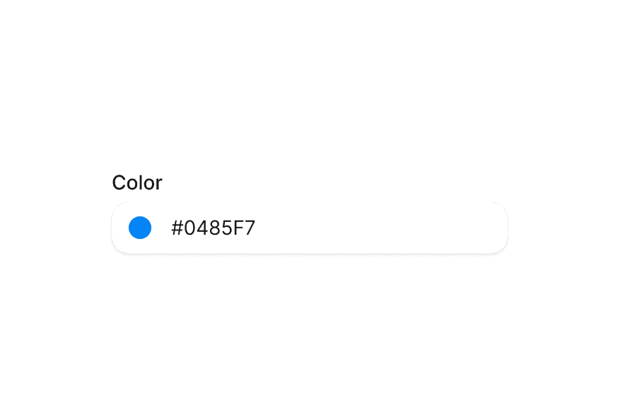
ColorSwatch 颜色色块
颜色值的视觉预览,并提供无障碍支持
用法
import { ColorSwatch } from '@heroui/react';示例
尺寸
形状
透明度
渲染函数
可使用 style render prop 读取颜色值并创建自定义视觉效果。
无障碍
使用 colorName 为颜色提供自定义可访问名称,并使用 aria-label 补充颜色用途的上下文。
自定义样式
Tailwind CSS
全局 CSS
可使用 @layer components 指令自定义 ColorSwatch 组件类。
了解更多。
@layer components {
  .color-swatch {
    @apply border-2 border-white;
  }
}
样式参考
HeroUI 遵循 BEM 方法论,确保组件变体与状态可复用且易于自定义。
CSS 类
ColorSwatch 组件使用以下 CSS 类(查看源码样式):
基础类
.color-swatch- 基础 swatch 样式,透明区域使用棋盘格背景
形状类
.color-swatch--circle- 圆形(默认).color-swatch--square- 圆角方形
尺寸类
.color-swatch--xs- 特小(16px).color-swatch--sm- 小(24px).color-swatch--md- 中(32px,默认).color-swatch--lg- 大(36px).color-swatch--xl- 特大(40px)
API 参考
ColorSwatch
| Prop | 类型 | 默认值 | 描述 |
|---|---|---|---|
color | string | Color | - | 要展示的颜色值(hex、rgb、hsl 等) |
colorName | string | - | 颜色的可访问名称(会覆盖自动生成的描述) |
className | string | - | 附加 CSS 类 |
shape | "circle" | "square" | "circle" | swatch 形状 |
size | "xs" | "sm" | "md" | "lg" | "xl" | "md" | swatch 尺寸 |
style | CSSProperties | ((renderProps) => CSSProperties) | - | 行内样式,或带颜色访问能力的 render prop 函数 |
aria-label | string | - | swatch 的无障碍标签 |
render | DOMRenderFunction<keyof React.JSX.IntrinsicElements, ColorSwatchRenderProps> | - | 使用自定义 render 函数覆盖默认 DOM 元素 |
Style Render
当把 style 作为函数传入时,会获得包含颜色对象在内的 render props:
<ColorSwatch
  color="#0485F7"
  style={({ color }) => ({
    boxShadow: `0 4px 14px ${color.toString("css")}80`,
  })}
/>
color 对象提供例如:
color.toString("css")- 返回 CSS 颜色字符串color.toString("hex")- 返回十六进制颜色字符串color.getChannelValue("alpha")- 返回 alpha 通道数值