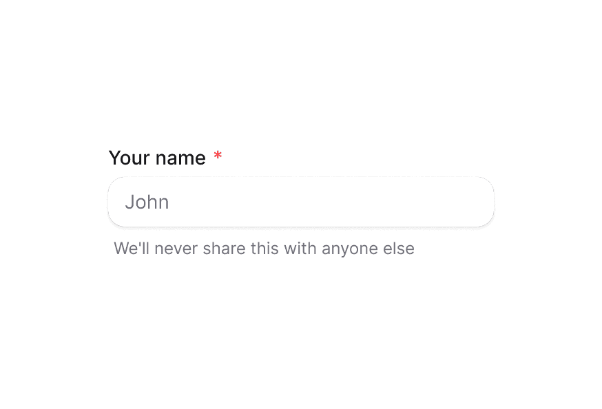
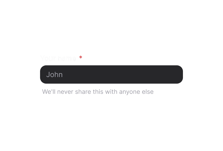
Description 描述
为表单字段及其他组件提供补充说明文本
用法
import { Description } from '@heroui/react';示例
搭配表单字段
<div className="flex flex-col gap-1">
  <Label htmlFor="password">Password</Label>
  <Input id="password" type="password" aria-describedby="password-description" />
  <Description id="password-description">
    至少 8 个字符,且包含一个大写字母
  </Description>
</div>
与 TextField 配合
import {TextField, Label, Input, Description} from '@heroui/react';

<TextField type="email">
  <Label>Email</Label>
  <Input placeholder="Enter your email" />
  <Description>We'll never share your email</Description>
</TextField>
使用 TextField 组件时,无障碍属性会自动应用到标签与描述。
自定义样式
Tailwind CSS
全局 CSS
可使用 @layer components 指令自定义 Description 组件类。了解更多。
@layer components {
  .description {
    @apply text-muted;
  }
}
样式参考
HeroUI 遵循 BEM 方法论,确保组件变体与状态可复用且易于自定义。
CSS 类
Description 组件使用以下 CSS 类(查看源码样式):
基础类
.description- 基础描述样式,使用muted文本颜色
API 参考
Description
| Prop | 类型 | 默认值 | 描述 |
|---|---|---|---|
className | string | - | 附加 CSS 类 |
children | ReactNode | - | 描述内容 |
无障碍
Description 组件通过以下方式增强无障碍性:
- 使用屏幕阅读器可识别的语义化 HTML
- 提供
slot="description"属性以集成 React Aria - 支持适当的文本对比度