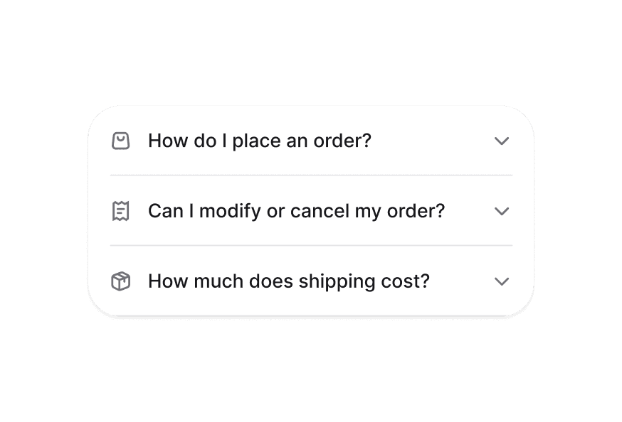
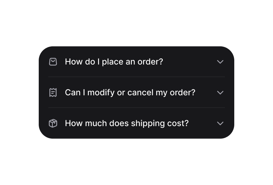
DisclosureGroup 折叠面板组
管理多个 Disclosure 项展开状态的容器
用法
import { DisclosureGroup } from '@heroui/react';组件结构
import {DisclosureGroup, Disclosure} from '@heroui/react';

export default () => (
  <DisclosureGroup>
    <Disclosure id="item1">
      <Disclosure.Heading>
        <Disclosure.Trigger>
          <Disclosure.Indicator />
        </Disclosure.Trigger>
      </Disclosure.Heading>
      <Disclosure.Content />
    </Disclosure>
  </DisclosureGroup>
)
示例
受控组件
可使用 expandedKeys 与 onExpandedChange props 配合外部导航控件控制哪些 Disclosure 处于展开状态。
自定义样式
Tailwind CSS
全局 CSS
可使用 @layer components 指令自定义 DisclosureGroup 组件类。
了解更多。
@layer components {
  .disclosure-group {
    @apply w-full;

    /* Performance optimization */
    contain: layout style;
  }
}
样式参考
HeroUI 遵循 BEM 方法论,确保组件变体与状态可复用且易于自定义。
CSS 类
DisclosureGroup 组件使用以下 CSS 类(查看源码样式):
基础类
.disclosure-group- 基础容器样式,含布局 containment
交互状态
组件同时支持 CSS 伪类与 data 属性:
- Disabled:整个分组上
:disabled或[aria-disabled="true"] - Expanded Management:自动管理子 Disclosure 项上的
[data-expanded]状态
API 参考
DisclosureGroup
| Prop | 类型 | 默认值 | 描述 |
|---|---|---|---|
expandedKeys | Set<Key> | - | 当前展开项(受控) |
defaultExpandedKeys | Iterable<Key> | - | 初始展开项(非受控) |
onExpandedChange | (keys: Set<Key>) => void | - | 展开项变化时的回调 |
allowsMultipleExpanded | boolean | false | 是否允许多项同时展开 |
isDisabled | boolean | false | 是否禁用组内所有 Disclosure |
children | ReactNode | RenderFunction | - | 要渲染的 Disclosure 项 |
className | string | - | 附加 CSS 类 |
Render Props
使用 render prop 模式时,提供以下值:
| Prop | 类型 | 描述 |
|---|---|---|
expandedKeys | Set<Key> | 当前展开项的 key |
isDisabled | boolean | 分组是否禁用 |