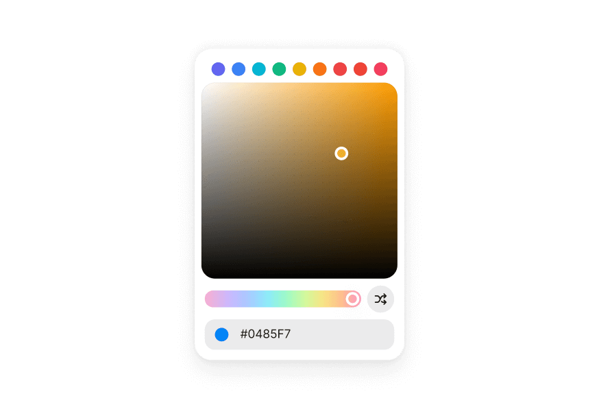
ColorField 颜色输入框
基于 React Aria ColorField 的颜色输入字段,支持标签、描述与验证
用法
import { ColorField, parseColor } from '@heroui/react';组件结构
import {ColorField, Label, ColorSwatch, Description, FieldError, parseColor} from '@heroui/react';

export default () => (
  <ColorField>
    <Label />
    <ColorField.Group>
      <ColorField.Prefix>
        <ColorSwatch color="#000000" />
      </ColorField.Prefix>
      <ColorField.Input />
    </ColorField.Group>
    <Description />
    <FieldError />
  </ColorField>
)
ColorField 将标签、颜色输入、描述与错误合并为单个无障碍组件。
示例
变体
ColorField.Group 组件支持两种视觉变体:
primary(默认)- 标准样式带阴影,适用于大多数场景secondary- 低强调变体无阴影,适用于 Surface 组件内
表面样式
在 Surface 组件内使用时,在 ColorField.Group 上使用 variant="secondary" 以应用适合 Surface 背景的低强调变体。
带描述
必填字段
禁用
宽度充满
表单校验
将 isInvalid 与 FieldError 一起使用以显示验证消息。
分量编辑
ColorField 支持通过设置 colorSpace 与 channel 属性编辑单个颜色通道(hue、saturation、lightness、red、green、blue、alpha)。
受控组件
控制值以与其他组件或状态管理同步。
表单示例
包含验证与提交处理的完整表单示例。
渲染函数
自定义样式
Tailwind CSS
全局 CSS
ColorField 默认样式较少。覆盖 .color-field 类以自定义容器样式。
@layer components {
  .color-field {
    @apply flex flex-col gap-1;

    &[data-invalid="true"],
    &[aria-invalid="true"] {
      [data-slot="description"] {
        @apply hidden;
      }
    }

    [data-slot="label"] {
      @apply w-fit;
    }

    [data-slot="description"] {
      @apply px-1;
    }
  }
}
样式参考
HeroUI 遵循 BEM 方法论,确保组件变体与状态可复用且易于自定义。
CSS 类
.color-field– 最小样式的根容器(flex flex-col gap-1)
Note: 子组件(Label、Description、FieldError)有各自的 CSS 类与样式。请参阅各自文档了解自定义选项。ColorField.Group 样式见下方 API 参考。
交互状态
ColorField 根据状态自动管理以下 data 属性:
- Invalid:
[data-invalid="true"]或[aria-invalid="true"]- 无效时自动隐藏 description slot - Required:
[data-required="true"]-isRequired为 true 时应用 - Disabled:
[data-disabled="true"]-isDisabled为 true 时应用 - Focus Within:
[data-focus-within="true"]- 任一子 input 聚焦时应用
API 参考
ColorField
ColorField 继承 React Aria ColorField 组件的所有属性。
Base Props
| Prop | 类型 | 默认值 | 描述 |
|---|---|---|---|
children | React.ReactNode | (values: ColorFieldRenderProps) => React.ReactNode | - | 子组件(Label、ColorField.Group 等)或 render 函数 |
className | string | (values: ColorFieldRenderProps) => string | - | CSS 类,支持 render props |
style | React.CSSProperties | (values: ColorFieldRenderProps) => React.CSSProperties | - | 内联样式,支持 render props |
fullWidth | boolean | false | 是否占满容器宽度 |
id | string | - | 元素唯一标识符 |
render | DOMRenderFunction<keyof React.JSX.IntrinsicElements, ColorFieldRenderProps> | - | 使用自定义 render 函数覆盖默认 DOM 元素 |
Value Props
| Prop | 类型 | 默认值 | 描述 |
|---|---|---|---|
value | Color | null | - | 当前值(受控) |
defaultValue | Color | null | - | 默认值(非受控) |
onChange | (color: Color | null) => void | - | 值变化时的回调 |
Channel Props
| Prop | 类型 | 默认值 | 描述 |
|---|---|---|---|
colorSpace | ColorSpace | - | 提供 channel 时颜色字段操作的颜色空间 |
channel | ColorChannel | - | 要编辑的颜色通道。未提供时编辑 hex 值 |
Validation Props
| Prop | 类型 | 默认值 | 描述 |
|---|---|---|---|
isRequired | boolean | false | 表单提交前是否必须输入 |
isInvalid | boolean | - | 值是否无效 |
validate | (value: Color) => ValidationError | true | null | undefined | - | 自定义验证函数 |
validationBehavior | 'native' | 'aria' | 'native' | 使用原生 HTML 表单验证还是 ARIA 属性 |
State Props
| Prop | 类型 | 默认值 | 描述 |
|---|---|---|---|
isDisabled | boolean | - | 是否禁用 |
isReadOnly | boolean | - | 是否可选中但不可更改 |
isWheelDisabled | boolean | - | 是否禁用滚轮更改值 |
Form Props
| Prop | 类型 | 默认值 | 描述 |
|---|---|---|---|
name | string | - | HTML 表单提交时 input 元素的名称 |
autoFocus | boolean | - | 渲染时是否自动聚焦 |
Accessibility Props
| Prop | 类型 | 默认值 | 描述 |
|---|---|---|---|
aria-label | string | - | 无可见标签时的无障碍标签 |
aria-labelledby | string | - | 标注此字段的元素 ID |
aria-describedby | string | - | 描述此字段的元素 ID |
aria-details | string | - | 包含附加详情的元素 ID |
Composition Components
ColorField 与以下需单独导入并直接使用的组件配合:
- Label - 来自
@heroui/react的字段标签组件 - ColorField.Group - 颜色输入组组件(见下方文档)
- ColorField.Input - ColorField.Group 内的 input 元素
- ColorField.Prefix / ColorField.Suffix - 输入组的前缀与后缀 slot
- ColorSwatch - 来自
@heroui/react的颜色预览组件 - Description - 来自
@heroui/react的帮助文本组件 - FieldError - 来自
@heroui/react的验证错误消息
每个组件有各自的 props API。在 ColorField 内直接使用它们进行组合:
import {ColorField, Label, ColorSwatch, Description, FieldError, parseColor} from '@heroui/react';

<ColorField
  isRequired
  isInvalid={hasError}
  value={color}
  onChange={setColor}
>
  <Label>Brand Color</Label>
  <ColorField.Group>
    <ColorField.Prefix>
      <ColorSwatch color={color?.toString("hex") || "#E4E4E7"} />
    </ColorField.Prefix>
    <ColorField.Input />
  </ColorField.Group>
  <Description>Select your brand's primary color.</Description>
  <FieldError>Please enter a valid color.</FieldError>
</ColorField>
Color Types
ColorField 使用 React Aria Components 的 Color 对象:
import {parseColor} from '@heroui/react';

// Parse from hex string
const color = parseColor('#3B82F6');

// Get hex string from color
const hex = color.toString('hex'); // "#3b82f6"

// Get RGB values
const rgb = color.toString('rgb'); // "rgb(59, 130, 246)"

// Use in ColorField
<ColorField value={color} onChange={setColor}>
  {/* ... */}
</ColorField>
Render Props
对 className、style 或 children 使用 render props 时,可使用以下值:
| Prop | 类型 | 描述 |
|---|---|---|
isDisabled | boolean | 字段是否禁用 |
isInvalid | boolean | 字段是否当前无效 |
isReadOnly | boolean | 字段是否只读 |
isRequired | boolean | 字段是否必填 |
isFocused | boolean | 字段是否当前聚焦 |
isFocusWithin | boolean | 是否有子元素聚焦 |
isFocusVisible | boolean | 焦点是否可见(键盘导航) |
ColorField.Group
ColorField.Group 接受 React Aria Group 组件的所有属性,以及以下属性:
| Prop | 类型 | 默认值 | 描述 |
|---|---|---|---|
className | string | - | 与组件样式合并的 Tailwind 类 |
fullWidth | boolean | false | 颜色输入组是否占满容器宽度 |
variant | "primary" | "secondary" | "primary" | 视觉变体。primary 为默认带阴影样式;secondary 为低强调无阴影,适用于 Surface 内 |
render | DOMRenderFunction<keyof React.JSX.IntrinsicElements, GroupRenderProps> | - | 使用自定义 render 函数覆盖默认 DOM 元素 |
ColorField.Input
ColorField.Input 接受 React Aria Input 组件的所有属性,以及以下属性:
| Prop | 类型 | 默认值 | 描述 |
|---|---|---|---|
className | string | - | 与组件样式合并的 Tailwind 类 |
placeholder | string | - | 为空时显示的占位文本 |
ColorField.Prefix
ColorField.Prefix 接受标准 HTML div 属性:
| Prop | 类型 | 默认值 | 描述 |
|---|---|---|---|
className | string | - | 与组件样式合并的 Tailwind 类 |
children | ReactNode | - | 前缀 slot 中显示的内容 |
ColorField.Suffix
ColorField.Suffix 接受标准 HTML div 属性:
| Prop | 类型 | 默认值 | 描述 |
|---|---|---|---|
className | string | - | 与组件样式合并的 Tailwind 类 |
children | ReactNode | - | 后缀 slot 中显示的内容 |
ColorField.Group Styling
Customizing the component classes
基础类驱动每个实例。使用 @layer components 一次性覆盖。
@layer components {
  .color-input-group {
    @apply inline-flex h-9 items-center overflow-hidden rounded-field border bg-field text-sm text-field-foreground shadow-field outline-none;

    &:hover,
    &[data-hovered="true"] {
      @apply bg-field-hover;
    }

    &[data-focus-within="true"],
    &:focus-within {
      @apply status-focused-field;
    }

    &[data-invalid="true"] {
      @apply status-invalid-field;
    }

    &[data-disabled="true"],
    &[aria-disabled="true"] {
      @apply status-disabled;
    }
  }

  .color-input-group__input {
    @apply flex flex-1 items-center rounded-none border-0 bg-transparent px-3 py-2 shadow-none outline-none;
  }

  .color-input-group__prefix,
  .color-input-group__suffix {
    @apply shrink-0 text-field-placeholder flex items-center;
  }
}
ColorField.Group CSS Classes
.color-input-group– 根容器样式.color-input-group__input– Input 包装器样式.color-input-group__prefix– 前缀元素样式.color-input-group__suffix– 后缀元素样式
ColorField.Group Interactive States
- Hover:
:hover或[data-hovered="true"] - Focus Within:
[data-focus-within="true"]或:focus-within - Invalid:
[data-invalid="true"](与aria-invalid同步) - Disabled:
[data-disabled="true"]或[aria-disabled="true"]