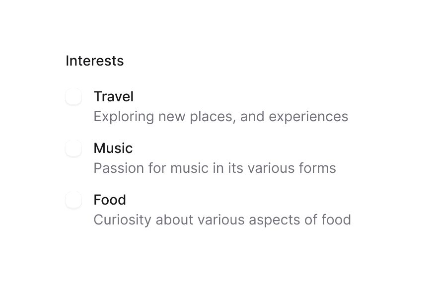
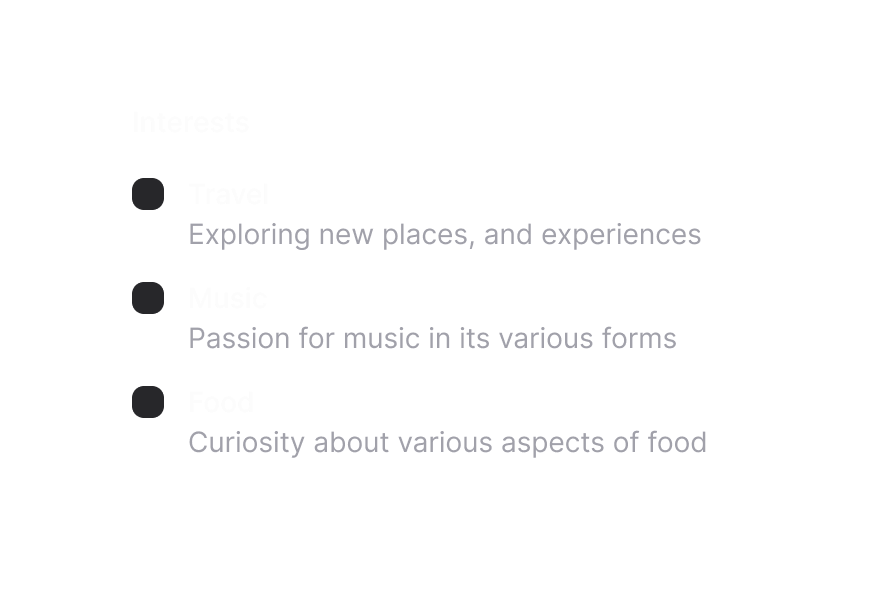
Fieldset 字段组
将相关表单控件与图例、描述和操作组合在一起
用法
import { Fieldset } from '@heroui/react';组件结构
import { Fieldset } from '@heroui/react';

export default () => (
  <Fieldset>
    <Fieldset.Legend />
    <Fieldset.Group>
      {/* form fields go here */}
    </Fieldset.Group>
    <Fieldset.Actions>
      {/* action buttons go here */}
    </Fieldset.Actions>
  </Fieldset>
)
示例
表面样式
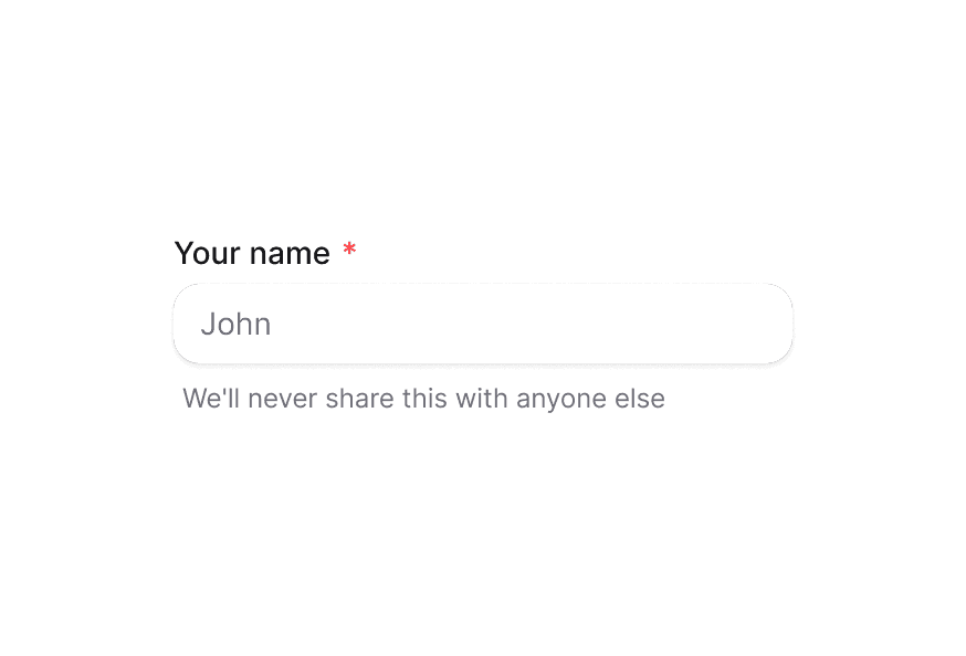
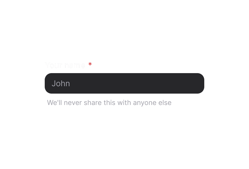
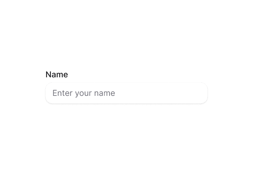
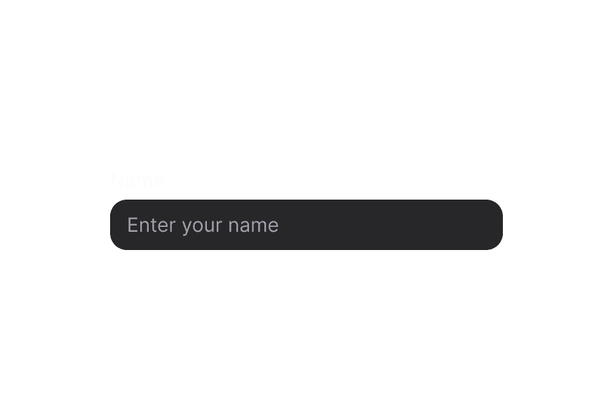
在 Surface 内使用时,请在表单控件(Input、TextArea 等)上使用 variant="secondary",以应用适合 Surface 背景的低强调变体。
自定义样式
Tailwind CSS
全局 CSS
使用 @layer components 指令定位 Fieldset 的 BEM 风格类。
@layer components {
  .fieldset {
    @apply gap-5 rounded-xl border border-border/60 bg-surface p-6 shadow-field;
  }

  .fieldset__legend {
    @apply text-lg font-semibold;
  }

  .fieldset__field-group {
    @apply gap-3 md:grid md:grid-cols-2;
  }

  .fieldset__actions {
    @apply flex justify-end gap-2 pt-2;
  }
}
样式参考
HeroUI 遵循 BEM 方法论,确保组件变体与状态可复用且易于自定义。
CSS 类
Fieldset 复合组件暴露以下 CSS 选择器:
基础类
.fieldset– 根容器.fieldset__legend– 图例元素.fieldset__field-group– 分组字段包裹层.fieldset__actions– 字段下方的操作栏
API 参考
Fieldset
| Prop | 类型 | 默认值 | 描述 |
|---|---|---|---|
className | string | - | 应用于根元素的 Tailwind CSS 类 |
children | React.ReactNode | - | Fieldset 内容(图例、分组、描述、操作) |
nativeProps | React.HTMLAttributes<HTMLFieldSetElement> | 支持原生 fieldset 属性与事件 |
Fieldset.Legend
| Prop | 类型 | 默认值 | 描述 |
|---|---|---|---|
className | string | - | 图例元素的 Tailwind 类 |
children | React.ReactNode | - | 图例内容,通常为纯文本 |
nativeProps | React.HTMLAttributes<HTMLLegendElement> | - | 原生 legend 属性 |
Fieldset.Group
| Prop | 类型 | 默认值 | 描述 |
|---|---|---|---|
className | string | - | 分组字段的布局与间距类 |
children | React.ReactNode | - | fieldset 内要分组的表单控件 |
nativeProps | React.HTMLAttributes<HTMLDivElement> | - | 原生 div 属性 |
Fieldset.Actions
| Prop | 类型 | 默认值 | 描述 |
|---|---|---|---|
className | string | - | 对齐操作按钮或文本的 Tailwind 类 |
children | React.ReactNode | - | 操作按钮或辅助文本 |
nativeProps | React.HTMLAttributes<HTMLDivElement> | - | 原生 div 属性 |