NumberField 数字输入框
数字输入字段,包含增减按钮、校验与国际化格式化能力。
用法
import { NumberField } from '@heroui/react';组件结构
import {NumberField, Label, Description, FieldError} from '@heroui/react';

export default () => (
  <NumberField>
    <Label />
    <NumberField.Group>
      <NumberField.DecrementButton />
      <NumberField.Input />
      <NumberField.IncrementButton />
    </NumberField.Group>
    <Description />
    <FieldError />
  </NumberField>
)
NumberField 允许用户输入数值,并可选择是否显示增减按钮。它支持国际化格式化、校验与键盘导航。
示例
变体
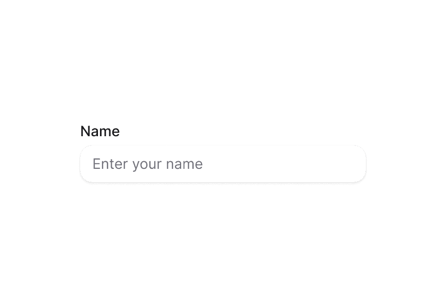
NumberField 组件支持两种视觉变体:
primary(默认)— 带阴影的标准样式,适用于大多数场景secondary— 低强调、无阴影,适合在 Surface 等表面背景上使用
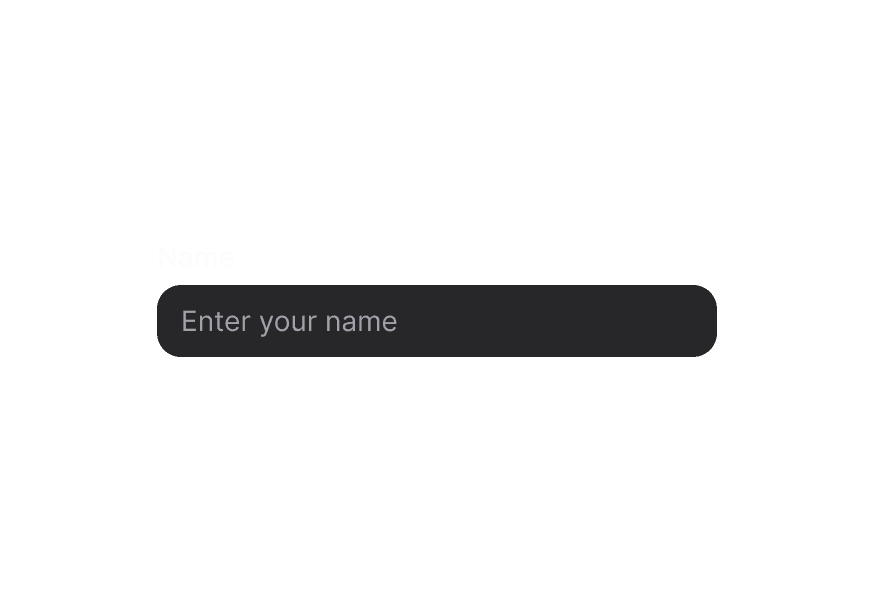
表面样式
在 Surface 内使用时,请使用 variant="secondary",以应用适合表面背景的低强调变体。
带描述
必填字段
禁用状态
宽度充满
表单校验
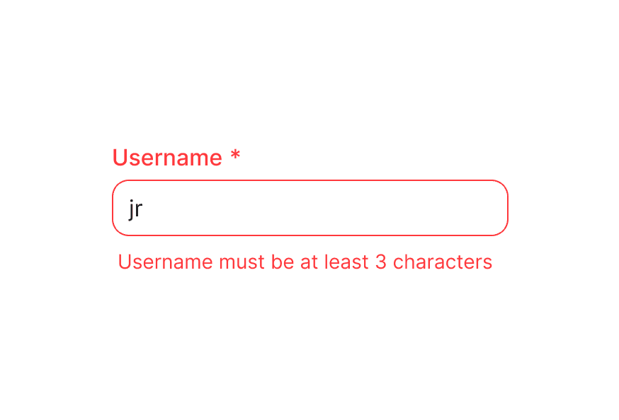
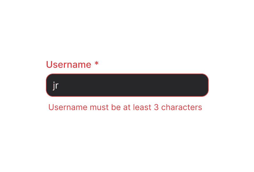
将 isInvalid 与 FieldError 配合使用,以展示校验消息。
受控组件
控制 value 以与其他组件同步或执行自定义格式化。
步进值
配置增减步进值以实现精确控制。
格式化选项
支持将数字格式化为货币、百分比、小数或单位,并具备国际化能力。
表单示例
完整的表单集成示例,包含校验与提交处理。
带校验
通过受控 value 实现自定义校验逻辑。
自定义图标
自定义增减按钮图标。
步进箭头
使用垂直布局的 chevron 图标,呈现不同的视觉风格。
渲染函数
自定义样式
Tailwind CSS
全局 CSS
若要自定义组件类,可使用 @layer components 指令。了解更多。
@layer components {
  .number-field {
    @apply flex flex-col gap-1;
  }

  /* When invalid, the description is hidden automatically */
  .number-field[data-invalid="true"] [data-slot="description"],
  .number-field[aria-invalid="true"] [data-slot="description"] {
    @apply hidden;
  }

  .number-field__group {
    @apply bg-field text-field-foreground shadow-field rounded-field inline-flex h-9 items-center overflow-hidden border;
  }

  .number-field__input {
    @apply flex-1 rounded-none border-0 bg-transparent px-3 py-2 tabular-nums;
  }

  .number-field__increment-button,
  .number-field__decrement-button {
    @apply flex h-full w-10 items-center justify-center rounded-none bg-transparent;
  }
}
样式参考
HeroUI 遵循 BEM 方法论,确保组件变体与状态可复用且易于自定义。
CSS 类
基础类
.number-field– 根容器,样式非常克制(flex flex-col gap-1).number-field__group– 输入与按钮的容器,包含边框与背景样式.number-field__input– 数字输入字段.number-field__increment-button– 用于增加数值的按钮.number-field__decrement-button– 用于减少数值的按钮
变体类
.number-field--primary– 带阴影的主变体(默认).number-field--secondary– 无阴影的次变体,适合用在 surface 上
说明: 子组件(Label、Description、FieldError)拥有各自的 CSS 类与样式。自定义方式请参见对应文档。
交互状态
NumberField 会根据状态自动管理以下 data 属性:
- Invalid:
[data-invalid="true"]或[aria-invalid="true"]– 无效时会自动隐藏 description 插槽 - Disabled:
[data-disabled="true"]– 当isDisabled为 true 时应用 - Focus Within:
[data-focus-within="true"]– 当输入框或按钮聚焦时应用 - Focus Visible:
[data-focus-visible="true"]– 当焦点可见(键盘导航)时应用 - Hovered:
[data-hovered="true"]– 当悬停在按钮上时应用
更多属性可通过渲染 prop 获得(见下方的 NumberFieldRenderProps)。
API 参考
NumberField
NumberField 继承 React Aria NumberField 组件的全部 props。
Base Props
| Prop | 类型 | 默认值 | 描述 |
|---|---|---|---|
children | React.ReactNode | (values: NumberFieldRenderProps) => React.ReactNode | - | 子组件(Label、Group、Input 等)或渲染函数。 |
className | string | (values: NumberFieldRenderProps) => string | - | 用于样式的 CSS 类,支持渲染 prop。 |
style | React.CSSProperties | (values: NumberFieldRenderProps) => React.CSSProperties | - | 行内样式,支持渲染 prop。 |
fullWidth | boolean | false | 数字字段是否占满容器宽度 |
id | string | - | 元素的唯一标识符。 |
variant | "primary" | "secondary" | "primary" | 组件的视觉变体。primary 为默认带阴影样式。secondary 为低强调、无阴影变体,适合用在 surface 上。 |
render | DOMRenderFunction<keyof React.JSX.IntrinsicElements, NumberFieldRenderProps> | - | 使用自定义渲染函数覆盖默认 DOM 元素。 |
Value Props
| Prop | 类型 | 默认值 | 描述 |
|---|---|---|---|
value | number | - | 当前值(受控)。 |
defaultValue | number | - | 默认值(非受控)。 |
onChange | (value: number | undefined) => void | - | 值变化时触发的事件处理函数。 |
Formatting Props
| Prop | 类型 | 默认值 | 描述 |
|---|---|---|---|
formatOptions | Intl.NumberFormatOptions | - | 数字格式化选项(货币、百分比、小数、单位等)。 |
locale | string | - | 数字格式化的区域设置。 |
Validation Props
| Prop | 类型 | 默认值 | 描述 |
|---|---|---|---|
isRequired | boolean | false | 提交表单前是否要求用户输入。 |
isInvalid | boolean | - | 当前值是否无效。 |
validate | (value: number) => ValidationError | true | null | undefined | - | 自定义校验函数。 |
validationBehavior | 'native' | 'aria' | 'native' | 使用原生 HTML 表单校验或 ARIA 属性。 |
validationErrors | string[] | - | 服务端校验错误。 |
Range Props
| Prop | 类型 | 默认值 | 描述 |
|---|---|---|---|
minValue | number | - | 允许的最小值。 |
maxValue | number | - | 允许的最大值。 |
step | number | 1 | 增减操作的步进值。 |
State Props
| Prop | 类型 | 默认值 | 描述 |
|---|---|---|---|
isDisabled | boolean | - | 是否禁用输入。 |
isReadOnly | boolean | - | 是否可选中但不可修改。 |
Form Props
| Prop | 类型 | 默认值 | 描述 |
|---|---|---|---|
name | string | - | input 元素的名称,用于 HTML 表单提交。 |
autoFocus | boolean | - | 元素渲染后是否应获得焦点。 |
Accessibility Props
| Prop | 类型 | 默认值 | 描述 |
|---|---|---|---|
aria-label | string | - | 没有可见标签时的无障碍标签。 |
aria-labelledby | string | - | 用于标注该字段的元素 ID。 |
aria-describedby | string | - | 用于描述该字段的元素 ID。 |
aria-details | string | - | 包含更多详情的元素 ID。 |
Composition Components
NumberField 需要与以下独立组件组合使用,请分别导入并直接使用:
- NumberField.Group – 输入与按钮的容器
- NumberField.Input – 数字输入字段
- NumberField.IncrementButton – 用于增加数值的按钮
- NumberField.DecrementButton – 用于减少数值的按钮
- Label – 字段标签组件(
@heroui/react) - Description – 辅助说明文本组件(
@heroui/react) - FieldError – 校验错误信息组件(
@heroui/react)
这些组件各自拥有 props API。请直接在 NumberField 内组合使用:
<NumberField isRequired isInvalid={hasError} minValue={0} maxValue={100}>
  <Label>Quantity</Label>
  <NumberField.Group>
    <NumberField.DecrementButton />
    <NumberField.Input />
    <NumberField.IncrementButton />
  </NumberField.Group>
  <Description>Enter a value between 0 and 100</Description>
  <FieldError>Value must be between 0 and 100</FieldError>
</NumberField>
NumberField.Group Props
NumberField.Group 继承 React Aria Group 组件的 props。
| Prop | 类型 | 默认值 | 描述 |
|---|---|---|---|
children | React.ReactNode | (values: GroupRenderProps) => React.ReactNode | - | 子组件(Input、Buttons)或渲染函数。 |
className | string | (values: GroupRenderProps) => string | - | 用于样式的 CSS 类。 |
NumberField.Input Props
NumberField.Input 继承 React Aria Input 组件的 props。
| Prop | 类型 | 默认值 | 描述 |
|---|---|---|---|
className | string | - | 用于样式的 CSS 类。 |
variant | "primary" | "secondary" | "primary" | 输入的视觉变体。primary 为默认带阴影样式。secondary 为低强调、无阴影变体,适合用在 surface 上。 |
NumberField.IncrementButton Props
NumberField.IncrementButton 继承 React Aria Button 组件的 props。
| Prop | 类型 | 默认值 | 描述 |
|---|---|---|---|
children | React.ReactNode | <IconPlus /> | 按钮的图标或内容。默认为加号图标。 |
className | string | - | 用于样式的 CSS 类。 |
slot | "increment" | "increment" | 必须设置为 "increment"(会自动设置)。 |
NumberField.DecrementButton Props
NumberField.DecrementButton 继承 React Aria Button 组件的 props。
| Prop | 类型 | 默认值 | 描述 |
|---|---|---|---|
children | React.ReactNode | <IconMinus /> | 按钮的图标或内容。默认为减号图标。 |
className | string | - | 用于样式的 CSS 类。 |
slot | "decrement" | "decrement" | 必须设置为 "decrement"(会自动设置)。 |
NumberFieldRenderProps
在 className、style 或 children 上使用渲染 prop 时,可使用以下值:
| Prop | 类型 | 描述 |
|---|---|---|
isDisabled | boolean | 字段是否禁用。 |
isInvalid | boolean | 字段当前是否无效。 |
isReadOnly | boolean | 字段是否只读。 |
isRequired | boolean | 字段是否必填。 |
isFocused | boolean | 字段是否聚焦(已弃用,请使用 isFocusWithin)。 |
isFocusWithin | boolean | 是否有任意子元素聚焦。 |
isFocusVisible | boolean | 是否为可见焦点(键盘导航)。 |
value | number | undefined | 当前值。 |
minValue | number | undefined | 允许的最小值。 |
maxValue | number | undefined | 允许的最大值。 |
step | number | 增减步进值。 |