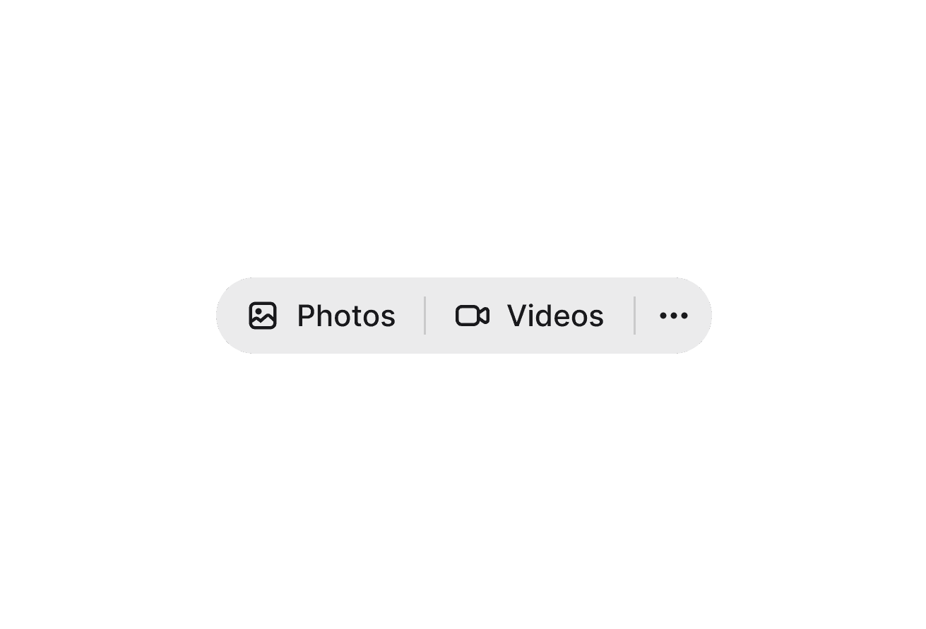
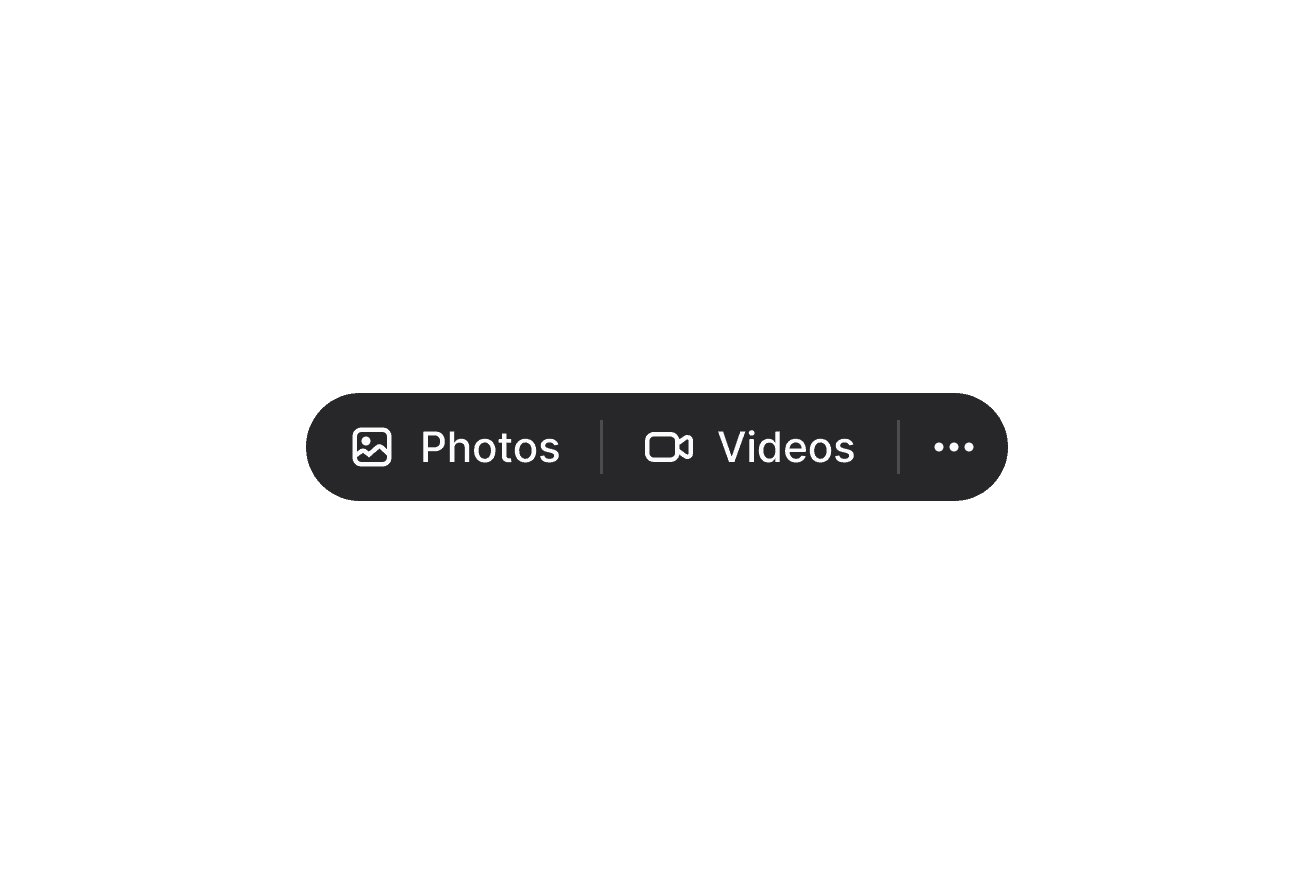
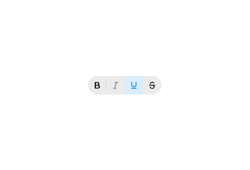
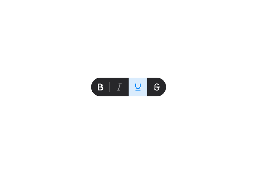
Toolbar 工具栏
用于承载可交互控件的容器,并支持方向键导航。
用法
import { Toolbar } from '@heroui/react';示例
垂直方向
组合模式
与 ButtonGroup 组合
自定义样式
Tailwind CSS
全局 CSS
若要自定义组件类,可使用 @layer components 指令。了解更多。
@layer components {
  .toolbar {
    @apply gap-4 rounded-lg bg-surface p-3;
  }
}
样式参考
HeroUI 遵循 BEM 方法论,确保组件变体与状态可复用且易于自定义。
CSS 类
Toolbar 使用以下 CSS 类(查看源码样式):
.toolbar- 基础容器.toolbar--horizontal- 水平方向(默认).toolbar--vertical- 垂直方向.toolbar--attached- Attached 变体:surface 背景与完全圆角
API 参考
Toolbar
| Prop | 类型 | 默认值 | 描述 |
|---|---|---|---|
isAttached | boolean | false | Toolbar 是否使用带完全圆角的 surface 背景 |
orientation | "horizontal" | "vertical" | "horizontal" | Toolbar 的方向 |
aria-label | string | - | Toolbar 的无障碍标签 |
aria-labelledby | string | - | 用于标注该 Toolbar 的元素 id |
children | React.ReactNode | (values: ToolbarRenderProps) => React.ReactNode | - | 内容或渲染 prop |
className | string | (values: ToolbarRenderProps) => string | - | 额外的 CSS 类名 |
ToolbarRenderProps
使用渲染 prop 模式时,会提供以下值:
| Prop | 类型 | 描述 |
|---|---|---|
orientation | "horizontal" | "vertical" | 当前 Toolbar 的方向 |