TagGroup 标签组
可聚焦的标签列表,支持键盘导航、选择与移除。
用法
import { TagGroup } from '@heroui/react';组件结构
import { TagGroup, Tag, Label, Description, ErrorMessage } from '@heroui/react';

export default () => (
  <TagGroup>
    <Label />
    <TagGroup.List>
      <Tag>
        <Tag.RemoveButton />
      </Tag>
    </TagGroup.List>
    <Description />
    <ErrorMessage />
  </TagGroup>
)
示例
尺寸
变体
禁用
选择模式
受控组件
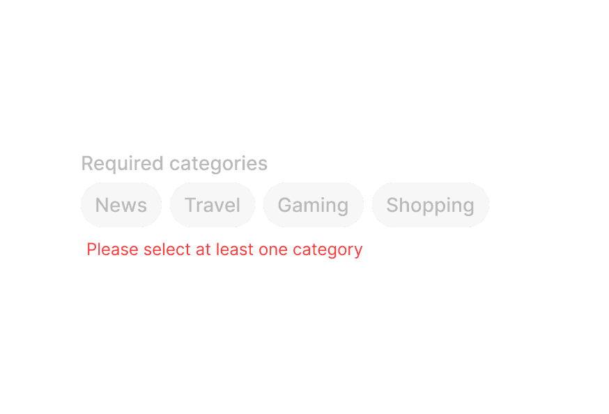
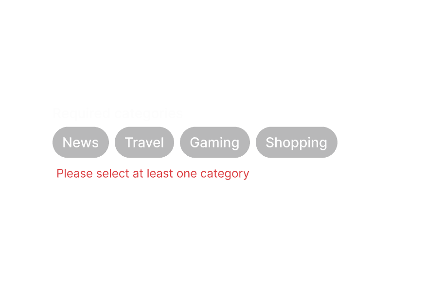
带错误信息
带列表数据
带前缀
带移除按钮
渲染函数
自定义样式
Tailwind CSS
全局 CSS
若要自定义组件类,可使用 @layer components 指令。了解更多。
@layer components {
  .tag-group {
    @apply flex flex-col gap-2;
  }

  .tag-group__list {
    @apply flex flex-wrap gap-2;
  }

  .tag {
    @apply rounded-full px-3 py-1;
  }

  .tag__remove-button {
    @apply ml-1;
  }
}
样式参考
HeroUI 遵循 BEM 方法论,确保组件变体与状态可复用且易于自定义。
CSS 类
TagGroup 组件使用以下 CSS 类(查看源码样式 与 tag.css):
基础类
.tag-group- TagGroup 根容器.tag-group__list- 标签列表容器.tag- 标签基础样式.tag__remove-button- 移除按钮触发器
插槽类
.tag-group [slot="description"]- Description 插槽样式.tag-group [slot="errorMessage"]- ErrorMessage 插槽样式
尺寸类
.tag--sm- 小尺寸标签.tag--md- 中尺寸标签(默认).tag--lg- 大尺寸标签
变体类
.tag--default- 默认变体.tag--surface- 带 Surface 背景的变体
状态类
.tag[data-selected="true"]- 选中状态.tag[data-disabled="true"]- 禁用状态.tag[data-hovered="true"]- 悬停状态.tag[data-pressed="true"]- 按下状态.tag[data-focus-visible="true"]- 聚焦状态(键盘焦点)
交互状态
该组件同时支持 CSS 伪类与 data 属性:
- 悬停:标签上
:hover或[data-hovered="true"] - 聚焦:标签上
:focus-visible或[data-focus-visible="true"] - 按下:标签上
:active或[data-pressed="true"] - 已选中:标签上
[data-selected="true"]或[aria-selected="true"] - 禁用:标签上
:disabled或[data-disabled="true"]
API 参考
TagGroup
| Prop | 类型 | 默认值 | 描述 |
|---|---|---|---|
selectionMode | "none" | "single" | "multiple" | "none" | 允许的选择类型。 |
selectedKeys | Selection | - | 当前选中的 key(受控)。 |
defaultSelectedKeys | Selection | - | 初始选中的 key(非受控)。 |
onSelectionChange | (keys: Selection) => void | - | 选中变化时调用的事件处理函数。 |
disabledKeys | Iterable<Key> | - | 禁用标签的 key。 |
isDisabled | boolean | - | 是否禁用整个 TagGroup。 |
onRemove | (keys: Set<Key>) => void | - | 移除标签时调用的事件处理函数。 |
size | "sm" | "md" | "lg" | "md" | 组内标签尺寸。 |
variant | "default" | "surface" | "default" | 标签视觉变体。 |
className | string | - | 额外的 Tailwind CSS 类。 |
children | ReactNode | RenderFunction | - | TagGroup 内容或渲染函数。 |
render | DOMRenderFunction<keyof React.JSX.IntrinsicElements, undefined> | - | 使用自定义渲染函数覆盖默认 DOM 元素。 |
TagGroup.List
| Prop | 类型 | 默认值 | 描述 |
|---|---|---|---|
items | Iterable<T> | - | 标签列表要展示的数据项。 |
renderEmptyState | () => ReactNode | - | 列表为空时的渲染函数。 |
className | string | - | 额外的 Tailwind CSS 类。 |
children | ReactNode | RenderFunction | - | 标签列表内容或渲染函数。 |
render | DOMRenderFunction<keyof React.JSX.IntrinsicElements, TagListRenderProps> | - | 使用自定义渲染函数覆盖默认 DOM 元素。 |
Tag
| Prop | 类型 | 默认值 | 描述 |
|---|---|---|---|
id | Key | - | 标签唯一标识。 |
textValue | string | - | 标签内容的字符串表示,用于无障碍。 |
isDisabled | boolean | - | 是否禁用该标签。 |
className | string | - | 额外的 Tailwind CSS 类。 |
children | ReactNode | RenderFunction | - | 标签内容或渲染函数。 |
render | DOMRenderFunction<keyof React.JSX.IntrinsicElements, TagRenderProps> | - | 使用自定义渲染函数覆盖默认 DOM 元素。 |
提示: size、variant 由父级 TagGroup 继承,无法在单个 Tag 上直接设置。
Tag.RemoveButton
| Prop | 类型 | 默认值 | 描述 |
|---|---|---|---|
className | string | - | 额外的 Tailwind CSS 类。 |
children | ReactNode | - | 自定义移除按钮内容(默认为关闭图标)。 |
提示: Tag.RemoveButton 支持类似 SearchField.ClearButton 的定制方式。当为 TagGroup 提供 onRemove 时:
- 自动渲染:若
Tag的子节点中未包含自定义Tag.RemoveButton,会自动渲染默认移除按钮。 - 自定义按钮:若在
Tag下提供了自定义Tag.RemoveButton,将替换自动渲染的按钮。 - 自定义图标:可向
Tag.RemoveButton传入自定义子内容(如图标)以改变外观。
示例 — 自动渲染(默认):
<TagGroup onRemove={handleRemove}>
  <TagGroup.List>
    <Tag id="news">News</Tag>
    {/* Remove button is automatically rendered */}
  </TagGroup.List>
</TagGroup>
示例 — 自定义 RemoveButton(带图标):
<TagGroup onRemove={handleRemove}>
  <TagGroup.List>
    <Tag id="news">
      News
      <Tag.RemoveButton>
        <CustomIcon />
      </Tag.RemoveButton>
    </Tag>
  </TagGroup.List>
</TagGroup>
示例 — 在 render props 中使用自定义 RemoveButton:
<Tag id="news">
  {(renderProps) => (
    <>
      News
      {!!renderProps.allowsRemoving && (
        <Tag.RemoveButton>
          <CustomIcon />
        </Tag.RemoveButton>
      )}
    </>
  )}
</Tag>
RenderProps
在 TagGroup.List 中使用渲染函数时,会传入以下值:
| Prop | 类型 | 描述 |
|---|---|---|
isSelected | boolean | 标签是否选中。 |
isDisabled | boolean | 标签是否禁用。 |
isHovered | boolean | 标签是否悬停。 |
isPressed | boolean | 标签是否按下。 |
isFocused | boolean | 标签是否聚焦。 |
isFocusVisible | boolean | 标签是否为可见键盘焦点。 |