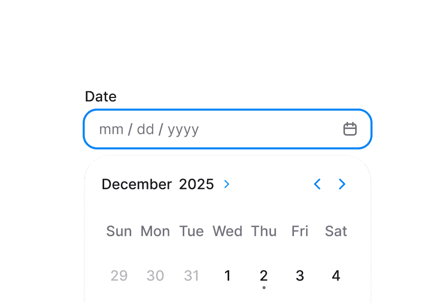
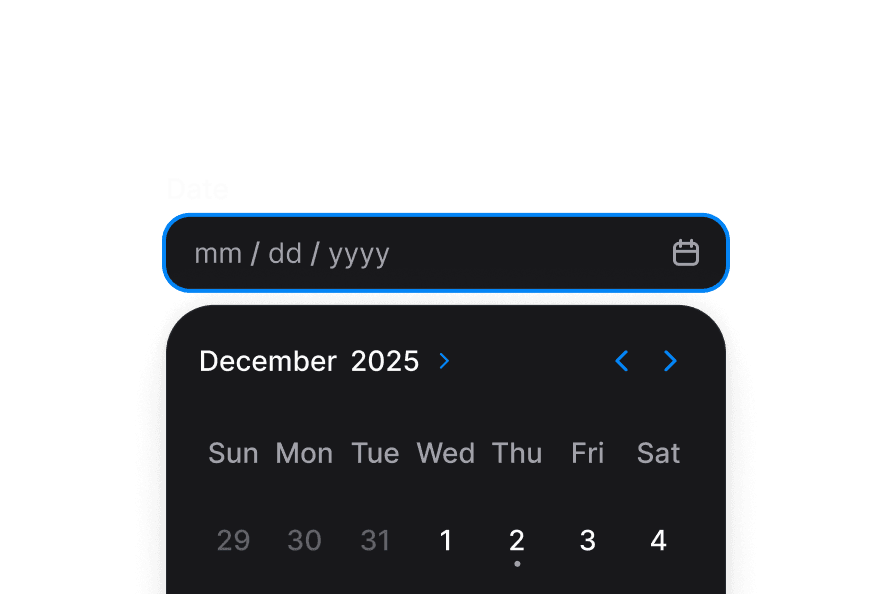
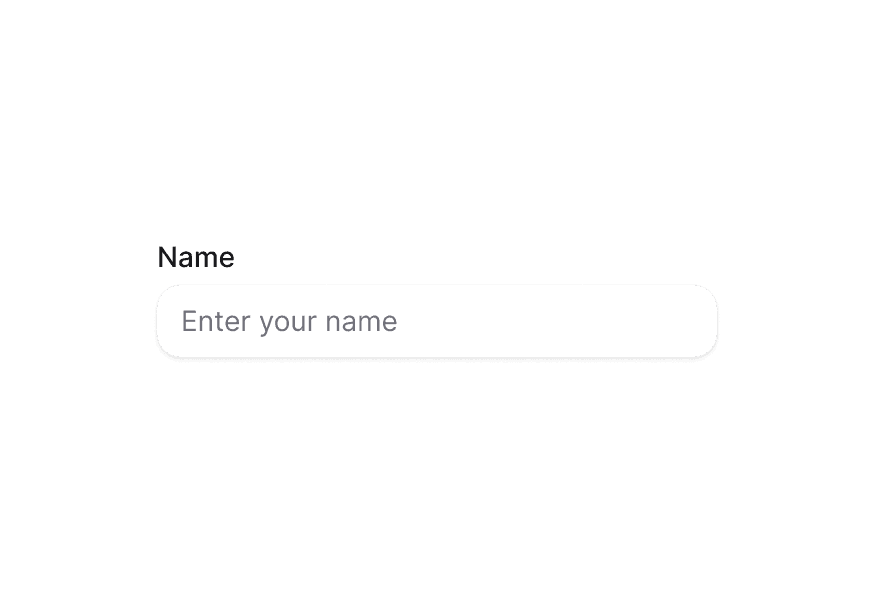
DateField 日期字段
基于 React Aria DateField 的日期输入字段,包含标签、说明与校验
用法
import { DateField } from '@heroui/react';组件结构
import {DateField, Label, Description, FieldError} from '@heroui/react';

export default () => (
  <DateField>
    <Label />
    <DateField.Group>
      <DateField.Input>
        {(segment) => <DateField.Segment segment={segment} />}
      </DateField.Input>
    </DateField.Group>
    <Description />
    <FieldError />
  </DateField>
)
DateField 将标签、日期输入、说明与错误信息组合为单个无障碍组件。
示例
带图标
通过前缀或后缀图标增强日期输入。
变体
DateField.Group 组件支持两种视觉变体:
primary(默认)- 标准样式带阴影,适用于大多数场景secondary- 低强调变体无阴影,适用于 Surface 组件内
表面样式
在 Surface 内使用时,请在 DateField.Group 上使用 variant="secondary" 以应用适合 Surface 背景的低强调变体。
带描述
必填字段
禁用
宽度充满
表单校验
配合 FieldError 使用 isInvalid 展示校验消息。
时间粒度
受控组件
控制 value 以与其他组件或状态管理同步。
表单示例
包含校验与提交的完整表单示例。
带校验
DateField 支持 minValue、maxValue 与自定义校验逻辑。
渲染函数
自定义样式
Tailwind CSS
全局 CSS
DateField 默认样式较轻量。覆盖 .date-field 类可自定义容器样式。
@layer components {
  .date-field {
    @apply flex flex-col gap-1;

    &[data-invalid="true"],
    &[aria-invalid="true"] {
      [data-slot="description"] {
        @apply hidden;
      }
    }

    [data-slot="label"] {
      @apply w-fit;
    }

    [data-slot="description"] {
      @apply px-1;
    }
  }
}
样式参考
HeroUI 遵循 BEM 方法论,确保组件变体与状态可复用且易于自定义。
CSS 类
.date-field– 轻量样式的根容器(flex flex-col gap-1)
Note: 子组件(Label、Description、FieldError)拥有各自的 CSS 类与样式。自定义方式请参阅对应文档。DateField.Group 样式见下文 API 参考。
交互状态
DateField 会根据状态自动设置以下 data 属性:
- Invalid:
[data-invalid="true"]或[aria-invalid="true"]- 无效时自动隐藏 description slot - Required:
[data-required="true"]- 当isRequired为 true 时应用 - Disabled:
[data-disabled="true"]- 当isDisabled为 true 时应用 - Focus Within:
[data-focus-within="true"]- 任一子输入聚焦时应用
API 参考
DateField
DateField 继承 React Aria DateField 的全部 props。
Base Props
| Prop | 类型 | 默认值 | 描述 |
|---|---|---|---|
children | React.ReactNode | (values: DateFieldRenderProps) => React.ReactNode | - | 子组件(Label、DateField.Group 等)或渲染函数。 |
className | string | (values: DateFieldRenderProps) => string | - | 用于样式的 CSS 类,支持渲染 prop。 |
style | React.CSSProperties | (values: DateFieldRenderProps) => React.CSSProperties | - | 内联样式,支持渲染 prop。 |
fullWidth | boolean | false | 日期字段是否占满容器宽度。 |
id | string | - | 元素的唯一 id。 |
render | DOMRenderFunction<keyof React.JSX.IntrinsicElements, DateFieldRenderProps> | - | 使用自定义渲染函数覆盖默认 DOM 元素。 |
Value Props
| Prop | 类型 | 默认值 | 描述 |
|---|---|---|---|
value | DateValue | null | - | 当前值(受控)。类型见 @internationalized/date。 |
defaultValue | DateValue | null | - | 默认值(非受控)。类型见 @internationalized/date。 |
onChange | (value: DateValue | null) => void | - | 值变化时触发的事件处理函数。 |
placeholderValue | DateValue | null | - | 影响占位符格式的占位日期。 |
Validation Props
| Prop | 类型 | 默认值 | 描述 |
|---|---|---|---|
isRequired | boolean | false | 是否在提交表单前要求用户输入。 |
isInvalid | boolean | - | 值是否无效。 |
minValue | DateValue | null | - | 用户可选择最早日期。类型见 @internationalized/date。 |
maxValue | DateValue | null | - | 用户可选择最晚日期。类型见 @internationalized/date。 |
isDateUnavailable | (date: DateValue) => boolean | - | 针对每个日期调用;返回 true 表示该日期不可用。 |
validate | (value: DateValue) => ValidationError | true | null | undefined | - | 自定义校验函数。 |
validationBehavior | 'native' | 'aria' | 'native' | 使用原生 HTML 表单校验还是 ARIA 属性。 |
Format Props
| Prop | 类型 | 默认值 | 描述 |
|---|---|---|---|
granularity | Granularity | - | 显示的最小单位。日期默认为 "day",时间默认为 "minute"。 |
hourCycle | 12 | 24 | - | 以 12 或 24 小时制显示时间;默认由语言环境决定。 |
hideTimeZone | boolean | false | 是否隐藏时区缩写。 |
shouldForceLeadingZeros | boolean | - | 是否始终为月、日、小时等显示前导零。 |
State Props
| Prop | 类型 | 默认值 | 描述 |
|---|---|---|---|
isDisabled | boolean | - | 是否禁用输入。 |
isReadOnly | boolean | - | 是否可选中但不可修改。 |
Form Props
| Prop | 类型 | 默认值 | 描述 |
|---|---|---|---|
name | string | - | 输入元素的 name,用于 HTML 表单提交;以 ISO 8601 字符串提交。 |
autoFocus | boolean | - | 是否在渲染后自动聚焦该元素。 |
autoComplete | string | - | 输入应提供的自动完成类型。 |
Accessibility Props
| Prop | 类型 | 默认值 | 描述 |
|---|---|---|---|
aria-label | string | - | 无可见标签时的无障碍标签。 |
aria-labelledby | string | - | 标注该字段的元素 id。 |
aria-describedby | string | - | 描述该字段的元素 id。 |
aria-details | string | - | 包含额外详情的元素 id。 |
Composition Components
DateField 与以下独立组件配合使用,请分别导入并直接使用:
- Label – 来自
@heroui/react的字段标签 - DateField.Group – 日期输入分组(详见下文)
- DateField.Input – 来自
@heroui/react的分段位编辑输入 - DateField.InputContainer – 可横向滚动的容器,用于组合多个输入(例如开始/结束范围)
- DateField.Segment – 单个日期段位(年、月、日等)
- DateField.Prefix / DateField.Suffix – 输入组的前缀与后缀插槽
- Description – 来自
@heroui/react的辅助说明 - FieldError – 来自
@heroui/react的校验错误信息
这些组件各自有独立的 props API。在 DateField 中直接组合使用:
import {parseDate} from '@internationalized/date';
import {DateField, Label, Description, FieldError} from '@heroui/react';

<DateField
  isRequired
  isInvalid={hasError}
  minValue={today(getLocalTimeZone())}
  value={date}
  onChange={setDate}
>
  <Label>Appointment Date</Label>
  <DateField.Group>
    <DateField.Input>
      {(segment) => <DateField.Segment segment={segment} />}
    </DateField.Input>
  </DateField.Group>
  <Description>Select a date from today onwards.</Description>
  <FieldError>Please select a valid date.</FieldError>
</DateField>
DateValue Types
DateField 使用 @internationalized/date 中的类型:
CalendarDate– 不含时间与时区的日期CalendarDateTime– 含时间、不含时区ZonedDateTime– 含时间与时区Time– 仅时间
示例:
import {parseDate, today, getLocalTimeZone} from '@internationalized/date';

// Parse from string
const date = parseDate('2024-01-15');

// Today's date
const todayDate = today(getLocalTimeZone());

// Use in DateField
<DateField value={date} onChange={setDate}>
  {/* ... */}
</DateField>
说明: DateField 依赖
@internationalized/date进行解析、运算与类型定义。更多类型与函数见 Internationalized Date 文档。
Render Props
对 className、style 或 children 使用渲染 prop 时,可使用以下值:
| Prop | 类型 | 描述 |
|---|---|---|
isDisabled | boolean | 字段是否禁用。 |
isInvalid | boolean | 字段当前是否无效。 |
isReadOnly | boolean | 字段是否只读。 |
isRequired | boolean | 字段是否必填。 |
isFocused | boolean | 字段是否聚焦。 |
isFocusWithin | boolean | 是否有子元素聚焦。 |
isFocusVisible | boolean | 焦点是否可见(键盘导航)。 |
DateField.Group
DateField.Group 继承 React Aria Group 的全部 props,并额外支持:
| Prop | 类型 | 默认值 | 描述 |
|---|---|---|---|
className | string | - | 与组件样式合并的 Tailwind CSS 类。 |
fullWidth | boolean | false | 日期输入组是否占满容器宽度。 |
variant | "primary" | "secondary" | "primary" | 视觉变体。primary 为默认带阴影样式;secondary 为低强调、无阴影,适合用于 Surface。 |
DateField.Input
DateField.Input 继承 React Aria DateInput 的全部 props,并额外支持:
| Prop | 类型 | 默认值 | 描述 |
|---|---|---|---|
className | string | - | 与组件样式合并的 Tailwind CSS 类。 |
variant | "primary" | "secondary" | "primary" | 输入的视觉变体。primary 为默认带阴影样式;secondary 为低强调、无阴影,适合用于 Surface。 |
DateField.Input 接受渲染函数作为子节点,函数参数为日期段位;每个段位对应日期的一部分(年、月、日等)。
DateField.Segment
DateField.Segment 继承 React Aria DateSegment 的全部 props:
| Prop | 类型 | 默认值 | 描述 |
|---|---|---|---|
segment | DateSegment | - | 来自 DateField.Input 渲染函数的 DateSegment 对象。 |
className | string | - | 与组件样式合并的 Tailwind CSS 类。 |
DateField.InputContainer
DateField.InputContainer 接受标准 HTML div 属性:
| Prop | 类型 | 默认值 | 描述 |
|---|---|---|---|
className | string | - | 与组件样式合并的 Tailwind CSS 类。 |
children | ReactNode | - | 滚动容器中的内容(通常为多个 DateField.Input)。 |
DateField.Prefix
DateField.Prefix 接受标准 HTML div 属性:
| Prop | 类型 | 默认值 | 描述 |
|---|---|---|---|
className | string | - | 与组件样式合并的 Tailwind CSS 类。 |
children | ReactNode | - | 前缀插槽中要显示的内容。 |
DateField.Suffix
DateField.Suffix 接受标准 HTML div 属性:
| Prop | 类型 | 默认值 | 描述 |
|---|---|---|---|
className | string | - | 与组件样式合并的 Tailwind CSS 类。 |
children | ReactNode | - | 后缀插槽中要显示的内容。 |
DateField.Group Styling
Customizing the component classes
基础类作用于所有实例,可通过 @layer components 一次性覆盖。
@layer components {
  .date-input-group {
    @apply inline-flex h-9 items-center overflow-hidden rounded-field border bg-field text-sm text-field-foreground shadow-field outline-none;

    &:hover,
    &[data-hovered="true"] {
      @apply bg-field-hover;
    }

    &[data-focus-within="true"],
    &:focus-within {
      @apply status-focused-field;
    }

    &[data-invalid="true"] {
      @apply status-invalid-field;
    }

    &[data-disabled="true"],
    &[aria-disabled="true"] {
      @apply status-disabled;
    }
  }

  .date-input-group__input {
    @apply flex flex-1 items-center gap-px rounded-none border-0 bg-transparent px-3 py-2 shadow-none outline-none;
  }

  .date-input-group__segment {
    @apply inline-block rounded-md px-0.5 text-end tabular-nums outline-none;

    &:focus,
    &[data-focused="true"] {
      @apply bg-accent-soft text-accent-soft-foreground;
    }
  }

  .date-input-group__input-container {
    @apply flex flex-1 items-center;
    overflow-x: auto;
    overflow-y: clip;
    scrollbar-width: none;
  }

  .date-input-group__prefix,
  .date-input-group__suffix {
    @apply pointer-events-none shrink-0 text-field-placeholder flex items-center;
  }
}
DateField.Group CSS Classes
.date-input-group– 根容器样式.date-input-group__input– 输入包裹层样式.date-input-group__input-container– 用于组合多个输入的滚动容器.date-input-group__segment– 单个日期段位样式.date-input-group__prefix– 前缀元素样式.date-input-group__suffix– 后缀元素样式
DateField.Group Interactive States
- Hover:
:hover或[data-hovered="true"] - Focus Within:
[data-focus-within="true"]或:focus-within - Invalid:
[data-invalid="true"](与aria-invalid同步) - Disabled:
[data-disabled="true"]或[aria-disabled="true"] - Segment Focus:段位上
:focus或[data-focused="true"] - Segment Placeholder:段位上
[data-placeholder="true"]