Checkbox 复选框更新
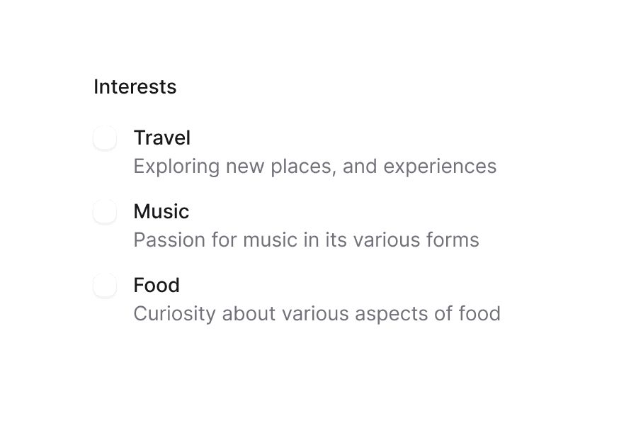
复选框允许用户从列表中选择多项,或标记单个项目为选中状态
用法
import { Checkbox } from '@heroui/react';组件结构
import { Checkbox, Description, FieldError } from '@heroui/react';

export default () => (
  <Checkbox>
    <Checkbox.Content>
      <Checkbox.Control>
        <Checkbox.Indicator />
      </Checkbox.Control>
      Label {/* 纯文本 — 可点击标签与无障碍名称 */}
    </Checkbox.Content>
    <Description /> {/* 可选 — 字段级帮助文本 */}
    <FieldError /> {/* 可选 — 校验消息 */}
  </Checkbox>
);
示例
变体
Checkbox 组件支持两种视觉变体:
primary(默认)- 标准样式与默认背景,适用于大多数场景secondary- 低强调变体,适用于 Surface 组件内
全圆角
禁用
外部标签
带描述
默认选中
无效状态
受控组件
半选状态
表单集成
渲染属性
渲染函数
自定义指示器
自定义样式
Tailwind CSS
全局 CSS
可使用 @layer components 指令自定义 Checkbox 组件类。
了解更多。
@layer components {
  .checkbox {
    @apply inline-flex gap-3 items-center;
  }

  .checkbox__control {
    @apply size-5 border-2 border-gray-400 rounded data-[selected=true]:bg-blue-500 data-[selected=true]:border-blue-500;

    /* Animated background indicator */
    &::before {
      @apply bg-accent pointer-events-none absolute inset-0 z-0 origin-center scale-50 rounded-md opacity-0 content-[''];

      transition:
        scale 200ms linear,
        opacity 200ms linear,
        background-color 200ms ease-out;
    }

    /* Show indicator when selected */
    &[data-selected="true"]::before {
      @apply scale-100 opacity-100;
    }
  }

  .checkbox__indicator {
    @apply text-white;
  }

  .checkbox__content {
    @apply items-center gap-3;
  }
}
样式参考
HeroUI 遵循 BEM 方法论,确保组件变体与状态可复用且易于自定义。
CSS 类
Checkbox 组件使用以下 CSS 类(查看源码样式):
基础类
.checkbox- 基础复选框容器(字段).checkbox__content- 包裹控件与标签文本的可点击 label.checkbox__control- 复选框控件框.checkbox__indicator- 复选框勾选指示器
交互状态
复选框同时支持 CSS 伪类与 data 属性:
- Selected:
[data-selected="true"]或[aria-checked="true"](显示勾选与背景色变化) - Indeterminate:
[data-indeterminate="true"](显示不确定状态的短横线) - Invalid:
[data-invalid="true"]或[aria-invalid="true"](显示 danger 色错误状态) - Hover:
Checkbox.Control(按钮)上的:hover或[data-hovered="true"] - Focus:按钮上的
:focus-visible或[data-focus-visible="true"](控件上显示焦点环) - Disabled:字段上的
[data-disabled="true"](降低透明度,包括帮助文本) - Pressed:
:active或[data-pressed="true"]
API 参考
Checkbox
| Prop | 类型 | 默认值 | 描述 |
|---|---|---|---|
isSelected | boolean | false | 是否选中 |
defaultSelected | boolean | false | 默认是否选中(非受控) |
isIndeterminate | boolean | false | 是否处于不确定状态 |
isDisabled | boolean | false | 是否禁用 |
isInvalid | boolean | false | 是否无效 |
isReadOnly | boolean | false | 是否只读 |
isRequired | boolean | false | 是否必须选中 |
validate | (value: boolean) => ValidationError | true | null | undefined | - | 自定义验证函数 |
validationBehavior | 'native' | 'aria' | 'native' | 使用原生 HTML 表单验证还是 ARIA |
variant | "primary" | "secondary" | "primary" | 视觉变体。primary 为默认带阴影样式;secondary 为低强调无阴影,适用于 Surface 内 |
name | string | - | 提交 HTML 表单时 input 元素的名称 |
value | string | - | 提交 HTML 表单时 input 元素的值 |
onChange | (isSelected: boolean) => void | - | 值变化时的回调 |
children | React.ReactNode | (values: CheckboxFieldRenderProps) => React.ReactNode | - | 内容或字段 render prop |
render | DOMRenderFunction<keyof React.JSX.IntrinsicElements, CheckboxFieldRenderProps> | - | 使用自定义 render 函数覆盖默认 DOM 元素 |
Checkbox.Content
可点击的 <label>,包裹控件与标签文本。将 Checkbox.Control 与 Label 放在其中;Description/FieldError 作为 Checkbox.Content 的兄弟节点。无标签的复选框可省略 Label,并在 Checkbox 上传递 aria-label。
| Prop | 类型 | 默认值 | 描述 |
|---|---|---|---|
children | React.ReactNode | (values: CheckboxButtonRenderProps) => React.ReactNode | - | 按钮内容(控件 + 标签)或按钮 render prop |
className | string | (values: CheckboxButtonRenderProps) => string | - | 应用于可点击 label 的类 |
CheckboxFieldRenderProps
在根 Checkbox 上使用 render prop 时,提供以下字段级值:
| Prop | 类型 | 描述 |
|---|---|---|
isSelected | boolean | 是否当前选中 |
isIndeterminate | boolean | 是否处于不确定状态 |
isDisabled | boolean | 是否禁用 |
isReadOnly | boolean | 是否只读 |
isInvalid | boolean | 是否无效 |
isRequired | boolean | 是否必填 |
CheckboxButtonRenderProps
Checkbox.Control 与 Checkbox.Indicator 使用按钮级 render props(isHovered、isPressed、isFocusVisible 等)。将函数作为 Checkbox.Control 子节点或传给 Checkbox.Indicator 以访问它们。