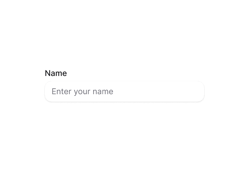
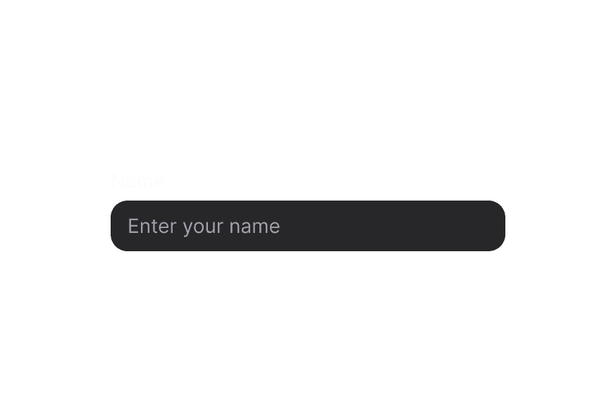
InputGroup 输入框组
将相关输入控件与前后缀元素组合,以增强表单字段
用法
import { InputGroup } from '@heroui/react';组件结构
import {InputGroup, TextField, Label} from '@heroui/react';

export default () => (
  <TextField>
    <Label />
    <InputGroup>
      <InputGroup.Prefix />
      <InputGroup.Input /> {/* Or use InputGroup.TextArea for multiline input */}
      <InputGroup.Suffix />
    </InputGroup>
  </TextField>
)
InputGroup 使用可选的前缀与后缀包裹输入框,形成视觉上统一的组合。通常放在 TextField 内,用于在输入前后添加图标、文字、按钮等元素。单行输入请使用 InputGroup.Input,多行输入请使用 InputGroup.TextArea。
示例
变体
InputGroup 组件支持两种视觉变体:
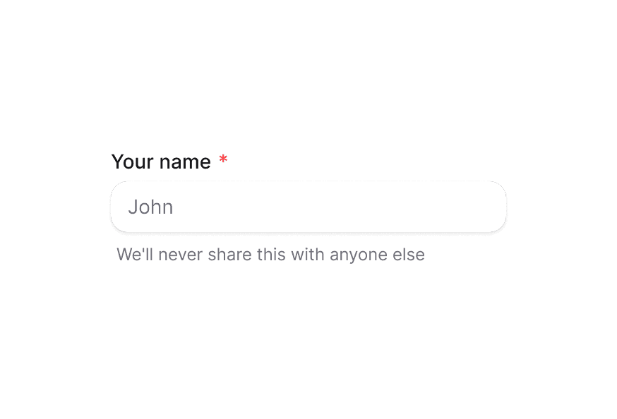
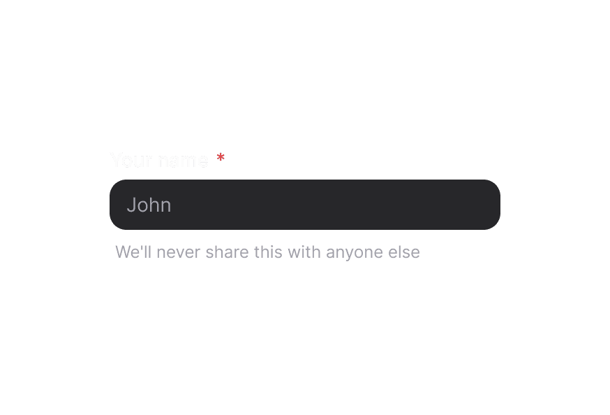
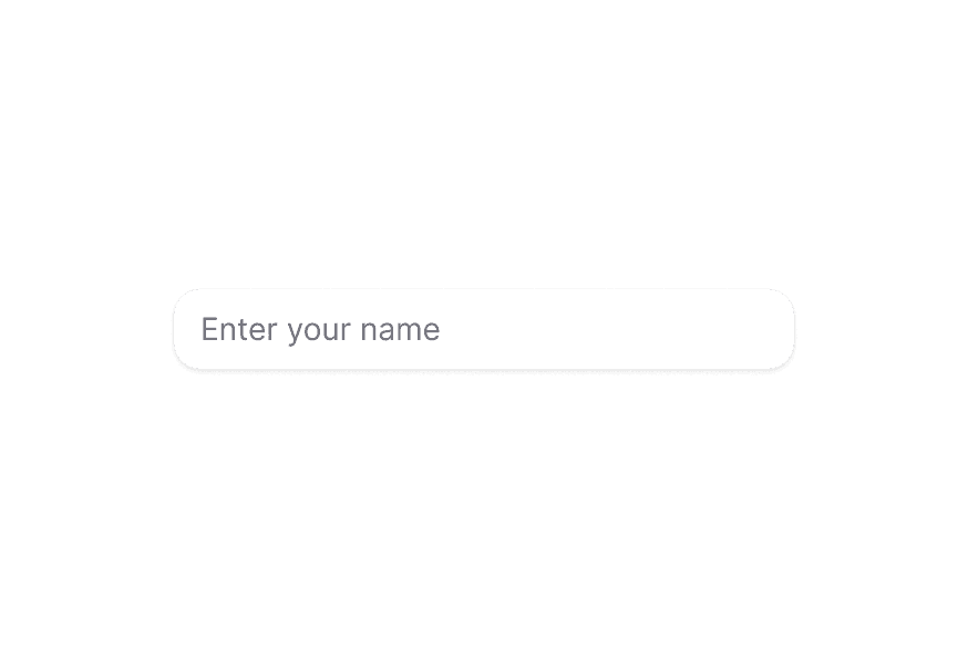
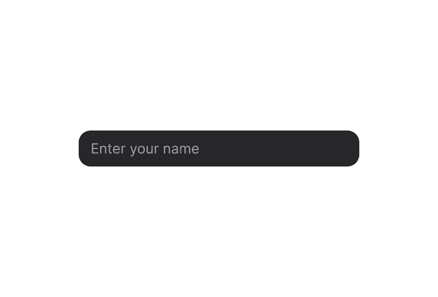
primary(默认)- 标准样式带阴影,适用于大多数场景secondary- 低强调变体无阴影,适用于 Surface 组件内
表面样式
在 Surface 内使用时,请使用 variant="secondary" 以应用适合 Surface 背景的低强调变体。
后缀加载状态
在后缀显示加载 spinner 以表示正在处理。
必填字段
InputGroup 会遵循父级 TextField 的必填状态。
禁用状态
InputGroup 会遵循父级 TextField 的禁用状态。
宽度充满
文字前缀
使用文字作为前缀,例如货币符号或协议前缀。
文字后缀
使用文字作为后缀,例如域名后缀或单位。
图标前缀与文字后缀
组合图标前缀与文字后缀。
复制按钮后缀
在后缀中加入交互按钮,例如复制按钮。
图标前缀与复制按钮
组合图标前缀与交互式后缀按钮。
密码可见性切换
在后缀中使用按钮切换密码可见性。
键盘快捷键
使用 Kbd 组件展示键盘快捷键。
徽章后缀
在后缀中加入徽章或 chip,用于展示状态或标签。
表单校验
InputGroup 会自动反映父级 TextField 的无效状态。
前缀图标
在输入框前添加图标。
后缀图标
在输入框后添加图标。
前缀与后缀
同时组合前缀与后缀。
文本域
多行输入请使用 InputGroup.TextArea,并搭配前缀与后缀。当存在 textarea 时,容器高度会自动适应内容,并将前缀/后缀与顶部对齐。
用法示例
import {InputGroup, TextField, Label, Button} from '@heroui/react';
import {Icon} from '@iconify/react';

function Example() {
  return (
    <TextField>
      <Label>Email</Label>
      <InputGroup>
        <InputGroup.Prefix>
          <Icon icon="gravity-ui:envelope" />
        </InputGroup.Prefix>
        <InputGroup.Input placeholder="name@email.com" />
        <InputGroup.Suffix>
          <Button isIconOnly aria-label="Confirm" size="sm" variant="ghost">
            <Icon icon="gravity-ui:check" />
          </Button>
        </InputGroup.Suffix>
      </InputGroup>
    </TextField>
  );
}
文本域用法示例
import {Envelope} from "@gravity-ui/icons";
import {Description, FieldError, InputGroup, Label, TextField} from "@heroui/react";
import {useState} from "react";

function TextAreaExample() {
  const [feedback, setFeedback] = useState("");

  return (
    <TextField fullWidth isInvalid={feedback.length > 500} name="feedback" onChange={setFeedback}>
      <Label>Your Feedback</Label>
      <InputGroup fullWidth>
        <InputGroup.Prefix>
          <Envelope className="size-4 text-muted" />
        </InputGroup.Prefix>
        <InputGroup.TextArea
          className="resize-none"
          placeholder="Share your thoughts, suggestions, or issues..."
          rows={5}
          value={feedback}
        />
      </InputGroup>
      <Description className="flex w-full items-center justify-between px-1">
        <span>Maximum 500 characters.</span>
        <span className="ml-auto">{feedback.length}/500</span>
      </Description>
      <FieldError>Feedback must be less than 500 characters</FieldError>
    </TextField>
  );
}
自定义样式
Tailwind CSS
全局 CSS
InputGroup 使用可自定义的 CSS 类。覆盖组件类以匹配设计系统。
@layer components {
  .input-group {
    @apply bg-field text-field-foreground shadow-field rounded-field inline-flex min-h-9 items-center overflow-hidden border text-sm outline-none;
  }

  .input-group__input {
    @apply flex-1 rounded-none border-0 bg-transparent px-3 py-2 shadow-none outline-none;
  }

  .input-group__prefix {
    @apply text-field-placeholder rounded-l-field flex h-full items-center justify-center rounded-r-none bg-transparent px-3;
  }

  .input-group__suffix {
    @apply text-field-placeholder rounded-r-field flex h-full items-center justify-center rounded-l-none bg-transparent px-3;
  }

  /* Secondary variant */
  .input-group--secondary {
    @apply shadow-none;
    background-color: var(--color-default);
  }
}
样式参考
HeroUI 遵循 BEM 方法论,确保组件变体与状态可复用且易于自定义。
CSS 类
基础类
.input-group– 根容器:带边框、背景与 flex 布局。默认min-h-9与items-center;存在 textarea 时切换为items-start.input-group__input– 透明背景、无边框的输入元素。textarea 也使用该基础类.input-group__prefix– 左侧圆角的前缀容器。与 textarea 搭配时与顶部对齐.input-group__suffix– 右侧圆角的后缀容器。与 textarea 搭配时与顶部对齐
变体类
.input-group--primary– 带阴影的主变体(默认).input-group--secondary– 无阴影的次变体,适用于 Surface 内
Note: 使用 InputGroup.TextArea 时,容器从 items-center 切换为 items-start,并使用 height: auto 替代固定高度。前缀与后缀与顶部对齐,并增加内边距以匹配 textarea 的垂直内边距。textarea 使用相同的 .input-group__input 基础类,并通过 [data-slot="input-group-textarea"] 选择器应用 textarea 专用样式(最小高度与纵向 resize)。
交互状态
InputGroup 会根据状态自动管理以下 data 属性:
- Hover:
[data-hovered]- 悬停在组合上时应用 - Focus Within:
[data-focus-within]- 输入聚焦时应用 - Invalid:
[data-invalid]- 父级 TextField 无效时应用 - Disabled:
[data-disabled]或[aria-disabled]- 父级 TextField 禁用时应用
API 参考
InputGroup
InputGroup 继承 React Aria Group 组件的全部 props。
Base Props
| Prop | 类型 | 默认值 | 描述 |
|---|---|---|---|
children | React.ReactNode | (values: GroupRenderProps) => React.ReactNode | - | 子组件(Input、TextArea、Prefix、Suffix)或 render 函数 |
className | string | (values: GroupRenderProps) => string | - | CSS 类,支持 render props |
style | React.CSSProperties | (values: GroupRenderProps) => React.CSSProperties | - | 行内样式,支持 render props |
fullWidth | boolean | false | 输入组是否占满容器宽度 |
id | string | - | 元素唯一标识符 |
Variant Props
| Prop | 类型 | 默认值 | 描述 |
|---|---|---|---|
variant | "primary" | "secondary" | "primary" | 视觉变体。primary 为默认带阴影样式;secondary 为低强调无阴影,适用于 Surface 内 |
Accessibility Props
| Prop | 类型 | 默认值 | 描述 |
|---|---|---|---|
aria-label | string | - | 无可见标签时的无障碍标签 |
aria-labelledby | string | - | 标注该组的元素 ID |
aria-describedby | string | - | 描述该组的元素 ID |
aria-details | string | - | 包含更多详情的元素 ID |
role | 'group' | 'region' | 'presentation' | 'group' | 分组的无障碍角色。重要内容用 region,纯视觉分组用 presentation |
Composition Components
InputGroup 与以下子组件配合使用:
- InputGroup.Root - 根容器(也可写作
InputGroup) - InputGroup.Input - 单行输入元素组件
- InputGroup.TextArea - 多行 textarea 元素组件
- InputGroup.Prefix - 前缀容器组件
- InputGroup.Suffix - 后缀容器组件
InputGroup.Input
InputGroup.Input 继承 React Aria Input 组件的全部 props。
| Prop | 类型 | 默认值 | 描述 |
|---|---|---|---|
className | string | - | CSS 类 |
variant | "primary" | "secondary" | "primary" | 输入视觉变体 |
type | string | 'text' | 输入类型(text、password、email 等) |
value | string | - | 当前值(受控) |
defaultValue | string | - | 默认值(非受控) |
placeholder | string | - | 占位文本 |
disabled | boolean | - | 是否禁用 |
readOnly | boolean | - | 是否只读 |
InputGroup.TextArea
InputGroup.TextArea 继承 React Aria TextArea 组件的全部 props。
| Prop | 类型 | 默认值 | 描述 |
|---|---|---|---|
className | string | - | CSS 类 |
variant | "primary" | "secondary" | "primary" | textarea 视觉变体 |
value | string | - | 当前值(受控) |
defaultValue | string | - | 默认值(非受控) |
placeholder | string | - | 占位文本 |
rows | number | - | 可见文本行数 |
disabled | boolean | - | 是否禁用 |
readOnly | boolean | - | 是否只读 |
InputGroup.Prefix
| Prop | 类型 | 默认值 | 描述 |
|---|---|---|---|
children | React.ReactNode | - | 前缀内容(图标、文字等) |
className | string | - | CSS 类 |
InputGroup.Suffix
| Prop | 类型 | 默认值 | 描述 |
|---|---|---|---|
children | React.ReactNode | - | 后缀内容(图标、按钮、徽章等) |
className | string | - | CSS 类 |