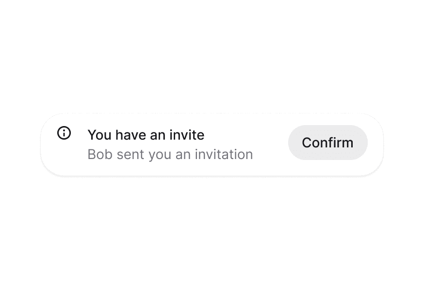
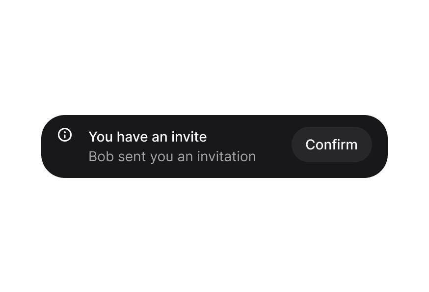
向用户展示临时通知与消息,支持自动消失与可定制的放置位置。
import { Toast, toast } from '@heroui/react';
<Toast.Provider>
  <Toast>
    <Toast.Indicator />
    <Toast.Content>
      <Toast.Title />
      <Toast.Description />
    </Toast.Content>
    <Toast.ActionButton />
    <Toast.CloseButton />
  </Toast>
</Toast.Provider>
在应用根节点渲染 Provider。
import { Toast, Button, toast } from '@heroui/react';

function App() {
  return (
    <div>
      <Toast.Provider />
      <Button onPress={() => toast("Simple message")}>
        Show toast
      </Button>
    </div>
  );
}
若要自定义组件类,可使用 @layer components 指令。了解更多。
@layer components {
  .toast {
    @apply rounded-xl shadow-lg;
  }

  .toast__content {
    @apply gap-2;
  }
}
HeroUI 遵循 BEM 方法论,确保组件变体与状态可复用且易于自定义。
Toast 使用以下 CSS 类(查看源码样式):
.toast — Toast 根容器.toast-region — Toast 区域容器.toast__content — 包裹标题与说明的内容容器.toast__indicator — 图标/指示器容器.toast__title — Toast 标题文本.toast__description — Toast 说明文本.toast__action — 操作按钮容器.toast__close-button — 关闭按钮容器
.toast--default — 默认灰色变体.toast--accent — 强调蓝色变体.toast--success — 成功绿色变体.toast--warning — 警告黄/橙色变体.toast--danger — 危险红色变体
组件支持多种状态:
- 最前:
[data-frontmost] — 应用于堆叠中最上层可见的 Toast
- 索引:
[data-index] — 基于 Toast 在堆叠中的位置
- 放置:
[data-placement="*"] — 基于 Toast 区域的放置位置
- 进入中:
[data-entering] — Toast 首次绘制时应用
- 退出中:
[data-exiting] — 关闭中的 Toast 播放退出过渡时应用
- 展开:
[data-expanded] — 堆叠展开时应用于每个 Toast
- 隐藏:
[data-hidden] — 应用于超出 maxVisibleToasts 的 Toast
| Prop | 类型 | 默认值 | 描述 |
|---|
placement | "top start" | "top" | "top end" | "bottom start" | "bottom" | "bottom end" | "bottom" | Toast 区域的放置位置 |
gap | number | 12 | Toast 之间的间距(像素) |
isExpanded | boolean | false | 强制堆叠保持展开布局(不会暂停计时器) |
maxVisibleToasts | number | 3 | 同时最多显示的 Toast 数量 |
hotkey | string[] | ["altKey", "KeyT"] | 将焦点移入 Toast 区域并展开堆叠的快捷键。修饰键使用 KeyboardEvent 布尔属性名(如 "altKey"),其他按键使用 event.code(如 "KeyT")。未列出的修饰键必须处于松开状态,因此 Alt+T 不会在 Ctrl+Alt+T 时触发。传 [] 可禁用 |
scaleFactor | number | 0.05 | 堆叠 Toast 的缩放系数(0–1) |
width | number | string | 460 | Toast 宽度(像素或 CSS 值) |
queue | ToastQueue<T> | - | 自定义 Toast 队列实例 |
children | ReactNode | ((props: {toast: QueuedToast<T>}) => ReactNode) | - | 自定义渲染函数或子节点 |
className | string | - | 附加的 CSS 类 |
| Prop | 类型 | 默认值 | 描述 |
|---|
toast | QueuedToast<T> | - | 来自队列的 Toast 数据(必填) |
variant | "default" | "accent" | "success" | "warning" | "danger" | "default" | Toast 的视觉变体 |
placement | ToastVariants["placement"] | - | 放置位置(继承自 Provider) |
scaleFactor | number | - | 缩放系数(继承自 Provider) |
className | string | - | 附加的 CSS 类 |
children | ReactNode | - | Toast 内容(ToastContent、ToastIndicator 等) |
| Prop | 类型 | 默认值 | 描述 |
|---|
children | ReactNode | - | 内容(通常为 ToastTitle 与 ToastDescription) |
className | string | - | 附加的 CSS 类 |
| Prop | 类型 | 默认值 | 描述 |
|---|
variant | ToastVariants["variant"] | - | 默认图标的变体 |
children | ReactNode | - | 自定义指示图标(默认使用变体图标) |
className | string | - | 附加的 CSS 类 |
| Prop | 类型 | 默认值 | 描述 |
|---|
children | ReactNode | - | 标题文本 |
className | string | - | 附加的 CSS 类 |
| Prop | 类型 | 默认值 | 描述 |
|---|
children | ReactNode | - | 说明文本 |
className | string | - | 附加的 CSS 类 |
| Prop | 类型 | 默认值 | 描述 |
|---|
children | ReactNode | - | 操作按钮内容 |
className | string | - | 附加的 CSS 类 |
All Button props | - | - | 接受 Button 组件的全部 props |
| Prop | 类型 | 默认值 | 描述 |
|---|
className | string | - | 附加的 CSS 类 |
All CloseButton props | - | - | 接受 CloseButton 组件的全部 props |
ToastQueue 用于管理 <Toast.Provider> 的状态。状态存放在 React 之外,因此你可以在应用的任意位置触发 Toast。
| Option | 类型 | 默认值 | 描述 |
|---|
exitDuration | number | 300 | 关闭中的 Toast 为播放退出动画而保持挂载的时长(0 表示立即移除) |
maxVisibleToasts | number | 3 | 同时最多显示的 Toast 数量(仅视觉) |
wrapUpdate | (fn: () => void) => void | - | 包裹状态更新的函数(例如 document.startViewTransition);默认直接应用更新并由 CSS transition 驱动动画 |
| Method | 参数 | 返回值 | 描述 |
|---|
add | (content: T, options?: ToastOptions) | string | 将 Toast 加入队列,返回 Toast key |
update | (key: string, content: T, options?: {timeout?: number; onClose?: () => void}) | boolean | 原地更新 Toast,保持其在堆叠中的位置;timeout 重新开始倒计时(0 表示保持打开),省略则沿用当前倒计时。Toast 已不存在时返回 false |
close | (key: string) | void | 按 key 关闭 Toast |
pauseAll | () | void | 暂停所有 Toast 计时器 |
resumeAll | () | void | 恢复所有 Toast 计时器 |
clear | () | void | 关闭所有 Toast(每个 Toast 播放退出动画并触发各自的 onClose) |
subscribe | (fn: () => void) | () => void | 订阅队列变化,返回取消订阅函数 |
默认 toast 函数提供便捷方法用于显示 Toast:
import { toast } from '@heroui/react';

// 基础 toast(默认约 4 秒后自动消失)
toast("Event has been created");

// 变体方法(默认同样约 4 秒后自动消失)
toast.success("File saved");
toast.info("New update available");
toast.warning("Please check your settings");
toast.danger("Something went wrong");

// 传入 options。利用返回的 id,操作按钮可以关闭它所属的 Toast。
const eventId = toast("Event has been created", {
  description: "Your event has been scheduled for tomorrow",
  variant: "default",
  timeout: 5000, // 自定义超时:5 秒
  onClose: () => console.log("Closed"),
  actionProps: {
    children: "View",
    onPress: () => toast.close(eventId),
  },
  indicator: <CustomIcon />,
});

// 原地更新已有 Toast(保持其在堆叠中的位置)。
// 省略的选项会被继承,因此若原 Toast 是持久的,需要显式传入 `timeout` 才会开始倒计时。
const id = toast("Saving…", { timeout: 0 });
toast.update(id, "Saved", { variant: "success", timeout: 4000 });

// Promise 支持(自动显示加载指示)。Promise 结束时加载 Toast 会原地更新 —
// 同一个 Toast、同一个堆叠位置;自动关闭倒计时从这一刻开始。
toast.promise(
  uploadFile(),
  {
    loading: "Uploading file...",
    success: (data) => `File ${data.filename} uploaded`,
    error: "Failed to upload file",
  }
);

// 手动加载状态(持久 toast:不自动消失)
const loadingId = toast("Creating event...", {
  isLoading: true,
  timeout: 0, // 持久 toast:不自动消失
});

// 随后原地更新,并开始自动关闭倒计时
toast.update(loadingId, "Event created", { variant: "success", timeout: 4000 });

// 队列方法
toast.close(key);
toast.clear();
toast.pauseAll();
toast.resumeAll();
| Option | 类型 | 默认值 | 描述 |
|---|
title | ReactNode | - | Toast 标题(变体方法的第一个参数) |
description | ReactNode | - | 可选说明文本 |
variant | "default" | "accent" | "success" | "warning" | "danger" | "default" | 视觉变体 |
indicator | ReactNode | - | 自定义指示图标(null 可隐藏) |
actionProps | ButtonProps | - | 操作按钮 props |
isLoading | boolean | false | 使用加载指示替代指示器 |
timeout | number | 4000 | 自动消失超时(毫秒)。默认 4000ms(4 秒)。设为 0 表示持久 Toast,不自动消失 |
onClose | () => void | - | Toast 被关闭时触发(此时退出动画开始播放) |
| Option | 类型 | 默认值 | 描述 |
|---|
loading | ReactNode | - | Promise pending 时显示的消息 |
success | ReactNode | ((data: T) => ReactNode) | - | 成功时显示的消息(可为函数) |
error | ReactNode | ((error: Error) => ReactNode) | - | 失败时显示的消息(可为函数) |
每个 Toast 实现 WAI-ARIA AlertDialog 模式,并分组渲染在带标签的地标区域中:
- 地标区域:Toast 渲染在可通过
F6 到达的带标签地标区域中;Alt + T 可将焦点直接移入。快捷键可通过 hotkey prop 配置,传空数组可禁用;区域标签可通过 aria-label 覆盖
- 键盘:
Tab 可到达可见 Toast 的控件,Escape 折叠展开的堆叠;关闭聚焦的 Toast 时焦点会移至最近的剩余 Toast
- 屏幕阅读器:每个 Toast 使用
role="alertdialog" 并关联标题与描述;新 Toast 会自动播报
- 计时器:悬停或聚焦堆叠时、以及页面处于后台标签页时,自动关闭计时会暂停