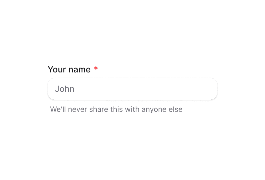
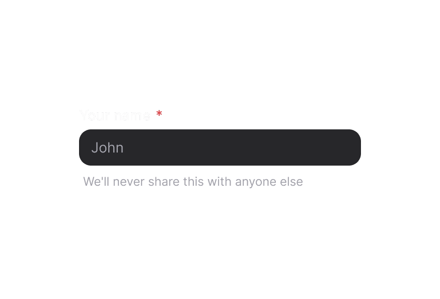
TextArea
Primitive multiline text input component that accepts standard HTML attributes
Usage
import { TextArea } from '@heroui/react';For validation, labels, and error messages, see TextField.
Examples
Variants
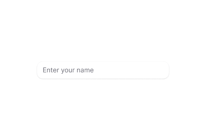
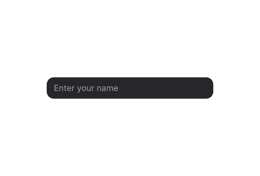
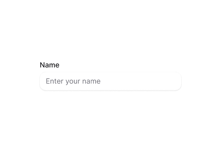
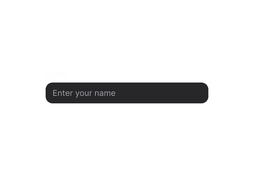
The TextArea component supports two visual variants:
primary(default) - Standard styling with shadow, suitable for most use casessecondary- Lower emphasis variant without shadow, suitable for use in Surface components
In Surface
When used inside a Surface component, use variant="secondary" to apply the lower emphasis variant suitable for surface backgrounds.
Full Width
Controlled
Rows and Resizing
Customization
Tailwind CSS
Global CSS
Override the shared .textarea class once with Tailwind's @layer components.
@layer components {
  .textarea {
    @apply rounded-xl border border-border bg-surface px-4 py-3 text-sm leading-6 shadow-sm;

    &:hover,
    &[data-hovered="true"] {
      @apply bg-surface-secondary border-border/80;
    }

    &:focus-visible,
    &[data-focus-visible="true"] {
      @apply border-accent ring-2 ring-accent/20;
    }

    &[data-invalid="true"] {
      @apply border-danger bg-danger-soft text-danger;
    }
  }
}
Styling Reference
HeroUI follows the BEM methodology to ensure component variants and states are reusable and easy to customize.
CSS Classes
Base Classes
.textarea– Underlying<textarea>element styling
Interactive States
- Hover:
:hoveror[data-hovered="true"] - Focus Visible:
:focus-visibleor[data-focus-visible="true"] - Invalid:
[data-invalid="true"] - Disabled:
:disabledor[aria-disabled="true"]
API Reference
TextArea
TextArea accepts all standard HTML <textarea> attributes plus the following:
| Prop | Type | Default | Description |
|---|---|---|---|
className | string | - | Tailwind classes merged with the base styles. |
rows | number | 3 | Number of visible text lines. |
cols | number | - | Visible width of the text control. |
value | string | - | Controlled value for the textarea. |
defaultValue | string | - | Initial uncontrolled value. |
onChange | (event: React.ChangeEvent<HTMLTextAreaElement>) => void | - | Change handler. |
placeholder | string | - | Placeholder text. |
disabled | boolean | false | Disables the textarea. |
readOnly | boolean | false | Makes the textarea read-only. |
required | boolean | false | Marks the textarea as required. |
name | string | - | Name for form submission. |
autoComplete | string | - | Autocomplete hint for the browser. |
maxLength | number | - | Maximum number of characters. |
minLength | number | - | Minimum number of characters. |
wrap | 'soft' | 'hard' | - | How text wraps when submitted. |
fullWidth | boolean | false | Whether the textarea should take full width of its container |
variant | "primary" | "secondary" | "primary" | Visual variant of the component. primary is the default style with shadow. secondary is a lower emphasis variant without shadow, suitable for use in surfaces. |
For validation props like
isInvalid,isRequired, and error handling, use TextField with TextArea as a child component.