CheckboxUpdated
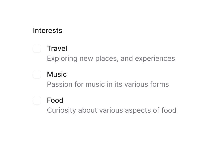
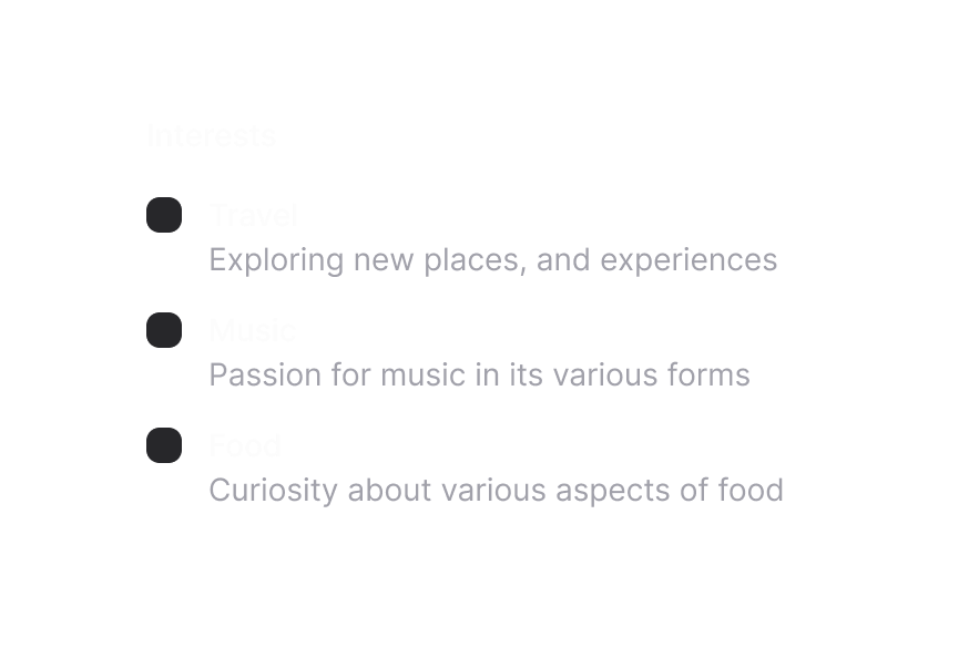
Checkboxes allow users to select multiple items from a list of individual items, or to mark one individual item as selected.
Import
import { Checkbox } from '@heroui/react';Usage
Anatomy
Import the Checkbox component and access all parts using dot notation.
import { Checkbox, Description, FieldError } from '@heroui/react';

export default () => (
  <Checkbox>
    <Checkbox.Content>
      <Checkbox.Control>
        <Checkbox.Indicator />
      </Checkbox.Control>
      Label {/* plain text — the clickable label + accessible name */}
    </Checkbox.Content>
    <Description /> {/* Optional — field-level help text */}
    <FieldError /> {/* Optional — validation message */}
  </Checkbox>
);
Disabled
Default Selected
Controlled
Indeterminate
External Label
With Description
Render Props
Form Integration
Invalid
Custom Indicator
Full Rounded
Variants
The Checkbox component supports two visual variants:
primary(default) - Standard styling with default background, suitable for most use casessecondary- Lower emphasis variant, suitable for use in Surface components
Custom Render Function
Styling
Passing Tailwind CSS classes
You can customize individual Checkbox components:
import { Checkbox } from '@heroui/react';

function CustomCheckbox() {
  return (
    <Checkbox name="custom">
      <Checkbox.Content>
        <Checkbox.Control className="border-2 border-purple-500 data-[selected=true]:bg-purple-500">
          <Checkbox.Indicator className="text-white" />
        </Checkbox.Control>
        Custom Checkbox
      </Checkbox.Content>
    </Checkbox>
  );
}
Customizing the component classes
To customize the Checkbox component classes, you can use the @layer components directive.
Learn more.
@layer components {
  .checkbox {
    @apply inline-flex gap-3 items-center;
  }

  .checkbox__control {
    @apply size-5 border-2 border-gray-400 rounded data-[selected=true]:bg-blue-500 data-[selected=true]:border-blue-500;

    /* Animated background indicator */
    &::before {
      @apply bg-accent pointer-events-none absolute inset-0 z-0 origin-center scale-50 rounded-md opacity-0 content-[''];

      transition:
        scale 200ms linear,
        opacity 200ms linear,
        background-color 200ms ease-out;
    }

    /* Show indicator when selected */
    &[data-selected="true"]::before {
      @apply scale-100 opacity-100;
    }
  }

  .checkbox__indicator {
    @apply text-white;
  }

  .checkbox__content {
    @apply items-center gap-3;
  }
}
HeroUI follows the BEM methodology to ensure component variants and states are reusable and easy to customize.
CSS Classes
The Checkbox component uses these CSS classes (View source styles):
.checkbox- Base checkbox container (the field).checkbox__content- Clickable label wrapping the control and label text.checkbox__control- Checkbox control box.checkbox__indicator- Checkbox checkmark indicator
Interactive States
The checkbox supports both CSS pseudo-classes and data attributes for flexibility:
- Selected:
[data-selected="true"]or[aria-checked="true"](shows checkmark and background color change) - Indeterminate:
[data-indeterminate="true"](shows indeterminate state with dash) - Invalid:
[data-invalid="true"]or[aria-invalid="true"](shows error state with danger colors) - Hover:
:hoveror[data-hovered="true"]onCheckbox.Control(button) - Focus:
:focus-visibleor[data-focus-visible="true"]on the button (shows focus ring on control) - Disabled:
[data-disabled="true"]on the field (reduced opacity, including help text) - Pressed:
:activeor[data-pressed="true"]
API Reference
Checkbox Props
Inherits from React Aria CheckboxField.
| Prop | Type | Default | Description |
|---|---|---|---|
isSelected | boolean | false | Whether the checkbox is checked |
defaultSelected | boolean | false | Whether the checkbox is checked by default (uncontrolled) |
isIndeterminate | boolean | false | Whether the checkbox is in an indeterminate state |
isDisabled | boolean | false | Whether the checkbox is disabled |
isInvalid | boolean | false | Whether the checkbox is invalid |
isReadOnly | boolean | false | Whether the checkbox is read only |
isRequired | boolean | false | Whether the checkbox must be selected |
validate | (value: boolean) => ValidationError | true | null | undefined | - | Custom validation function |
validationBehavior | 'native' | 'aria' | 'native' | Whether to use native HTML form validation or ARIA |
variant | "primary" | "secondary" | "primary" | Visual variant of the component. primary is the default style with shadow. secondary is a lower emphasis variant without shadow, suitable for use in surfaces. |
name | string | - | The name of the input element, used when submitting an HTML form |
value | string | - | The value of the input element, used when submitting an HTML form |
onChange | (isSelected: boolean) => void | - | Handler called when the checkbox value changes |
children | React.ReactNode | (values: CheckboxFieldRenderProps) => React.ReactNode | - | Checkbox content or field render prop |
render | DOMRenderFunction<keyof React.JSX.IntrinsicElements, CheckboxFieldRenderProps> | - | Overrides the default DOM element with a custom render function. |
Checkbox.Content Props
The clickable <label> that wraps the control and label text. Put Checkbox.Control and the Label inside it; keep Description/FieldError as siblings of Checkbox.Content. For a checkbox with no label, omit the Label and pass an aria-label on Checkbox.
| Prop | Type | Default | Description |
|---|---|---|---|
children | React.ReactNode | (values: CheckboxButtonRenderProps) => React.ReactNode | - | Button content (control + label), or a button render prop |
className | string | (values: CheckboxButtonRenderProps) => string | - | Classes applied to the clickable label |
CheckboxFieldRenderProps
When using a render prop on the root Checkbox, these field-level values are provided:
| Prop | Type | Description |
|---|---|---|
isSelected | boolean | Whether the checkbox is currently checked |
isIndeterminate | boolean | Whether the checkbox is in an indeterminate state |
isDisabled | boolean | Whether the checkbox is disabled |
isReadOnly | boolean | Whether the checkbox is read only |
isInvalid | boolean | Whether the checkbox is invalid |
isRequired | boolean | Whether the checkbox is required |
CheckboxButtonRenderProps
Checkbox.Control and Checkbox.Indicator use button-level render props (isHovered, isPressed, isFocusVisible, etc.). Pass a function as Checkbox.Control children or to Checkbox.Indicator to access them.