Description
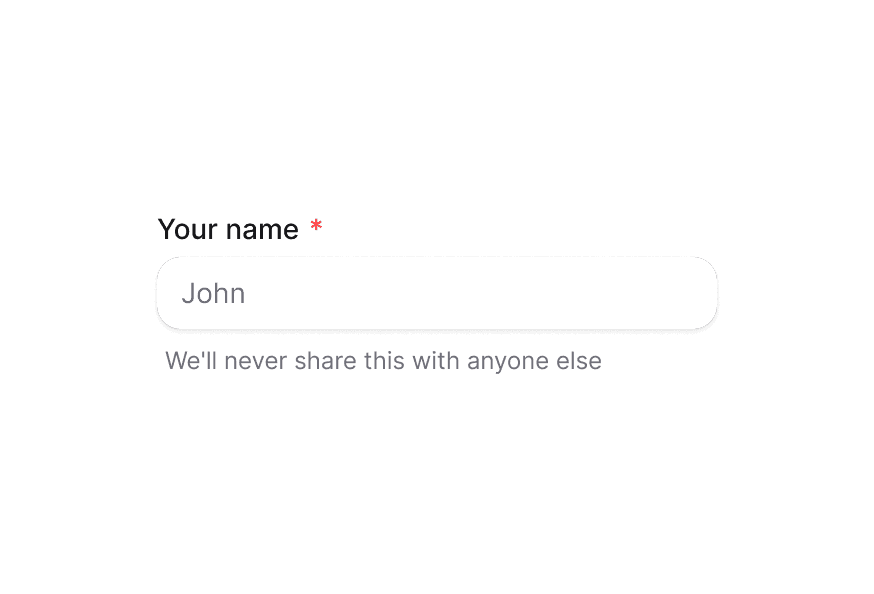
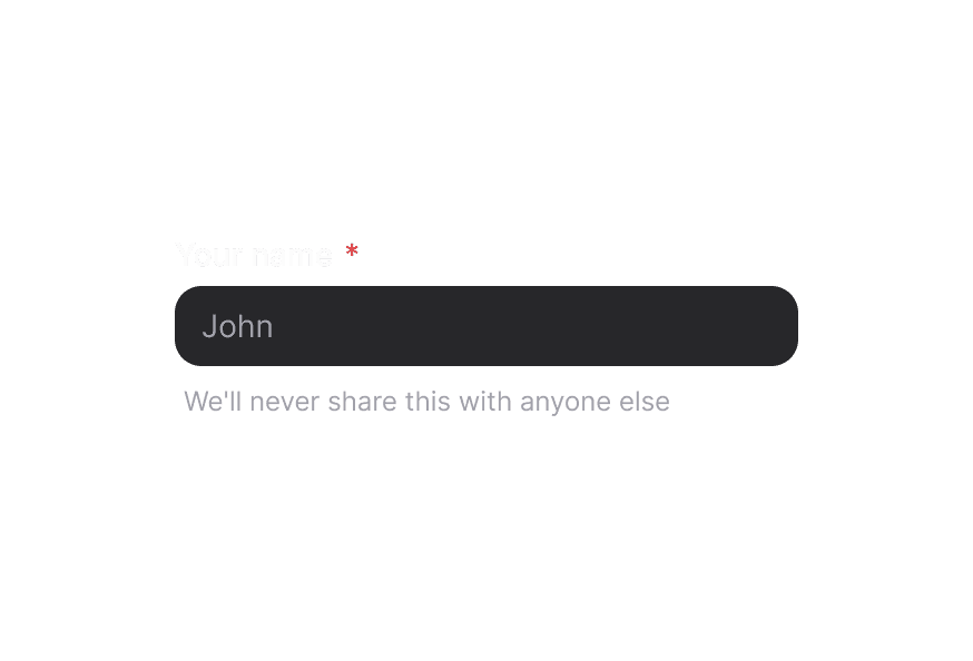
Provides supplementary text for form fields and other components
Usage
import { Description } from '@heroui/react';Examples
With Form Fields
<div className="flex flex-col gap-1">
  <Label htmlFor="password">Password</Label>
  <Input id="password" type="password" aria-describedby="password-description" />
  <Description id="password-description">
    Must be at least 8 characters with one uppercase letter
  </Description>
</div>
Integration with TextField
import {TextField, Label, Input, Description} from '@heroui/react';

<TextField type="email">
  <Label>Email</Label>
  <Input placeholder="Enter your email" />
  <Description>We'll never share your email</Description>
</TextField>
When using the TextField component, accessibility attributes are automatically applied to the label and description.
Customization
Tailwind CSS
Global CSS
To customize the Description component classes, you can use the @layer components directive. Learn more.
@layer components {
  .description {
    @apply text-muted;
  }
}
Styling Reference
HeroUI follows the BEM methodology to ensure component variants and states are reusable and easy to customize.
CSS Classes
The Description component uses these CSS classes (View source styles):
Base Classes
.description- Base description styles withmutedtext color
API Reference
Description
| Prop | Type | Default | Description |
|---|---|---|---|
className | string | - | Additional CSS classes |
children | ReactNode | - | The content of the description |
Accessibility
The Description component enhances accessibility by:
- Using semantic HTML that screen readers can identify
- Providing the
slot="description"attribute for React Aria integration - Supporting proper text contrast ratios