Disclosure
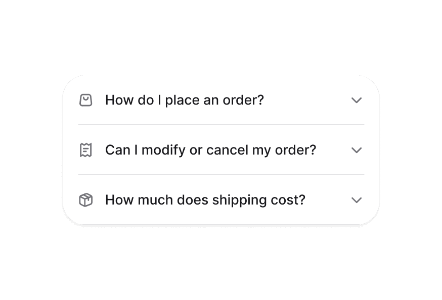
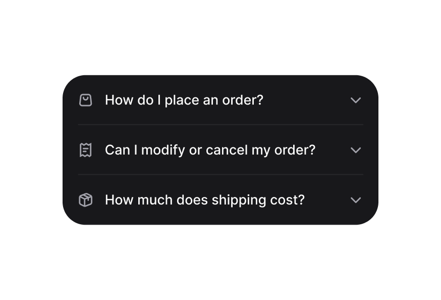
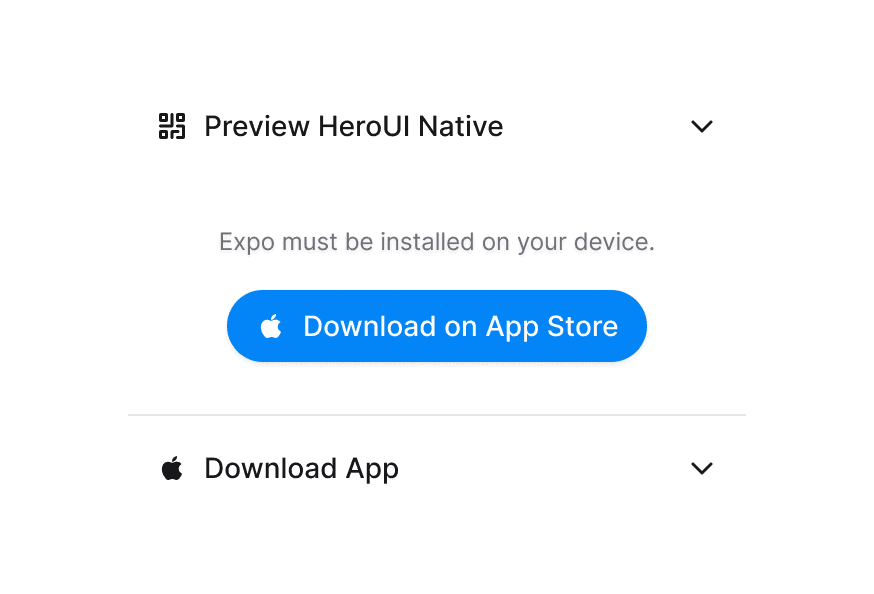
A disclosure is a collapsible section with a header containing a heading and a trigger button, and a panel that wraps the content.
Usage
import { Disclosure } from '@heroui/react';Anatomy
import { Disclosure } from '@heroui/react';

export default () => (
  <Disclosure>
    <Disclosure.Heading>
      <Disclosure.Trigger>
        <Disclosure.Indicator />
      </Disclosure.Trigger>
    </Disclosure.Heading>
    <Disclosure.Content/>
  </Disclosure>
)
Examples
Render Function
Customization
Tailwind CSS
Global CSS
To customize the Disclosure component classes, you can use the @layer components directive.
Learn more.
@layer components {
  .disclosure {
    @apply relative;
  }

  .disclosure__trigger {
    @apply cursor-pointer;
  }

  .disclosure__indicator {
    @apply transition-transform duration-300;
  }

  .disclosure__content {
    @apply overflow-hidden transition-all;
  }
}
Styling Reference
HeroUI follows the BEM methodology to ensure component variants and states are reusable and easy to customize.
CSS Classes
The Disclosure component uses these CSS classes (View source styles):
Base Classes
.disclosure- Base container styles.disclosure__heading- Heading wrapper.disclosure__trigger- Trigger button styles.disclosure__indicator- Chevron indicator styles.disclosure__content- Content container with animations
Interactive States
The component supports both CSS pseudo-classes and data attributes for flexibility:
- Expanded:
[data-expanded="true"]on indicator for rotation - Focus:
:focus-visibleor[data-focus-visible="true"]on trigger - Disabled:
:disabledor[aria-disabled="true"]on trigger - Hidden:
[aria-hidden="false"]on content for visibility
API Reference
Disclosure
| Prop | Type | Default | Description |
|---|---|---|---|
isExpanded | boolean | false | Controls the expanded state |
onExpandedChange | (isExpanded: boolean) => void | - | Callback when expanded state changes |
isDisabled | boolean | false | Whether the disclosure is disabled |
children | ReactNode | RenderFunction | - | Content to render |
className | string | - | Additional CSS classes |
render | DOMRenderFunction<keyof React.JSX.IntrinsicElements, DisclosureRenderProps> | - | Overrides the default DOM element with a custom render function. |
DisclosureTrigger
| Prop | Type | Default | Description |
|---|---|---|---|
children | ReactNode | RenderFunction | - | Trigger content |
className | string | - | Additional CSS classes |
DisclosureContent
| Prop | Type | Default | Description |
|---|---|---|---|
children | ReactNode | - | Content to show/hide |
className | string | - | Additional CSS classes |
render | DOMRenderFunction<keyof React.JSX.IntrinsicElements, DisclosureContentRenderProps> | - | Overrides the default DOM element with a custom render function. |
Render Props
When using the render prop pattern, these values are provided:
| Prop | Type | Description |
|---|---|---|
isExpanded | boolean | Current expanded state |
isDisabled | boolean | Whether disclosure is disabled |