DisclosureGroup
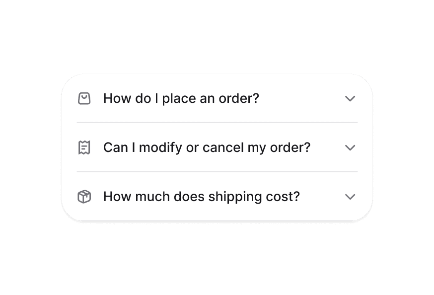
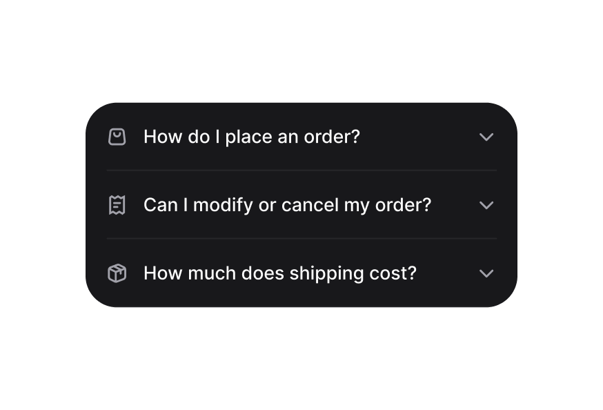
Container that manages multiple Disclosure items with coordinated expanded states
Usage
import { DisclosureGroup } from '@heroui/react';Anatomy
import {DisclosureGroup, Disclosure} from '@heroui/react';

export default () => (
  <DisclosureGroup>
    <Disclosure id="item1">
      <Disclosure.Heading>
        <Disclosure.Trigger>
          <Disclosure.Indicator />
        </Disclosure.Trigger>
      </Disclosure.Heading>
      <Disclosure.Content />
    </Disclosure>
  </DisclosureGroup>
)
Examples
Controlled
You can control which disclosures are expanded with external navigation controls using the expandedKeys and onExpandedChange props.
Customization
Tailwind CSS
Global CSS
To customize the DisclosureGroup component classes, you can use the @layer components directive.
Learn more.
@layer components {
  .disclosure-group {
    @apply w-full;

    /* Performance optimization */
    contain: layout style;
  }
}
Styling Reference
HeroUI follows the BEM methodology to ensure component variants and states are reusable and easy to customize.
CSS Classes
The DisclosureGroup component uses these CSS classes (View source styles):
Base Classes
.disclosure-group- Base container styles with layout containment
Interactive States
The component supports both CSS pseudo-classes and data attributes for flexibility:
- Disabled:
:disabledor[aria-disabled="true"]on entire group - Expanded Management: Automatically manages
[data-expanded]states on child Disclosure items
API Reference
DisclosureGroup
| Prop | Type | Default | Description |
|---|---|---|---|
expandedKeys | Set<Key> | - | The currently expanded items (controlled) |
defaultExpandedKeys | Iterable<Key> | - | The initially expanded items (uncontrolled) |
onExpandedChange | (keys: Set<Key>) => void | - | Handler called when expanded items change |
allowsMultipleExpanded | boolean | false | Whether multiple items can be expanded simultaneously |
isDisabled | boolean | false | Whether all disclosures in the group are disabled |
children | ReactNode | RenderFunction | - | Disclosure items to render |
className | string | - | Additional CSS classes |
Render Props
When using the render prop pattern, these values are provided:
| Prop | Type | Description |
|---|---|---|
expandedKeys | Set<Key> | Currently expanded item keys |
isDisabled | boolean | Whether the group is disabled |