AvatarGroupNew
Display a stacked or grid group of avatars with overflow counting
Usage
import { AvatarGroup, Avatar } from '@heroui/react';Anatomy
import { AvatarGroup, Avatar } from '@heroui/react';

export default () => (
  <AvatarGroup>
    <Avatar>
      <Avatar.Image />
      <Avatar.Fallback />
    </Avatar>
    <AvatarGroup.Count /> {/* Optional explicit child */}
  </AvatarGroup>
);
Examples
Max
With Count
Sizes
Grid
Overlap
Customization
Tailwind CSS
Global CSS
To customize the AvatarGroup component classes, you can use the @layer components directive.
Learn more.
@layer components {
  .avatar-group {
    --avatar-group-overlap: 0.75rem;
    --avatar-group-seam: 2px;
  }

  .avatar-group__count {
    @apply font-semibold;
  }
}
Styling Reference
HeroUI follows the BEM methodology to ensure component variants and states are reusable and easy to customize.
CSS Classes
The AvatarGroup component uses these CSS classes (View source styles):
Base Classes
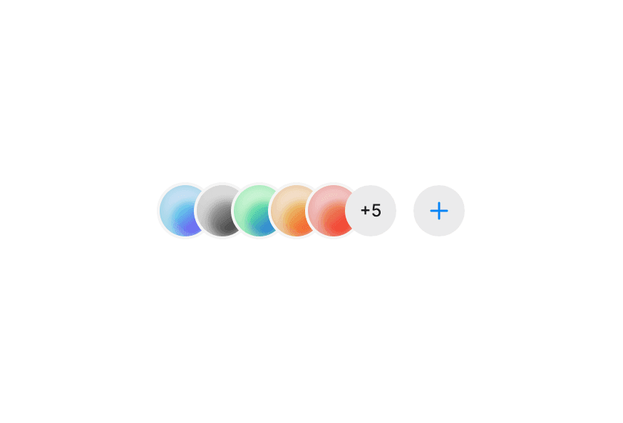
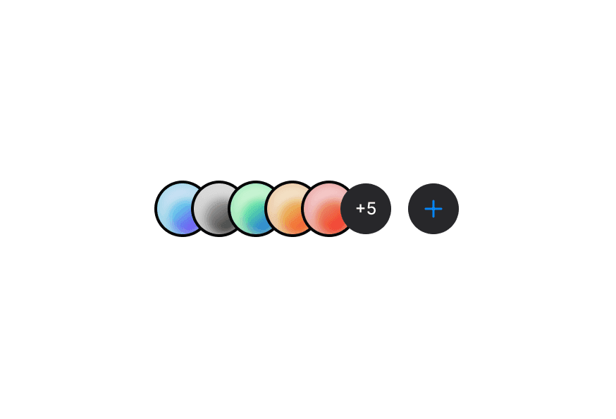
.avatar-group- Base avatar group container.avatar-group--grid- Grid layout modifier (no overlap).avatar-group--clip- Crescent mask / transparent seam (default stacked overlap).avatar-group--ring- Solid box-shadow outline via--background.avatar-group__count- Overflow count avatar
Stacked layout uses negative margin between siblings (--avatar-group-overlap, default 0.5rem). Clip mode masks overlapped avatars (not the last child / Count) and optically nudges fallback glyphs; ring mode uses a thin box-shadow outline via --background.
API Reference
AvatarGroup
| Prop | Type | Default | Description |
|---|---|---|---|
size | 'sm' | 'md' | 'lg' | 'md' | Size applied to child Avatars (and the overflow count) when they omit size (synced with Avatar) |
color | 'default' | 'accent' | 'success' | 'warning' | 'danger' | - | Color applied to child Avatars (and the overflow count) when they omit color |
variant | 'default' | 'soft' | - | Variant applied to child Avatars (and the overflow count) when they omit variant |
max | number | - | Maximum number of avatar children to render; omit to show all |
isGrid | boolean | false | Whether to use a wrapping grid layout without overlap |
overlap | 'clip' | 'ring' | 'clip' | Stacked overlap style: crescent clip (default) or box-shadow ring; ignored when isGrid |
className | string | - | Additional CSS classes |
children | React.ReactNode | - | Avatar components (and optional AvatarGroup.Count) to group together |
AvatarGroup.Count
Composes Avatar + Avatar.Fallback for the overflow indicator. Not truncated by max.
| Prop | Type | Default | Description |
|---|---|---|---|
children | React.ReactNode | - | Count content (e.g. +3) |
size | 'sm' | 'md' | 'lg' | - | Override size from the group |
color | 'default' | 'accent' | 'success' | 'warning' | 'danger' | - | Override color from the group |
variant | 'default' | 'soft' | - | Override variant from the group |
className | string | - | Additional CSS classes |
Note
- AvatarGroup uses React Context to pass
size,color, andvariantto direct Avatar children only maxtruncates visible avatars when set and auto-counts remaining children; omit to show all- For a known total (e.g. from the server), render an explicit
AvatarGroup.Count— it is not truncated bymaxand suppresses the auto count. PreferCountover the removed v2totalprop isGriddisables overlap and uses a wrapping grid layout insteadoverlapdefaults to"clip"(crescent seam); use"ring"for the solid outline; no effect withisGrid- No default
role="group"— when the stack is meaningful (assignees, viewers), passrole="group"witharia-labeloraria-labelledby