ProComponents, templates & AI tooling
HeroUI
27.7k

Toast

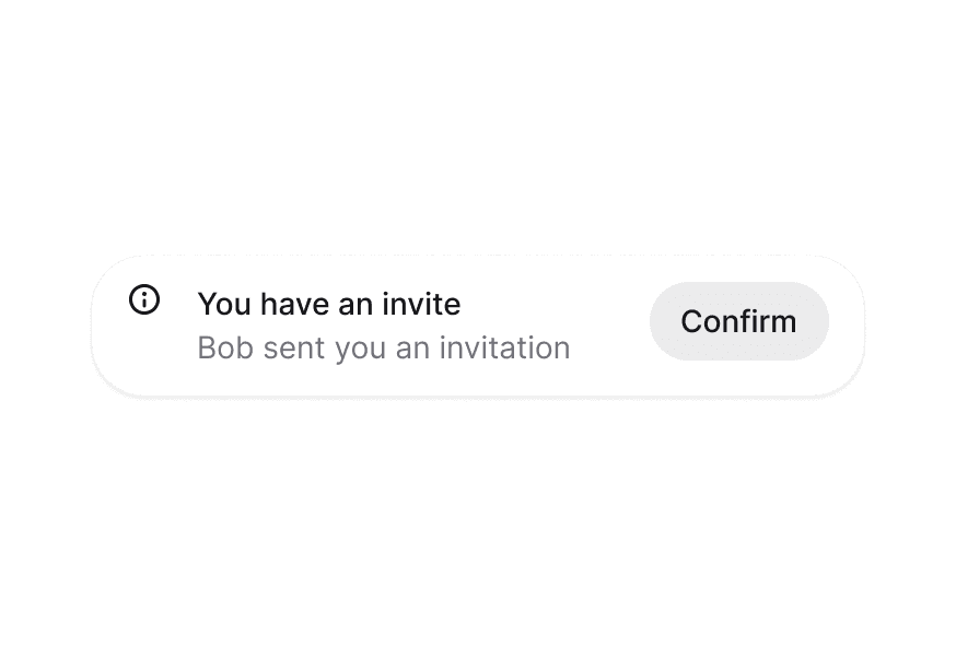
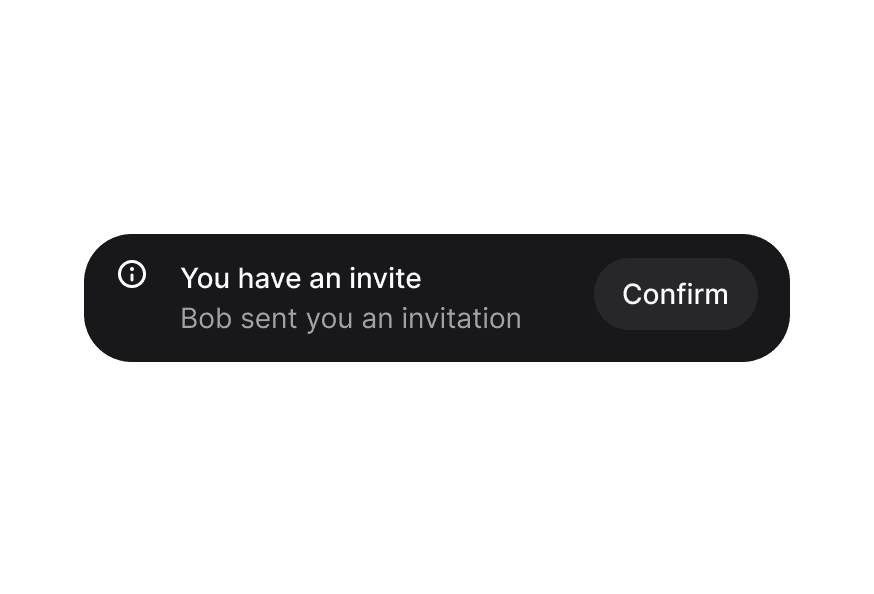
Display temporary notifications and messages to users with automatic dismissal and customizable placement

Usage

import { Toast, toast } from '@heroui/react';

Anatomy

<Toast.Provider>
  <Toast>
    <Toast.Indicator />
    <Toast.Content>
      <Toast.Title />
      <Toast.Description />
    </Toast.Content>
    <Toast.ActionButton />
    <Toast.CloseButton />
  </Toast>
</Toast.Provider>

Examples

Variants

Placements

Simple Toasts

Custom Indicators

Custom Toast Rendering

Promise & Loading

Callbacks

Custom Queues

Setup

Render the provider in the root of your app.

import { Toast, Button, toast } from '@heroui/react';

function App() {
  return (
    <div>
      <Toast.Provider />
      <Button onPress={() => toast("Simple message")}>
        Show toast
      </Button>
    </div>
  );
}

Customization

Tailwind CSS

Global CSS

To customize the Toast component classes, you can use the @layer components directive. Learn more.

@layer components {
  .toast {
    @apply rounded-xl shadow-lg;
  }

  .toast__content {
    @apply gap-2;
  }
}

Styling Reference

HeroUI follows the BEM methodology to ensure component variants and states are reusable and easy to customize.

CSS Classes

The Toast component uses these CSS classes (View source styles):

Base Classes

  • .toast - Base toast container
  • .toast__region - Toast region container
  • .toast__content - Content wrapper for title and description
  • .toast__indicator - Icon/indicator container
  • .toast__title - Toast title text
  • .toast__description - Toast description text
  • .toast__action - Action button container
  • .toast__close - Close button container

Variant Classes

  • .toast--default - Default gray variant
  • .toast--accent - Accent blue variant
  • .toast--success - Success green variant
  • .toast--warning - Warning yellow/orange variant
  • .toast--danger - Danger red variant

Interactive States

The component supports various states:

  • Frontmost: [data-frontmost] - Applied to the topmost visible toast
  • Index: [data-index] - Applied based on toast position in stack
  • Placement: [data-placement="*"] - Applied based on toast region placement

API Reference

Toast.Provider

PropTypeDefaultDescription
placement"top start" | "top" | "top end" | "bottom start" | "bottom" | "bottom end""bottom"Placement of the toast region
gapnumber12The gap between toasts in pixels
maxVisibleToastsnumber3Maximum number of toasts to display at once
scaleFactornumber0.05Scale factor for stacked toasts (0-1)
widthnumber | string460Width of the toast in pixels or CSS value
queueToastQueue<T>-Custom toast queue instance
childrenReactNode | ((props: {toast: QueuedToast<T>}) => ReactNode)-Custom render function or children
classNamestring-Additional CSS classes

Toast

PropTypeDefaultDescription
toastQueuedToast<T>-Toast data from queue (required)
variant"default" | "accent" | "success" | "warning" | "danger""default"Visual variant of the toast
placementToastVariants["placement"]-Placement (inherited from Provider)
scaleFactornumber-Scale factor (inherited from Provider)
classNamestring-Additional CSS classes
childrenReactNode-Toast content (ToastContent, ToastIndicator, etc.)

Toast.Content

PropTypeDefaultDescription
childrenReactNode-Content (typically ToastTitle and ToastDescription)
classNamestring-Additional CSS classes

Toast.Indicator

PropTypeDefaultDescription
variantToastVariants["variant"]-Variant for default icon
childrenReactNode-Custom indicator icon (defaults to variant icon)
classNamestring-Additional CSS classes

Toast.Title

PropTypeDefaultDescription
childrenReactNode-Title text
classNamestring-Additional CSS classes

Toast.Description

PropTypeDefaultDescription
childrenReactNode-Description text
classNamestring-Additional CSS classes

Toast.ActionButton

PropTypeDefaultDescription
childrenReactNode-Action button content
classNamestring-Additional CSS classes
All Button props--Accepts all Button component props

Toast.CloseButton

PropTypeDefaultDescription
classNamestring-Additional CSS classes
All CloseButton props--Accepts all CloseButton component props

ToastQueue

A ToastQueue manages the state for a <Toast.Provider>. The state is stored outside React so you can trigger toasts from anywhere in your application.

Constructor Options

OptionTypeDefaultDescription
maxVisibleToastsnumber3Maximum number of toasts to display at once (visual only)
wrapUpdate(fn: () => void) => void-Function to wrap state updates (e.g., for view transitions)

Methods

MethodParametersReturnsDescription
add(content: T, options?: ToastOptions)stringAdd a toast to the queue, returns toast key
close(key: string)voidClose a toast by its key
pauseAll()voidPause all toast timers
resumeAll()voidResume all toast timers
clear()voidClose all toasts
subscribe(fn: () => void)() => voidSubscribe to queue changes, returns unsubscribe function

toast Function

The default toast function provides convenient methods for showing toasts:

import { toast } from '@heroui/react';

// Basic toast (auto-dismisses after 4 seconds by default)
toast("Event has been created");

// Variant methods (also auto-dismiss after 4 seconds by default)
toast.success("File saved");
toast.info("New update available");
toast.warning("Please check your settings");
toast.danger("Something went wrong");

// With options
toast("Event has been created", {
  description: "Your event has been scheduled for tomorrow",
  variant: "default",
  timeout: 5000, // Custom timeout: 5 seconds
  onClose: () => console.log("Closed"),
  actionProps: {
    children: "View",
    onPress: () => {},
  },
  indicator: <CustomIcon />,
});

// Promise support (automatically shows loading spinner)
toast.promise(
  uploadFile(),
  {
    loading: "Uploading file...",
    success: (data) => `File ${data.filename} uploaded`,
    error: "Failed to upload file",
  }
);

// Manual loading state (persistent toast - no auto-dismiss)
const loadingId = toast("Creating event...", {
  isLoading: true,
  timeout: 0, // Persistent toast that doesn't auto-dismiss
});

// Later, close and show result
toast.close(loadingId);
toast.success("Event created");

// Queue methods
toast.close(key);
toast.clear();
toast.pauseAll();
toast.resumeAll();

toast Options

OptionTypeDefaultDescription
titleReactNode-Toast title (first parameter for variant methods)
descriptionReactNode-Optional description text
variant"default" | "accent" | "success" | "warning" | "danger""default"Visual variant
indicatorReactNode-Custom indicator icon (null to hide)
actionPropsButtonProps-Props for action button
isLoadingbooleanfalseShow loading spinner instead of indicator
timeoutnumber4000Auto-dismiss timeout in milliseconds. Defaults to 4000ms (4 seconds). Set to 0 for persistent toasts that don't auto-dismiss
onClose() => void-Callback when toast is closed

toast.promise Options

OptionTypeDefaultDescription
loadingReactNode-Message shown while promise is pending
successReactNode | ((data: T) => ReactNode)-Message shown on success (can be function)
errorReactNode | ((error: Error) => ReactNode)-Message shown on error (can be function)

On this page