Display temporary notifications and messages to users with automatic dismissal and customizable placement
Usage
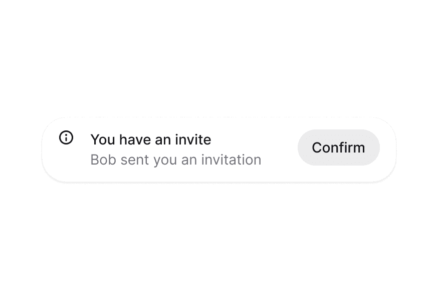
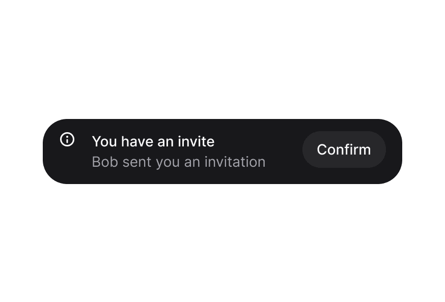
Anatomy
<Toast.Provider>
  <Toast>
    <Toast.Indicator />
    <Toast.Content>
      <Toast.Title />
      <Toast.Description />
    </Toast.Content>
    <Toast.ActionButton />
    <Toast.CloseButton />
  </Toast>
</Toast.Provider>
Examples
Variants
Placements
Expanded Stack
Simple Toasts
Custom Indicators
Custom Toast Rendering
Promise & Loading
Callbacks
Custom Queues
Setup
Render the provider in the root of your app.
import { Toast, Button, toast } from '@heroui/react';

function App() {
  return (
    <div>
      <Toast.Provider />
      <Button onPress={() => toast("Simple message")}>
        Show toast
      </Button>
    </div>
  );
}
Customization
Tailwind CSS
Global CSS
To customize the Toast component classes, you can use the @layer components directive.
Learn more.
@layer components {
  .toast {
    @apply rounded-xl shadow-lg;
  }

  .toast__content {
    @apply gap-2;
  }
}
Styling Reference
HeroUI follows the BEM methodology to ensure component variants and states are reusable and easy to customize.
CSS Classes
The Toast component uses these CSS classes (View source styles):
Base Classes
.toast- Base toast container.toast-region- Toast region container.toast__content- Content wrapper for title and description.toast__indicator- Icon/indicator container.toast__title- Toast title text.toast__description- Toast description text.toast__action- Action button container.toast__close-button- Close button container
Variant Classes
.toast--default- Default gray variant.toast--accent- Accent blue variant.toast--success- Success green variant.toast--warning- Warning yellow/orange variant.toast--danger- Danger red variant
Interactive States
The component supports various states:
- Frontmost:
[data-frontmost]- Applied to the topmost visible toast - Index:
[data-index]- Applied based on toast position in stack - Placement:
[data-placement="*"]- Applied based on toast region placement - Entering:
[data-entering]- Applied on first paint of a new toast - Exiting:
[data-exiting]- Applied while a closing toast plays its exit transition - Expanded:
[data-expanded]- Applied to every toast while the stack is expanded - Hidden:
[data-hidden]- Applied to toasts beyondmaxVisibleToasts
API Reference
Toast.Provider
| Prop | Type | Default | Description |
|---|---|---|---|
placement | "top start" | "top" | "top end" | "bottom start" | "bottom" | "bottom end" | "bottom" | Placement of the toast region |
gap | number | 12 | The gap between toasts in pixels |
isExpanded | boolean | false | Force the stack into its expanded layout (does not pause timers) |
maxVisibleToasts | number | 3 | Maximum number of toasts to display at once |
hotkey | string[] | ["altKey", "KeyT"] | Hotkey that moves focus to the toast region and expands the stack. Modifiers match KeyboardEvent boolean properties (e.g. "altKey"), other keys match event.code (e.g. "KeyT"). Modifiers you leave out must be up, so Alt+T does not also fire on Ctrl+Alt+T. Pass [] to disable |
scaleFactor | number | 0.05 | Scale factor for stacked toasts (0-1) |
width | number | string | 460 | Width of the toast in pixels or CSS value |
queue | ToastQueue<T> | - | Custom toast queue instance |
children | ReactNode | ((props: {toast: QueuedToast<T>}) => ReactNode) | - | Custom render function or children |
className | string | - | Additional CSS classes |
Toast
| Prop | Type | Default | Description |
|---|---|---|---|
toast | QueuedToast<T> | - | Toast data from queue (required) |
variant | "default" | "accent" | "success" | "warning" | "danger" | "default" | Visual variant of the toast |
placement | ToastVariants["placement"] | - | Placement (inherited from Provider) |
scaleFactor | number | - | Scale factor (inherited from Provider) |
className | string | - | Additional CSS classes |
children | ReactNode | - | Toast content (ToastContent, ToastIndicator, etc.) |
Toast.Content
| Prop | Type | Default | Description |
|---|---|---|---|
children | ReactNode | - | Content (typically ToastTitle and ToastDescription) |
className | string | - | Additional CSS classes |
Toast.Indicator
| Prop | Type | Default | Description |
|---|---|---|---|
variant | ToastVariants["variant"] | - | Variant for default icon |
children | ReactNode | - | Custom indicator icon (defaults to variant icon) |
className | string | - | Additional CSS classes |
Toast.Title
| Prop | Type | Default | Description |
|---|---|---|---|
children | ReactNode | - | Title text |
className | string | - | Additional CSS classes |
Toast.Description
| Prop | Type | Default | Description |
|---|---|---|---|
children | ReactNode | - | Description text |
className | string | - | Additional CSS classes |
Toast.ActionButton
| Prop | Type | Default | Description |
|---|---|---|---|
children | ReactNode | - | Action button content |
className | string | - | Additional CSS classes |
All Button props | - | - | Accepts all Button component props |
Toast.CloseButton
| Prop | Type | Default | Description |
|---|---|---|---|
className | string | - | Additional CSS classes |
All CloseButton props | - | - | Accepts all CloseButton component props |
ToastQueue
A ToastQueue manages the state for a <Toast.Provider>. The state is stored outside React so you can trigger toasts from anywhere in your application.
Constructor Options
| Option | Type | Default | Description |
|---|---|---|---|
exitDuration | number | 300 | How long a closing toast stays mounted for its exit animation (0 removes immediately) |
maxVisibleToasts | number | 3 | Maximum number of toasts to display at once (visual only) |
wrapUpdate | (fn: () => void) => void | - | Function to wrap state updates (e.g. document.startViewTransition); by default updates are applied directly and animated with CSS transitions |
Methods
| Method | Parameters | Returns | Description |
|---|---|---|---|
add | (content: T, options?: ToastOptions) | string | Add a toast to the queue, returns toast key |
update | (key: string, content: T, options?: {timeout?: number; onClose?: () => void}) | boolean | Update a toast in place, preserving its stack position; timeout restarts the countdown (0 keeps it open), omit it to keep the current countdown. Returns false if the toast no longer exists |
close | (key: string) | void | Close a toast by its key |
pauseAll | () | void | Pause all toast timers |
resumeAll | () | void | Resume all toast timers |
clear | () | void | Close all toasts (each toast animates out and fires its onClose) |
subscribe | (fn: () => void) | () => void | Subscribe to queue changes, returns unsubscribe function |
toast Function
The default toast function provides convenient methods for showing toasts:
import { toast } from '@heroui/react';

// Basic toast (auto-dismisses after 4 seconds by default)
toast("Event has been created");

// Variant methods (also auto-dismiss after 4 seconds by default)
toast.success("File saved");
toast.info("New update available");
toast.warning("Please check your settings");
toast.danger("Something went wrong");

// With options. The returned id lets the action close its own toast.
const eventId = toast("Event has been created", {
  description: "Your event has been scheduled for tomorrow",
  variant: "default",
  timeout: 5000, // Custom timeout: 5 seconds
  onClose: () => console.log("Closed"),
  actionProps: {
    children: "View",
    onPress: () => toast.close(eventId),
  },
  indicator: <CustomIcon />,
});

// Update an existing toast in place (keeps its position in the stack).
// Options you omit are inherited, so pass `timeout` to start a countdown
// on a toast that was created persistent.
const id = toast("Saving…", { timeout: 0 });
toast.update(id, "Saved", { variant: "success", timeout: 4000 });

// Promise support (automatically shows loading spinner). The loading toast
// updates in place when the promise settles — same toast, same stack
// position; the auto-dismiss countdown starts at that point.
toast.promise(
  uploadFile(),
  {
    loading: "Uploading file...",
    success: (data) => `File ${data.filename} uploaded`,
    error: "Failed to upload file",
  }
);

// Manual loading state (persistent toast - no auto-dismiss)
const loadingId = toast("Creating event...", {
  isLoading: true,
  timeout: 0, // Persistent toast that doesn't auto-dismiss
});

// Later, update in place and start the auto-dismiss countdown
toast.update(loadingId, "Event created", { variant: "success", timeout: 4000 });

// Queue methods
toast.close(key);
toast.clear();
toast.pauseAll();
toast.resumeAll();
toast Options
| Option | Type | Default | Description |
|---|---|---|---|
title | ReactNode | - | Toast title (first parameter for variant methods) |
description | ReactNode | - | Optional description text |
variant | "default" | "accent" | "success" | "warning" | "danger" | "default" | Visual variant |
indicator | ReactNode | - | Custom indicator icon (null to hide) |
actionProps | ButtonProps | - | Props for action button |
isLoading | boolean | false | Show loading spinner instead of indicator |
timeout | number | 4000 | Auto-dismiss timeout in milliseconds. Defaults to 4000ms (4 seconds). Set to 0 for persistent toasts that don't auto-dismiss |
onClose | () => void | - | Called when the toast is dismissed, as its exit animation starts |
toast.promise Options
| Option | Type | Default | Description |
|---|---|---|---|
loading | ReactNode | - | Message shown while promise is pending |
success | ReactNode | ((data: T) => ReactNode) | - | Message shown on success (can be function) |
error | ReactNode | ((error: Error) => ReactNode) | - | Message shown on error (can be function) |
Accessibility
Each toast implements the WAI-ARIA alertdialog pattern, grouped inside a labeled landmark region:
- Landmark region: Toasts render in a labeled landmark reachable with
F6;Alt+Tmoves focus straight to it. The hotkey is configurable via thehotkeyprop and can be disabled by passing an empty array, and the region label can be overridden witharia-label - Keyboard:
Tabreaches the controls of visible toasts,Escapecollapses the expanded stack, and dismissing a focused toast moves focus to the nearest remaining toast - Screen readers: Each toast uses
role="alertdialog"with its title and description linked; new toasts are announced automatically - Timers: Auto-dismiss pauses while the stack is hovered or focused, and while the page is in a background tab