Flexible container component for grouping related content and actions
Usage
Anatomy
import { Card } from "@heroui/react";

export default () => (
  <Card>
    <Card.Header>
      <Card.Title />
      <Card.Description />
    </Card.Header>
    <Card.Content />
    <Card.Footer />
  </Card>
);
Examples
Variants
Cards come in semantic variants that describe their prominence level rather than specific visual styles. This allows themes to interpret them differently:
transparent- Minimal prominence, transparent background (great for nested cards)default- Standard card for most use cases (surface-secondary)secondary- Medium prominence to draw moderate attention (surface-tertiary)tertiary- Higher prominence for important content (surface-tertiary)
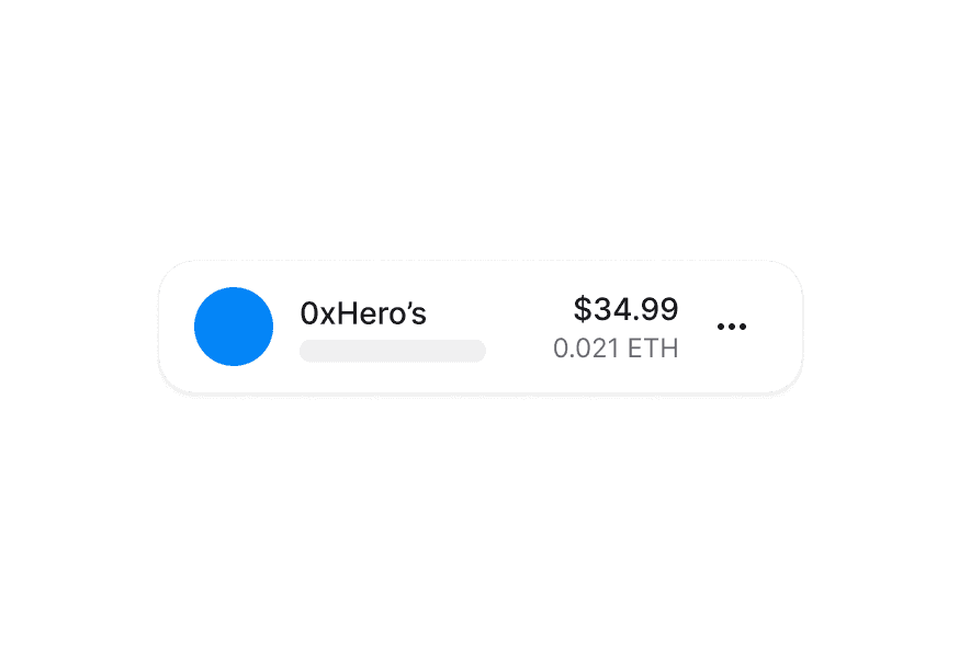
Horizontal Layout
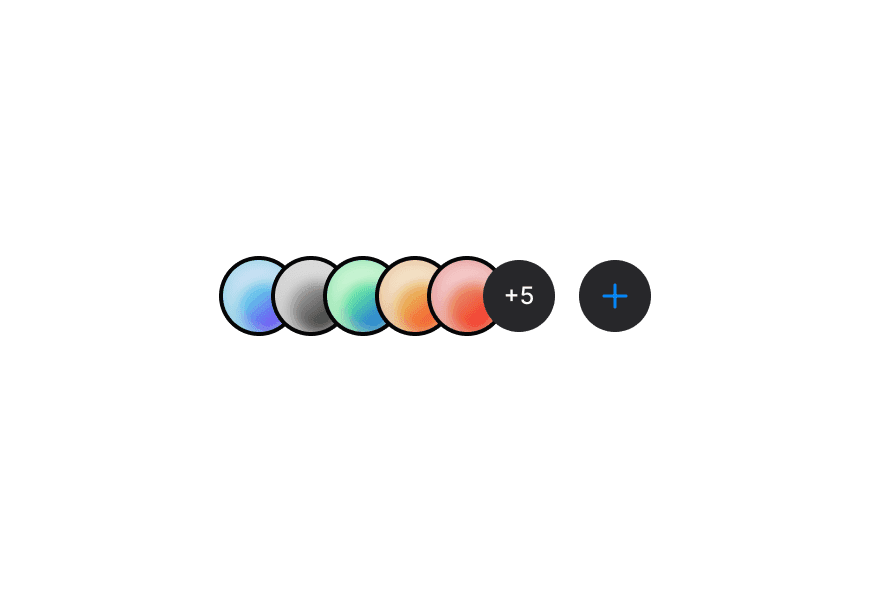
With Avatar
With Images
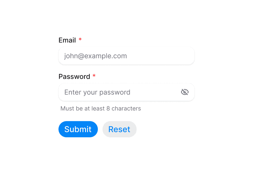
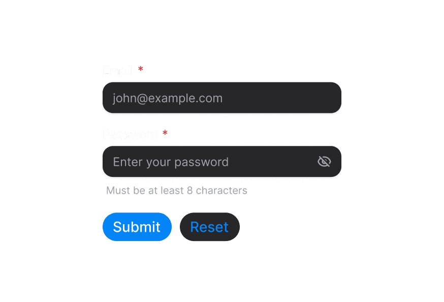
With Form
Customization
Tailwind CSS
Global CSS
To customize the Card component classes, you can use the @layer components directive.
Learn more.
@layer components {
  .card--secondary {
    @apply bg-gradient-to-br from-blue-50 to-purple-50;
  }

  .card__title {
    @apply text-xl font-bold;
  }
}
Styling Reference
HeroUI follows the BEM methodology to ensure component variants and states are reusable and easy to customize.
CSS Classes
Card uses BEM naming for predictable styling (View source styles):
Base Classes
.card- Base container with padding and border.card__header- Header section container.card__title- Title with base font size and weight.card__description- Muted description text.card__content- Flexible content container.card__footer- Footer with row layout
Variant Classes
.card--transparent- Minimal prominence, transparent background (maps totransparentvariant).card--default- Standard appearance with surface-secondary (default).card--secondary- Medium prominence with surface-tertiary (maps tosecondaryvariant).card--tertiary- Higher prominence with surface-tertiary (maps totertiaryvariant)
API Reference
Card
| Prop | Type | Default | Description |
|---|---|---|---|
variant | "transparent" | "default" | "secondary" | "tertiary" | "default" | Semantic variant indicating prominence level |
className | string | - | Additional CSS classes |
children | React.ReactNode | - | Card content |
Card.Header
| Prop | Type | Default | Description |
|---|---|---|---|
className | string | - | Additional CSS classes |
children | React.ReactNode | - | Header content |
Card.Title
| Prop | Type | Default | Description |
|---|---|---|---|
className | string | - | Additional CSS classes |
children | React.ReactNode | - | Title content (renders as h3) |
Card.Description
| Prop | Type | Default | Description |
|---|---|---|---|
className | string | - | Additional CSS classes |
children | React.ReactNode | - | Description content (renders as p) |
Card.Content
| Prop | Type | Default | Description |
|---|---|---|---|
className | string | - | Additional CSS classes |
children | React.ReactNode | - | Main content |
Card.Footer
| Prop | Type | Default | Description |
|---|---|---|---|
className | string | - | Additional CSS classes |
children | React.ReactNode | - | Footer content |
Accessibility
import { Card } from '@heroui/react';
import { cardVariants } from '@heroui/styles';

// Semantic markup
<Card role="article" aria-labelledby="card-title">
  <Card.Header>
    <Card.Title id="card-title">Article Title</Card.Title>
  </Card.Header>
</Card>

// Interactive cards
<a className={cardVariants().base()} href="/details" aria-label="View product details">
  <Card.Title>Product Name</Card.Title>
</a>