ComboBoxNew
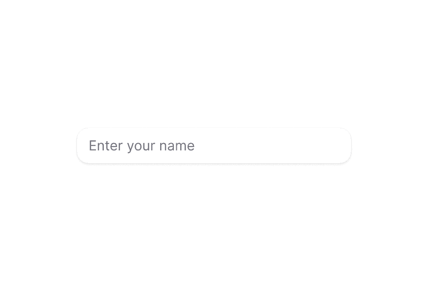
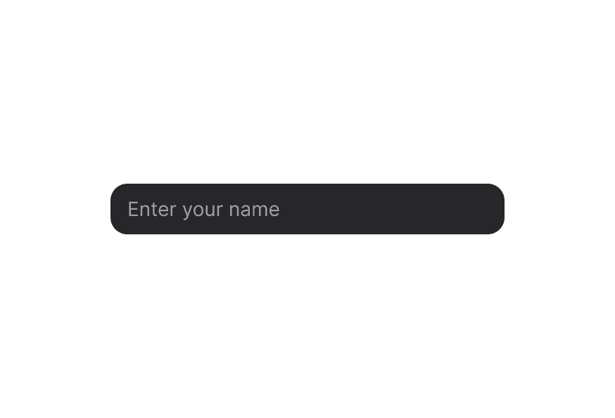
A combo box combines a text input with a listbox, allowing users to filter a list of options to items matching a query
Usage
import { ComboBox } from '@heroui/react';Anatomy
import { ComboBox, Input, Label, Description, Header, ListBox, Separator } from '@heroui/react';

export default () => (
  <ComboBox>
    <Label />
    <ComboBox.InputGroup>
      <Input />
      <ComboBox.Trigger />
    </ComboBox.InputGroup>
    {/* Displays the selected values, primarily used for multiple selection */}
    <ComboBox.Value />
    <Description />
    <ComboBox.Popover>
      <ListBox>
        <ListBox.Item>
          <Label />
          <Description />
          <ListBox.ItemIndicator />
        </ListBox.Item>
        <ListBox.Section>
          <Header />
          <ListBox.Item>
            <Label />
          </ListBox.Item>
        </ListBox.Section>
      </ListBox>
    </ComboBox.Popover>
  </ComboBox>
)
Examples
Full Width
With Description
Required
Disabled
With Disabled Options
With Sections
Controlled
Controlled Input Value
Asynchronous Loading
Default Selected Key
Allows Custom Value
Custom Indicator
Custom Value
Custom Filtering
Render Function
Menu Trigger
Use the menuTrigger prop to control when the popover opens:
focus(default): popover opens when the user focuses the inputinput: popover opens when the user edits the input textmanual: popover only opens when the user presses the trigger button or uses the arrow keys
Form Value
Use the formValue prop to control whether the selected item's key or text is submitted in forms. key is the default. When allowsCustomValue is true, the text is always submitted.
Validation Behavior
Use the validationBehavior prop to control how validation is displayed:
native(default): blocks form submission when the value is missing or invalidaria: shows errors in realtime and does not block submission
Custom Validation
Use the validate prop to return an error message when the value is invalid, or true when it is valid.
Read Only
Use the isReadOnly prop to make the ComboBox read-only. The selected value can be focused, but it cannot be changed.
Multiple Selection
Set selectionMode="multiple" to allow selecting more than one option. In multiple selection mode, use ComboBox.Value to display the selected items and pass selectionMode="multiple" to the inner ListBox as well. Selection is controlled with the value / defaultValue (Key[]) props and the onChange handler.
In Surface
When used inside a Surface component, use variant="secondary" to apply the lower emphasis variant suitable for surface backgrounds.
Customization
Tailwind CSS
Global CSS
To customize the ComboBox component classes, you can use the @layer components directive.
Learn more.
@layer components {
  .combo-box {
    @apply flex flex-col gap-1;
  }

  .combo-box__input-group {
    @apply relative inline-flex items-center;
  }

  .combo-box__trigger {
    @apply absolute right-0 text-muted;
  }

  .combo-box__popover {
    @apply rounded-lg border border-border bg-surface p-2;
  }
}
Styling Reference
HeroUI follows the BEM methodology to ensure component variants and states are reusable and easy to customize.
CSS Classes
The ComboBox component uses these CSS classes (View source styles):
Base Classes
.combo-box- Base ComboBox container.combo-box__input-group- Container for the input and trigger button.combo-box__value- The selected value display (used in multiple selection).combo-box__trigger- The button that triggers the popover.combo-box__popover- The popover container
State Classes
.combo-box[data-invalid="true"]- Invalid state.combo-box[data-disabled="true"]- Disabled ComboBox state.combo-box__trigger[data-focus-visible="true"]- Focused trigger state.combo-box__trigger[data-disabled="true"]- Disabled trigger state.combo-box__trigger[data-open="true"]- Open trigger state
Interactive States
The component supports both CSS pseudo-classes and data attributes for flexibility:
- Hover:
:hoveror[data-hovered="true"]on trigger - Focus:
:focus-visibleor[data-focus-visible="true"]on trigger - Disabled:
:disabledor[data-disabled="true"]on ComboBox - Open:
[data-open="true"]on trigger
API Reference
ComboBox
| Prop | Type | Default | Description |
|---|---|---|---|
inputValue | string | - | Current input value (controlled) |
defaultInputValue | string | - | Default input value (uncontrolled) |
onInputChange | (value: string) => void | - | Handler called when the input value changes |
selectionMode | "single" | "multiple" | "single" | Whether single or multiple selection is enabled |
selectedKey | Key | null | - | Current selected key (controlled, single selection) |
defaultSelectedKey | Key | null | - | Default selected key (uncontrolled, single selection) |
onSelectionChange | (key: Key | null) => void | - | Handler called when the selection changes (single selection) |
value | Key | null | Key[] | - | The currently selected keys (controlled). Key[] when selectionMode="multiple" |
defaultValue | Key | null | Key[] | - | The initial selected keys (uncontrolled). Key[] when selectionMode="multiple" |
onChange | (value: Key | null | Key[]) => void | - | Handler called when the selection changes |
items | Iterable<T> | - | The items to display in the listbox |
disabledKeys | Iterable<Key> | - | Keys of disabled items |
defaultFilter | (text: string, inputValue: string) => boolean | - | Custom filter function for filtering items |
isDisabled | boolean | - | Whether the ComboBox is disabled |
isReadOnly | boolean | - | Whether the input can be selected but not changed by the user |
isRequired | boolean | - | Whether user input is required |
isInvalid | boolean | - | Whether the ComboBox value is invalid |
validate | (value: ComboBoxValidationValue) => ValidationError | true | null | undefined | - | A function that returns an error message if a given value is invalid. Validation errors are displayed to the user when the form is submitted if validationBehavior="native". For realtime validation, use the isInvalid prop instead |
validationBehavior | "native" | "aria" | "native" | Whether to use native HTML form validation to prevent form submission when the value is missing or invalid, or mark the field as required or invalid via ARIA |
name | string | - | The name of the input, used when submitting an HTML form |
form | string | - | The id of a <form> element to associate the input with |
formValue | "text" | "key" | "key" | Whether the text or key of the selected item is submitted as part of an HTML form. When allowsCustomValue is true, this option does not apply and the text is always submitted |
autoComplete | string | - | Describes the type of autocomplete functionality |
autoFocus | boolean | - | Whether the element should receive focus on render |
allowsCustomValue | boolean | - | Whether the ComboBox allows custom values not in the list |
allowsEmptyCollection | boolean | - | Whether the ComboBox allows an empty collection |
menuTrigger | "focus" | "input" | "manual" | "focus" | The interaction required to display the ComboBox menu |
shouldFocusWrap | boolean | - | Whether keyboard navigation is circular |
fullWidth | boolean | false | Whether the ComboBox should take full width of its container |
variant | "primary" | "secondary" | "primary" | Visual variant of the component. primary is the default style with shadow. secondary is a lower emphasis variant without shadow, suitable for use in surfaces. |
className | string | - | Additional CSS classes |
children | ReactNode | RenderFunction | - | ComboBox content or render function |
render | DOMRenderFunction<keyof React.JSX.IntrinsicElements, ComboBoxRenderProps> | - | Overrides the default DOM element with a custom render function. |
ComboBox.InputGroup
| Prop | Type | Default | Description |
|---|---|---|---|
className | string | - | Additional CSS classes |
children | ReactNode | - | InputGroup content |
ComboBox.Value
Renders the selected values of a ComboBox, or a placeholder if no value is selected. By default the selected items are rendered as a comma separated list. Use the render function to customize this (for example, to display tags).
| Prop | Type | Default | Description |
|---|---|---|---|
placeholder | ReactNode | - | A value to display when no items are selected |
className | string | (values: ComboBoxValueRenderProps) => string | - | Additional CSS classes |
children | ReactNode | (values: ComboBoxValueRenderProps) => ReactNode | - | Custom render function for the selected values |
ComboBox.Trigger
| Prop | Type | Default | Description |
|---|---|---|---|
className | string | - | Additional CSS classes |
children | ReactNode | - | Custom trigger content |
ComboBox.Popover
| Prop | Type | Default | Description |
|---|---|---|---|
placement | "bottom" | "bottom left" | "bottom right" | "bottom start" | "bottom end" | "top" | "top left" | "top right" | "top start" | "top end" | "left" | "left top" | "left bottom" | "start" | "start top" | "start bottom" | "right" | "right top" | "right bottom" | "end" | "end top" | "end bottom" | "bottom" | Placement of the popover relative to the trigger |
className | string | - | Additional CSS classes |
children | ReactNode | - | Content children |
Render Props
When using render functions with ComboBox, these values are provided:
| Prop | Type | Description |
|---|---|---|
state | ComboBoxState | The state of the ComboBox |
inputValue | string | The current input value |
selectedKey | Key | null | The currently selected key |
selectedItem | Node | null | The currently selected item |
Accessibility
The ComboBox component implements the ARIA comboBox pattern and provides:
- Full keyboard navigation support
- Screen reader announcements for selection changes and input changes
- Proper focus management
- Support for disabled states
- Typeahead search functionality
- HTML form integration
- Support for custom values
For more information, see the React Aria ComboBox documentation.